Investigator contact details should continue to be available after completion of clinical trials

ClinicalTrials.gov front page

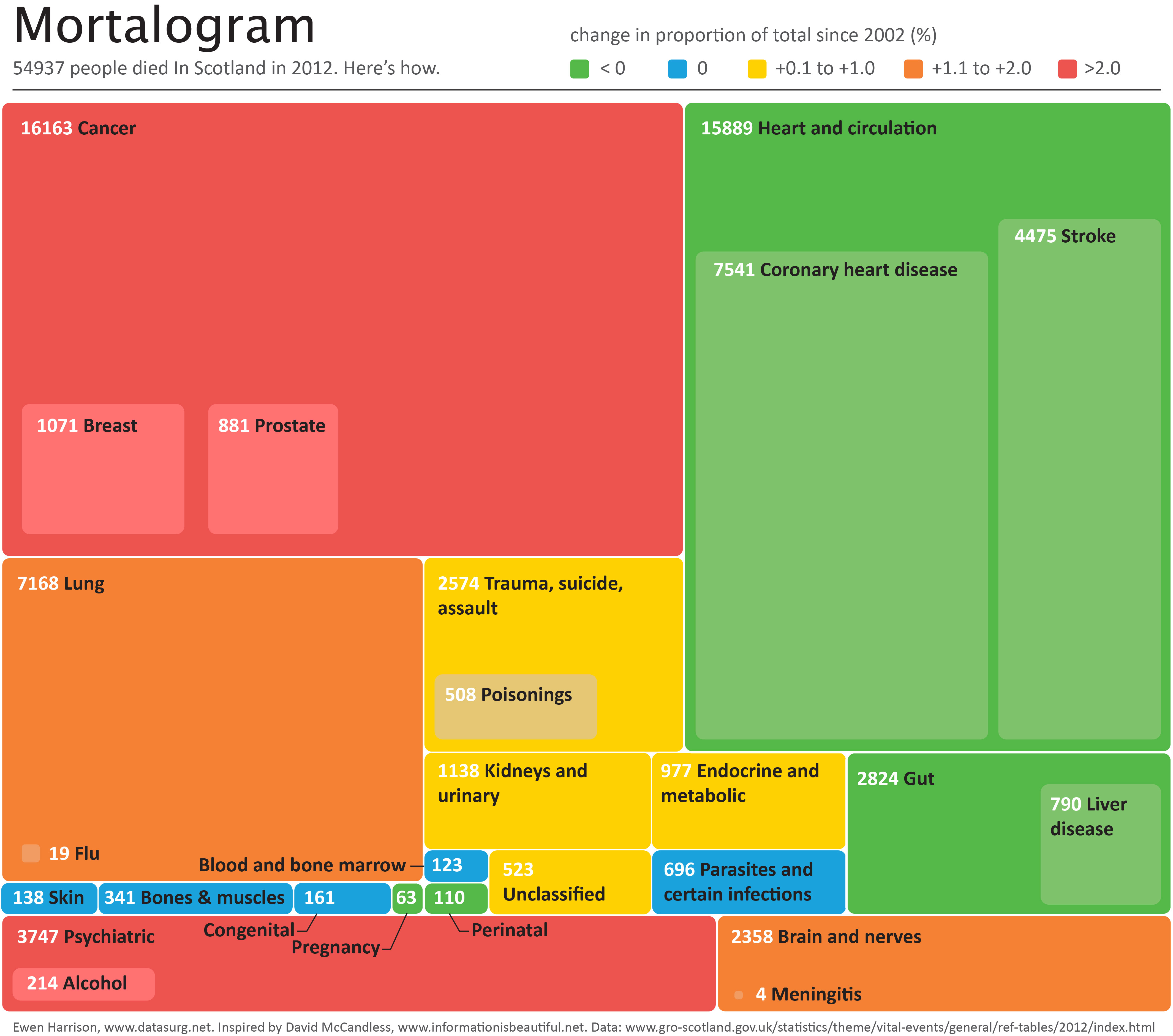
Why oh why does the National Library for Medicine remove investigator contact details from clinicaltrials.gov after completion of a trial. We need to contact them  to ask why their trial is not published!

BMJ letter from us on the subject:

For successful translation of results from research into practice there must also be timely dissemination of research findings (1). The Food and Drug Administration Amendments Act requires trials that are subject to mandatory reporting to post results within 12 months of study completion on ClinicalTrials.gov (2). Despite this initiative, less than a quarter of trial investigators comply (3).

Maruani and colleagues report that email reminders of the legal requirement to post results significantly improve reporting at six months (4). Any intervention that increases dissemination of clinical trial results is welcome and the authors should be commended for their efforts.

However, we do not understand the authors’ described methods. They report that the cohort included trials “that had available contact details (email addresses) of responsible parties”, and go on to state that they “extracted the email addresses of responsible parties from ClinicalTrials.gov”. In the discussion they highlight “the need for updating email addresses of responsible parties in ClinicalTrials.gov”.

We would be interested to know how this is possible as all email addresses for completed trials are removed from ClinicalTrials.gov as a matter of policy by the National Library of Medicine (Table 1).

We asked the National Library of Medicine (NLM) to comment on this. In addition, we asked what advice they would give a patient who had taken part in a completed clinical trial, and wished to contact the investigators to enquire about trial results. They responded:
“If the record is closed or completed, we remove all contact information in the location and contact section since there is no reason why a potential patient would need to contact them.”

The NLM will not provide contact email addresses on request, despite these previously being available on ClinicalTrials.gov while the trial was recruiting.

The removal of previously published contact information from ClinicalTrials.gov has important implications for transparency in trial reporting. Interventions, such as that proposed by Maruani, cannot be delivered at scale while this practice exists. Searching for contact details manually with Google or Pubmed is difficult at best and impossible for many, who may include patients that have participated in a study and wish to contact the investigators about trial results.

References
1. Ross JS, Tse T, Zarin DA, Xu H, Zhou L, Krumholz HM. Publication of NIH funded trials registered in ClinicalTrials.gov: cross sectional analysis. Bmj 2012;344: d7292.
2. Zarin DA, Tse T, Williams RJ, Califf RM, Ide NC. The ClinicalTrials.gov results database–update and key issues. N Engl J Med 2011;364(9): 852-860.
3. Prayle AP, Hurley MN, Smyth AR. Compliance with mandatory reporting of clinical trial results on ClinicalTrials.gov: cross sectional study. Bmj 2012;344: d7373.
4. Maruani A, Boutron I, Baron G, Ravaud P. Impact of sending email reminders of the legal requirement for posting results on ClinicalTrials.gov: cohort embedded pragmatic randomized controlled trial. Bmj 2014;349: g5579.

Adverse outcomes demand clear justification when introducing new surgical procedure

The introduction of new surgical procedures is fraught with difficulty. Determining that a procedure is safe to perform while surgeons are still learning how to do it has obvious problems. Comparing a new procedure to existing treatments requires the surgery to be performed on a scale rarely available at early stages of development. The IDEAL framework helps greatly with this process.

When performing liver surgery, it is crucial that sufficient liver is left behind at the end of the operation to do the necessary job of the liver. This is particularly important in the first days and weeks following surgery. When disease demands that a large proportion of the liver is removed, manoeuvres can be performed before surgery to increase the size of the liver left behind. The disease is invariably cancer and the manoeuvres usually involves blocking the vein supplying the part of the liver to be removed, a procedure called portal vein embolisation. This causes the liver to think part of it has already been removed. The part which will stay behind after surgery increases in size, hopefully sufficient to do the job of the liver after surgery. This often works but does require a delay in definitive surgery and in some patients does not work sufficiently well.

An alternative procedure has come to the fore recently. The ALPPS procedure (Associating Liver Partition and Portal vein Ligation for Staged Liver resection) combines this embolisation procedure with an operation to cut the liver along the line required to remove the diseased portion. But after making the cut, the operation is stopped and the patient woken up. Over the course of the following week the liver being left behind increases in size – quicker and more effectively say proponents of the ALPPS procedure. After a week, the patient is taken back to the operating room and the disease liver portion removed.

So should we start using the procedure to treat cancer which is widely spread in the liver?

The difficulty is knowing whether the new procedure is safe and effective. Early results suggest quite a high mortality associated with the procedure. But of course for patients with untreated cancer in the liver who do not have surgery, the mortality rate is high.

A study has been published which contains some positive data: ALPPS offers a better chance of complete resection in patients with primarily unresectable liver tumors compared with conventional-staged hepatectomies: results of a multicenter analysis.

However, it is still my feeling that the results of the procedure are not good and the traditional portal vein embolisation procedure seems to work well in our patients. Here is our letter with our concerns in response.

We read with interest the multicenter study by Schadde and colleagues in the April issue regarding the novel procedure of Associating Liver Partition and Portal vein Ligation for Staged Liver resection (ALPPS) [1]. Since the initial description 2 years ago [2] ALPPS has gained popularity as a surgical option for treating patients with advanced liver lesions not considered amenable to conventional two-stage or future liver remnant-enhancing procedures propagated by Rene Adam et al. [3] a decade ago. Indeed, the explosion of interest in ALPPS by surgeons and its adoption as a procedure of choice is concerning, given that the procedure appears to come with considerable cost to the patient, as shown in this study. The increased severe morbidity of 27 versus 15 % and the mortality of 15 versus 6 % may not achieve traditional measures of statistical significance in this study, but the effect size is concerning, and the direction of effect is consistent across outcome measures and studies. Is ALPPS in its current form safe enough for the widespread adoption that has occurred given increasingly effective nonsurgical approaches, including ablation, chemotherapy, selective internal radiation therapy [4], and growth factor/receptor inhibition?

As the authors rightly point out, the risk of selection bias is significant given the study design. It is unclear whether the logistic regression analysis adequately adjusts for the imbalance in baseline risk in favor of the ALPPS group: why, for instance, was operative risk (ASA grade) not controlled for in the multivariate analysis?

One of the potential benefits of a two-stage procedure is that it may disclose biologically unfavorable disease. By its very nature, ALPPS does not lend itself to such selection given the short time interval between the first and second stages. The authors appear to reject this argument, citing a similar overall recurrence rate seen in this study. We were puzzled with this position given that the study highlights an interesting observation: in the PVE/PVL group 11 % of patients had systemic progression prior to the second stage. Presumably this group of patients would not have benefitted from ALPPS.

In our practice, patients who may be deemed by others to be ideal candidates for ALPPS are seldom not amenable to either a two-stage liver resection or a single-stage resection with prior volume-enhancing maneuvers. Indeed, it is difficult to understand why an ALPPS approach was used at all in some of the cases presented at recent international conferences. We wonder what proportion and kind of patients with advanced liver lesions would really benefit from the ALPPS approach. The international ALPPS registry will perhaps provide clearer evidence for the role of this challenging approach to liver resection.

1. Schadde E, Ardiles V, Slankamenac K et al (2014) ALPPS offers a better chance of complete resection in patients with primarily unresectable liver tumors compared with conventional-staged hepatectomies: results of a multicenter analysis. World J Surg 38:1510–1519. doi:10.1007/s00268-014-2513-3

2. Schnitzbauer AA, Lang SA, Goessmann H et al (2012) Right portal vein ligation combined with in situ splitting induces rapid left lateral liver lobe hypertrophy enabling 2-staged extended right hepatic resection in small-for-size settings. Ann Surg 255:405–414

3. Adam R, Delvart V, Pascal G et al (2004) Rescue surgery for unresectable colorectal liver metastases downstaged by chemotherapy: a model to predict long-term survival. Ann Surg 240:644–657 discussion 657–658

4. Gulec SA, Pennington K, Wheeler J et al (2013) Yttrium-90 microsphere-selective internal radiation therapy with chemotherapy (chemo-SIRT) for colorectal cancer liver metastases: an in vivo double-arm-controlled phase II trial. Am J Clin Oncol 36:455–460


[gview file=”http://www.datasurg.net/wp-content/uploads/2014/11/Rohatgi-et-al.-2014-ALPPS-Adverse-Outcomes-Demand-Clear-Justification.pdf”]

Introduction of Surgical Safety Checklists in Ontario, Canada – don’t blame the study size

The recent publication of the Ontario experience in the introduction of Surgical Safety Checklists has caused a bit of a stooshie.

Checklists have consistently been shown to be associated with a reduction in death and complications following surgery. Since the publication of Atul Gawande’s seminal paper in 2009, checklists have been successfully introduced in a number of countries including Scotland. David Urbach and Nancy Baxter’s New England Journal of Medicine publication stands apart: the checklist made no difference.

Atul Gawande himself responded quickly asking two important questions. Firstly, were there sufficient patients included in the study to show a difference? Secondly, was the implementation robust and was the programme in place for long enough to expect a difference be seen.

He and others have reported the power of the study to be low – about 40% – meaning that were the study to be repeated multiple times and a true difference in mortality actually did exist, the chance of detecting it would be 40%. But power calculations performed after the event (post hoc) are completely meaningless – when no effect is seen in a study, the power is low by definition (mathsy explanation here).

There is no protocol provided with the Ontario study, so it is not clear if an estimate of the required sample size had been performed. Were it done, it may have gone something like this.

The risk of death in the Ontario population is 0.71%. This could have been determined from the same administrative dataset that the study used. Say we expect a similar reduction in death following checklist introduction as Gawande showed in 2009, 1.5% to 0.8%. For the Ontario population, this would be equivalent to an expected risk of death of 0.38%. This may or may not be reasonable. It is not clear that the “checklist effect” is the same across patients or procedures of different risks. Accepting this assumption for now, the study would have only required around 8000 patients per group to show a significant difference. The study actually included over 100000 patients per group. In fact, it was powered to show very small differences in the risk of death – a reduction of around 0.1% would probably have been detected.

Sample size for Ontario study.

Similar conclusions can be drawn for complication rate. Gawande showed a reduction from 11% to 7%, equivalent in Ontario to a reduction from 3.86% to 2.46%. The Ontario study was likely to show a reduction to 3.59% (at 90% power).

The explanation for the failure to show a difference does not lie in the numbers.

So assuming then that checklists do work, this negative result stems either from a failure of implementation – checklists were not being used or not being used properly – or a difference in the effect of checklists in this population. The former seems most likely. The authors report that …

… available data did not permit us to determine whether a checklist was used in a particular procedure, and we were unable to measure compliance with checklists at monthly intervals in our analysis. However, reported compliance with checklists is extraordinarily high …

Quality improvement interventions need sufficient time for introduction. In this study, only a minimum of 3 months was allowed which seems crazily short. Teams need to want to do it. In my own hospital there was a lot of grumbling (including from me) before acceptance. When I worked in the Netherlands, SURPASS was introduced. In this particular hospital it was delivered via the electronic patient record. A succession of electronic “baton passes” meant that a patient could not get to the operating theatre without a comprehensive series of checklists being completed. I like this use of technology to deliver safety. With robust implementation, training, and acceptance by staff, maybe the benefits of checklists will also be seen in Ontario.

Mortality after paediatric heart surgery using public domain data

This post comes with some big health warnings.

The recent events in Leeds highlight the difficulties faced in judging the results of surgery by individual hospital. A clear requirement is timely access to data in a form easily digestible by the public.

Here I’ve scraped the publically available data from the central cardiac audit database (CCAD). All the data are available at the links provided and are as presented this afternoon (06/04/2013). Please read the caveats carefully.

Hospital-specific 30-day mortality data are available for certain paediatric heart surgery procedures for 2009-2012. These data are not complete for 2011-12 and there may be missing data for earlier years. There may be important data for procedures not included here that should be accounted for. There is no case-mix adjustment.

All data are included in spreadsheets below as well as the code to run the analysis yourself, to ensure no mistakes have been made. Hopefully these data will be quickly superseded with a quality-assured update.

Mortality by centre

The funnel plot below has been generated by taking all surgical procedures performed from pages such as this and expressing all deaths within 30 days as a proportion of the total procedures performed by hospital.

The red horizontal line is the mean mortality rate for these procedures – 2.3%. The green, blue and red curved lines are decreasingly stringent control limits within which unit results may vary by chance.

ccad_funnel_april_2013

Mortality by procedure

The mortality associated with different procedures can be explored with this google motion chart. Note when a procedure is uncommon (to the left of the chart) the great variation seen year to year. These bouncing balls trace out the limits of a funnel plot. They highlight why year to year differences in mortality rates for rare procedures must be interpreted with caution.

[cf]googleVis[/cf]


Data

ccad_public_data_april_2013.xls

ccad_public_data_april_2013_centre

ccad_public_data_april_2013_aggregate

ccad_public_data_april_2013_lookup


Script

####################################
# CCAD public domain data analysis #
# 6 April 2013                     #
# Ewen Harrison                    #
# www.datasurg.net                 #
#################################### 

# Read data
data<-read.table("ccad_public_data_april_2013_centre.csv", sep=",", header=TRUE)

# Correct variable-type
data$centre_code<-factor(data$centre_code)

# Read centre names table
centre<-read.table("ccad_public_data_april_2013_lookup.csv", sep=",", header=TRUE)

# Combine
data<-merge(data, centre, by="centre_code")

# Subset by only procedures termed "Surgery" and remove procedures with no data. 
surg<-subset(data, type=="Surgery" & !is.na(data$centre_code))

# Display data
surg
str(surg)

# install.packages("plyr") # remove "#" first time to install
library(plyr)

# Aggregate data by centre
agg.surg<-ddply(surg, .(centre_code), summarise, observed_mr=sum(death_30d)/sum(count), 
  sum_death=sum(death_30d), count=sum(count))

# Overall mortality rate for procedures lists in all centres
mean.mort<-sum(surg$death_30d)/sum(surg$count)
mean.mort #2.3%

# Generate binomial confidence limits

# install.packages("binom") # remove "#" first time to install
library(binom)
binom_n<-seq(90, 1100, length.out=40)
ci.90<-binom.confint(mean.mort*binom_n, binom_n, conf.level = 0.90, methods = "agresti-coull")
ci.95<-binom.confint(mean.mort*binom_n, binom_n, conf.level = 0.95, methods = "agresti-coull")
ci.99<-binom.confint(mean.mort*binom_n, binom_n, conf.level = 0.997, methods = "agresti-coull")

# Plot chart
# install.packages("ggplot2") # remove "#" first time to install
library(ggplot2)
ggplot()+
	geom_point(data=agg.surg, aes(count,observed_mr))+
	geom_line(aes(ci.90$n, ci.90$lower, colour = "90% CI"))+ #hack to get legend
	geom_line(aes(ci.90$n, ci.90$upper), colour = "green")+
	geom_line(aes(ci.95$n, ci.95$lower, colour = "95% CI"))+ 
	geom_line(aes(ci.95$n, ci.95$upper), colour = "blue")+
	geom_line(aes(ci.99$n, ci.99$lower, colour = "99.7% CI"))+ 
	geom_line(aes(ci.99$n, ci.99$upper), colour = "red")+
	geom_text(data=agg.surg, aes(count,observed_mr,label=centre_code), size=3,vjust=-1)+
	geom_line(aes(x=90:1100, y=mean.mort), colour="red")+
	ggtitle("Observed mortality rate following paediatric heart surgery\nby centre using CCAD public domain data 2009-2012 (incomplete)")+
	scale_x_continuous(name="Number cases performed per centre 2009-2012", limits=c(90,1100))+
	scale_y_continuous(name="Observed mortality rate")+
	scale_colour_manual("",
		breaks=c("90% CI", "95% CI", "99.7% CI"),
		values=c("green", "blue", "red"))+
	theme_bw()+
	theme(legend.position=c(.9, .9))

# Google motion chart
# Load national aggregate data by procedure
agg_data<-read.table("ccad_public_data_april_2013_aggregate.csv", sep=",", header=TRUE)

# check
str(agg_data)

# install.packages("googleVis") # remove "#" first time to install
library(googleVis)
Motion=gvisMotionChart(agg_data, idvar="procedure", timevar="year",
	options=list(height=500, width=600,
		state='{"showTrails":true,"yZoomedDataMax":1,"iconType":"BUBBLE","orderedByY":false,"playDuration":9705.555555555555,"xZoomedIn":false,"yLambda":1,"xAxisOption":"3","nonSelectedAlpha":0.4,"xZoomedDataMin":0,"iconKeySettings":[],"yAxisOption":"5","orderedByX":false,"yZoomedIn":false,"xLambda":1,"colorOption":"2","dimensions":{"iconDimensions":["dim0"]},"duration":{"timeUnit":"Y","multiplier":1},"xZoomedDataMax":833,"uniColorForNonSelected":false,"sizeOption":"3","time":"2000","yZoomedDataMin":0.33};'),
		chartid="Survival_by_procedure_following_congenital_cardiac_surgery_in_UK_2000_2010")
plot(Motion)


Leeds paediatric heart surgery: managing outliers

Childrens’ heart surgery in Leeds has been suspended. Concerns about an excess in mortality have been raised and denied and I have written about seemingly large variations in mortality (“twice the national average”) being explained by chance.

In June 1998, the then Secretary of State for Health announced the establishment of an inquiry into the management of the care of children receiving complex cardiac surgery at Bristol Royal Infirmary between 1984 and 1995. The inquiry identified failures that contributed to the death children undergoing heart surgery and the 529-page report was a blueprint for wider reform of the NHS.

Funnel plots are useful for comparing the results of surgery between hospitals. The funnel plots below are from here and are for open cardiac surgery in children under one year in the UK 1991-1995. The Cardiac Surgery Registry (CSR) and Hospital episode statistics (HES) data were used to compare institutions. The horizontal dotted line is the national average and curved dotted line the limit of variation which might be expected by chance (95% confidence interval). The “O” is Bristol Royal Infirmary and “*” the eleven other UK centres. Bristol, as became apparent, was a clear outlier.

Funnel plots for open congenital heart surgery in chilldren under 1 year in UK 1991-1995

How should we deal with outliers?

The question is pertinent given the recent suspension of Leeds Royal Infirmary from performing children’s cardiac surgery. The UK Department of Health has produced guidelines in 2011 on the recommended process should a unit hit the dotted line, summarised below.

Stage 1 | 10 days

Hospitals with a performance indicator ‘alert’ or ‘alarm’ require scrutiny of the data handling and analyses performed to determine whether there is:

‘No case to answer’

  • potential outlier status not confirmed;
  • data and results revised in clinical audit records;
  • details formally recorded.

‘Case to answer’

  • potential outlier status;
  • proceed to stage 2.

Stage 2 | 5 days

The Lead Clinician in the hospital is informed about the potential outlier status and requested to identify any data errors or justifiable explanations. All relevant data and analyses should be made available to the Lead Clinician.

A copy of the request should also be sent to the Clinical Governance Lead of the hospital.

Stage 3 | 25 days

Lead Clinician to provide written response to national clinical audit team.

Stage 4 | 30 days

Review of Lead Clinician’s response to determine:
‘No case to answer’

  • It is confirmed that the data originally supplied by the provider contained inaccuracies. Reanalysis of accurate data no longer indicate outlier status;
  • Data and results should be revised in clinical audit records. Details of the hospital’s response and the review result recorded;
  • Lead Clinician notified in writing.

‘Case to answer’

  • It is confirmed that although the data originally supplied by the provider were inaccurate, analysis still indicates outlier status; or
  • It is confirmed that the originally supplied data were accurate, thus confirming the initial designation of outlier status;
  • proceed to stage 5.

Stage 5 | 5 days

Contact Lead Clinician by telephone, prior to written confirmation of potential outlier status; copied to clinical governance lead, medical director and chief executive. All relevant data and statistical analyses, including previous response from the lead clinician, made available to the medical director and chief executive.

Chief executive advised to inform relevant bodies about the concerns: primary care trusts, Strategic Health Authority, professional society/association, and Care Quality Commission. Informed that the audit body will proceed to publishing information of comparative performance that will identify providers.

Stage 6 | 10 days

Chief executive acknowledgement of receipt of the letter.

Stage 7

Public disclosure of comparative information that identifies providers (eg annual report of NCA).

The Situation in Leeds

It appears that in Leeds the process is at stage 2 – the local doctors have just been informed. The guidance suggests the identity of the statistical outliers should be anonymous at this stage. It may be that concerns were so great that special circumstances dictated the dramatic public announcement. We should find out in the next few weeks.

Leeds paediatric heart surgery: how much variation is acceptable?

It’s all got very messy in Leeds.

A long-term strategy of the government, supported in general by the health profession, is the concentration of high-risk uncommon surgery in fewer centres. This of course means closing departments in some hospitals currently providing those services. Few are in doubt that child heart surgery is high-risk, relatively uncommon and there are probably too many UK centres performing this highly specialised surgery at the moment. Leeds was one of three UK hospitals identified in an NHS review where congenital heart surgery would stop.

On this background and a vigorous local campaign, a case was won in the High Court which ruled the consultation flawed. That was 7th March 2013 and the ruling was published 3 days ago.

The following day, children’s heart surgery was suspended at Leeds after NHS Medical Director, Sir Bruce Keogh, was shown data suggesting that the mortality rate in Leeds was higher than expected.

There have been rumblings in the cardiac surgical community for some time that all was not well in Leeds … As medical director I couldn’t do nothing. I was really disturbed about the timing of this. I couldn’t sit back just because the timing was inconvenient, awkward or would look suspicious, as it does.

– Sir Bruce Keogh, NHS Medical Director

An “agitated cardiologist” later identified as Professor Sir Roger Boyle, director of the National Institute of Clinical Outcomes Research, told Sir Bruce that mortality rates over the last two years were “about twice the national average or more” and rising.

These data are not in the public domain. Sir Bruce and the Trust faced a difficult decision given the implications of the data. This is complicated by the recent court ruling and strength of public feeling, the recent publication of the Francis report into Mid Staffordshire NHS Foundation Trust and the background of cardiac surgery deaths at Bristol Royal Infirmary between 1984 and 1995.

Is mortality in Leeds higher than expected? What is expected? How much variation can be put down to chance? Is this how a potential outlier should be managed?

Dr John Gibbs, chairman of the Central Cardiac Database and the man responsible for the collection and analysis of the data has said the data are “not fit to be looked at by anyone outside the committee”.

It was at a very preliminary stage, and we are at the start of a long process to make sure the data was right and the methodology was correct. We would be irresponsible if we didn’t put in every effort to get the data right. It will cause untold damage for the future of audit results in this country. I think nobody will trust us again. It’s dreadful.

– Dr John Gibbs, chairman of the Central Cardiac Database

Not surprisingly, a senior cardiologist from Leeds, Elspeth Brown, has come out and said the data are just plain wrong and did not include all the relevant operations.

Twice the national average sounds a lot. is it?

Possibly. It’s difficult to know not seeing the data. Natural variation between hospitals in the results of surgery can and does occur by chance. It is possible to see “twice the national average” as a results of natural variation, disturbing as that may sound. It depends on the number of procedures performed annually – small hospitals have more variation – and whether all cardiac procedures are compared together, as opposed to each individual surgical procedure in isolation.

The challenge is in confidently detecting hospitals performing worse than would be expected by chance, as has been alleged in Leeds. Care needs to be taken to ensure that data are accurate and complete. Account is usually made of differences in the patients being treated and the complexity of the surgery performed (often referred to as case-mix).

The graphs below are “funnel plots” that show differences in mortality after congenital heart surgery in US hospitals. These were published in 2012 by Jacobs and colleagues from the University of South Florida College of Medicine. The open source paper is here, but the graphs come from the final paper here which although behind a paywall, the graphs are freely available (note the final version differs from the open source version).

Each graph is for group of child heart operations of increasing complexity and therefore risk. Upper left are the more straightforward procedures, bottom right more complex. The horizontal axis is the annual number of cases and the vertical axis the mortality as a percentage. Each dot on the graph is a hospital performing that particular type of surgery. If a hospital lies outwith the dotted line (95% confidence interval) then there is a possibility that the mortality rate is different from the average. The further above the top line, the greater the chance. These particular funnel plots are not corrected for case-mix, but this has been done else where in the analysis.

It is easy to see that when a hospital does few cases per year, the natural variation in mortality can be high. On the first graph, there is variation from 0 – 3% between different hospitals and this range increases as the surgery gets riskier. There is less variation between hospitals that do more cases. However, in the second graph even the two hospitals doing around 800 procedures per year, there is a greater than two-fold difference in mortality. On the first plot, twice the national average is 1.2%. There are around 11 hospitals above that level in the US for these procedures, the differences for 9 apparently occuring by chance (within the dotted line). Similar conclusions can be drawn from the other graphs of increasingly risky surgery.

Funnel plots of US centres performing congenital cardiac surgery

Data for cardiac sugery is published and freely available to the public. At the moment, data for children’s heart surgery is not published separately. The data for Leeds General Surgery can be seen here.

To compare children’s heart surgery in Leeds with other centres, we need to the raw data presented in this form and the data corrected for differences in patients. Other issues may be at play, but with the data in the public domain we will be in a better position to make a judgement as to whether an excess in mortality does indeed exist.