Mickey Mouse and the tubes connecting the liver

In liver surgery, it’s often important to know the exact layout of the connections the liver has to the rest of the body. Here are some images which hopefully make it clear. The liver is unusual because it has two blood supplies. The first is an an artery, the hepatic artery, which carries oxygen to the liver. The other is the portal vein which carries blood from the guts to the liver and contains the nutrients from food. The portal vein carries 3 times as much blood as the artery and is not to be messed with – 34% of patients with a portal vein injury do not survive.

The other important tube is the bile duct. This drains bile from the liver to the guts. If it gets blocked – by a gallstone or cancer – the patient becomes jaundiced (the skin going yellow).

We use an ultrasound machine to visualise the vessels and the bile duct. It can be tricky and difficult to interpret. The boss has a good technique for getting orientated – the Mickey Mouse sign. When seen in the transverse plane – imagine sitting at the patient’s feet looking up through the body towards the head – the large portal vein with the artery and bile duct in front looks like Mickey. I use this technique every time.

Intraoperative ultrasound to portal pedicle. Patient consent for publication obtained.
Portal pedicle on ultrasound. CHD, common hepatic duct; LHA, left hepatic artery; RHA, right hepatic artery; PV, portal vein; CBD, common bile duct; PHA, proper hepatic artery; aRHA, accessory right hepatic artery (if present); CHA, common hepatic artery; GDA, gastroduodenal artery; SMV/SV, superior mesenteric vein / splenic vein

Tweets of Surgical Colleges – what does it say about them?

What do the UK and Ireland Surgical Royal Colleges tweet about and how do they compare to the American College of Surgeons?

Twitter allow retrieval of the last 3200 tweets of a given user. Here are all tweets ever sent by the Royal Colleges a few days ago. The American College has tweeted over 6000 times, so only the latest 3200 are included. The Glasgow College is just getting going.

There is a bit of processing first. Charts are generated after removal of “stop words” – all the little words that go in between. Words then have common endings removed (e.g. -ing; stemming) and the most common ending for the group replaced (stem completion).

So what can be said? I was interested in whether Colleges tweet about training. I was pleased to see that the UK colleges do – a fair amount. Terms that are associated with training were less apparent in tweets from the RCSI and ACS.

Frequency of words in tweets from five surgical colleges

The figures below show clustering of terms within tweets, with term frequency increasing from left to right. There are some nice themes that emerge. In the RCSEng tweets there are themes relating to “training”, “events”, “working time”, and “the NHS”.  Similar subjects are apparent in RCSEd tweets, with prominence of their medical students surgical skill competition and issues specifically relating to the NHS in Scotland. As the RCPSG have only started tweeting, associations are greatly influenced by individual tweets.  The RCSI’s “Transition Year Mini Med School Programme” “MiniMed School Open Lecture Series” (updated 22/04/13) can be seen together with conference promotion. The ACS appear to use Twitter to communicate issues relating to patient health improvement programmes more prominently than other Colleges.

Term association in surgical college tweets (cluster dendrogram)

Network plots illustrate the strength of association of terms (weight of edges) and frequency of terms (font size of vertices). Do the terms in these plots represent the core values of these organisations?

Term network of College tweets

Publication of paediatric cardiac surgery results

The National Institute for Cardiovascular Outcomes Research (NICOR) has published the results of its investigation into mortality after paediatric heart surgery in England 2009-12.

The short report has two main findings – the quality of data collection at Leeds General Infirmary (LGI) was woeful, and differences in mortality between all hospitals are likely to be explained by natural variation.

nicor_data

The ability of an institution to collect and audit its own results can be viewed as a measure of organisational health. As can be seen in the table, the performance of LGI in this respect was terrible, and much worse than other units. A cause for concern in itself.

On the more controversial point of whether the mortality rate in LGI was worse than other centres, no convincing proof of this has been found.

The funnel plot below shows the number of expected deaths along the bottom. Centres performing greater numbers of procedures have a greater number of expected deaths, just by common sense.

These numbers have been corrected for the difference in the types of patients and surgery performed in hospitals – the specific procedure performed, patient age, weight, diagnosis, and previous medical conditions. All these factors impact on the risk of death following surgery.

Any hospital above the black horizontal line has a greater number of deaths than predicted and any hospital below has fewer.

nicor_funnel

By “the law of averages”, it would be expected that there was a roughly equal spread of hospitals above and below the line.

As can be seen, Alder Hey, Guys, and LGI are all close to triggering an “alert”.

The report rightly states that these units “may deserve additional scrutiny and monitoring of current performance”.

The 3-year risk adjusted mortality rate in LGI is 1.47 times the national average – lower than the “twice the national average” first reported.

The unambiguous message? Data collection and real-time analysis is core business in healthcare. Government and the NHS still do not have a grip of this. There are many more stories of significant differences between hospitals, hidden in poor quality data that no one is looking at.

Mortality after paediatric heart surgery using public domain data

This post comes with some big health warnings.

The recent events in Leeds highlight the difficulties faced in judging the results of surgery by individual hospital. A clear requirement is timely access to data in a form easily digestible by the public.

Here I’ve scraped the publically available data from the central cardiac audit database (CCAD). All the data are available at the links provided and are as presented this afternoon (06/04/2013). Please read the caveats carefully.

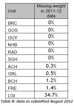
Hospital-specific 30-day mortality data are available for certain paediatric heart surgery procedures for 2009-2012. These data are not complete for 2011-12 and there may be missing data for earlier years. There may be important data for procedures not included here that should be accounted for. There is no case-mix adjustment.

All data are included in spreadsheets below as well as the code to run the analysis yourself, to ensure no mistakes have been made. Hopefully these data will be quickly superseded with a quality-assured update.
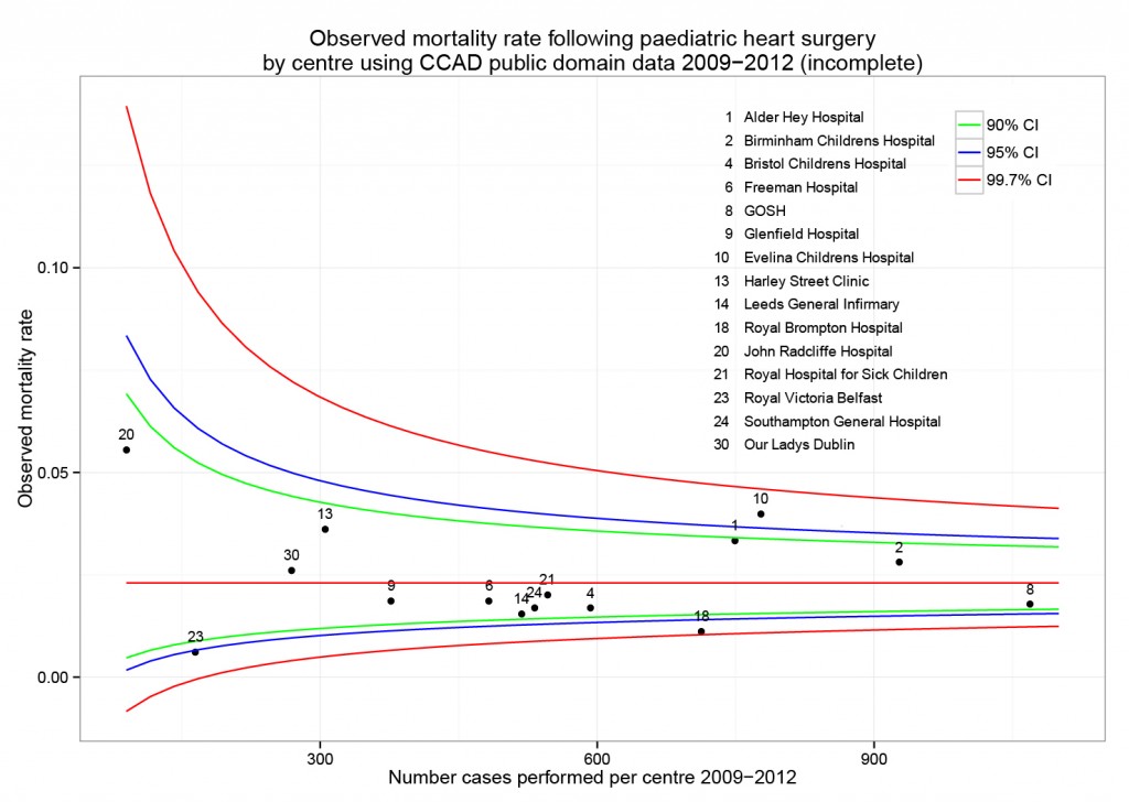
Mortality by centre

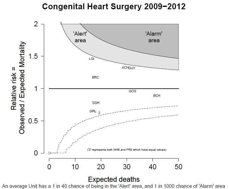
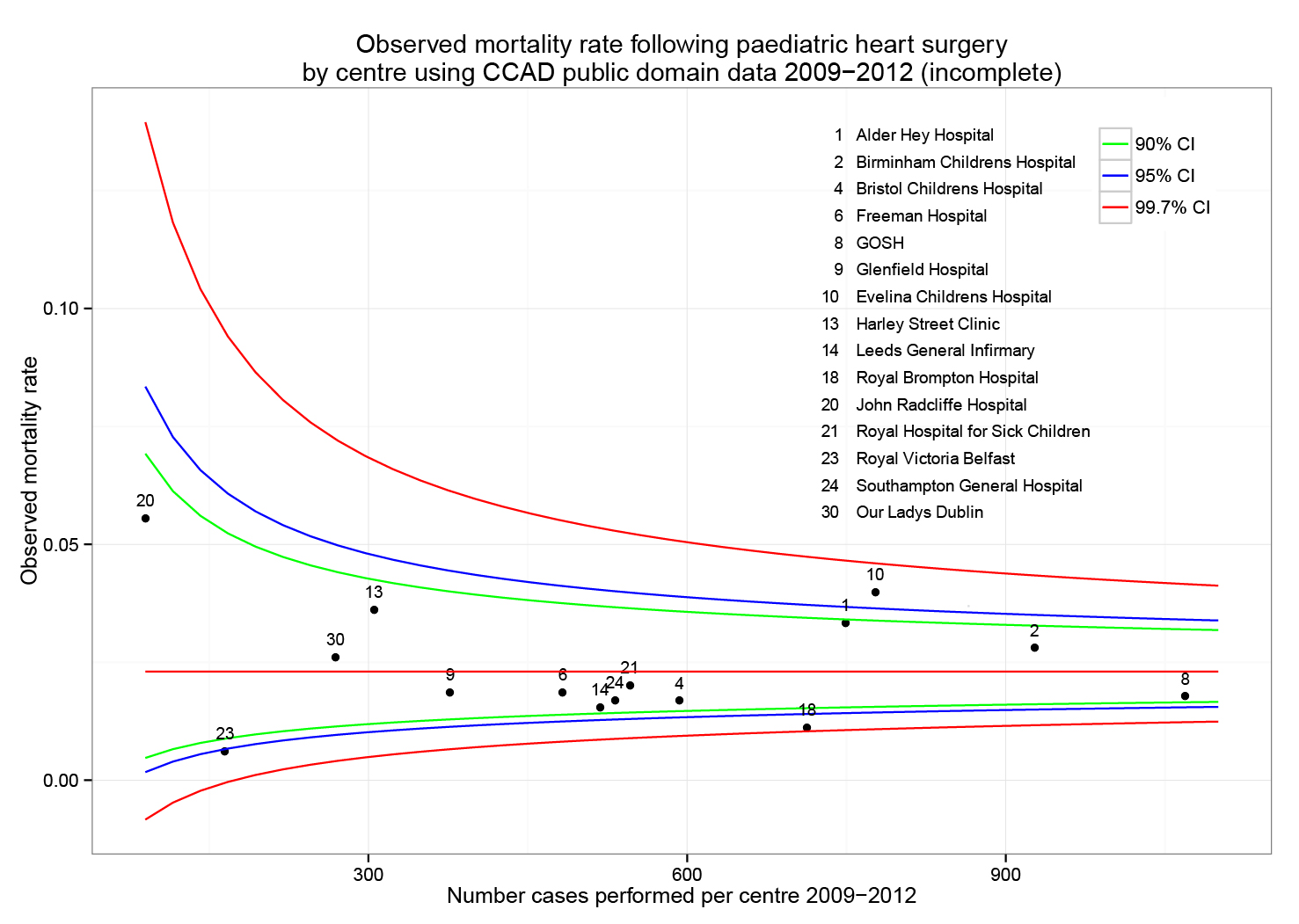
The funnel plot below has been generated by taking all surgical procedures performed from pages such as this and expressing all deaths within 30 days as a proportion of the total procedures performed by hospital.

The red horizontal line is the mean mortality rate for these procedures – 2.3%. The green, blue and red curved lines are decreasingly stringent control limits within which unit results may vary by chance.

ccad_funnel_april_2013

Mortality by procedure

The mortality associated with different procedures can be explored with this google motion chart. Note when a procedure is uncommon (to the left of the chart) the great variation seen year to year. These bouncing balls trace out the limits of a funnel plot. They highlight why year to year differences in mortality rates for rare procedures must be interpreted with caution.

[cf]googleVis[/cf]


Data

ccad_public_data_april_2013.xls

ccad_public_data_april_2013_centre

ccad_public_data_april_2013_aggregate

ccad_public_data_april_2013_lookup


Script

####################################
# CCAD public domain data analysis #
# 6 April 2013                     #
# Ewen Harrison                    #
# www.datasurg.net                 #
#################################### 

# Read data
data<-read.table("ccad_public_data_april_2013_centre.csv", sep=",", header=TRUE)

# Correct variable-type
data$centre_code<-factor(data$centre_code)

# Read centre names table
centre<-read.table("ccad_public_data_april_2013_lookup.csv", sep=",", header=TRUE)

# Combine
data<-merge(data, centre, by="centre_code")

# Subset by only procedures termed "Surgery" and remove procedures with no data. 
surg<-subset(data, type=="Surgery" & !is.na(data$centre_code))

# Display data
surg
str(surg)

# install.packages("plyr") # remove "#" first time to install
library(plyr)

# Aggregate data by centre
agg.surg<-ddply(surg, .(centre_code), summarise, observed_mr=sum(death_30d)/sum(count), 
  sum_death=sum(death_30d), count=sum(count))

# Overall mortality rate for procedures lists in all centres
mean.mort<-sum(surg$death_30d)/sum(surg$count)
mean.mort #2.3%

# Generate binomial confidence limits

# install.packages("binom") # remove "#" first time to install
library(binom)
binom_n<-seq(90, 1100, length.out=40)
ci.90<-binom.confint(mean.mort*binom_n, binom_n, conf.level = 0.90, methods = "agresti-coull")
ci.95<-binom.confint(mean.mort*binom_n, binom_n, conf.level = 0.95, methods = "agresti-coull")
ci.99<-binom.confint(mean.mort*binom_n, binom_n, conf.level = 0.997, methods = "agresti-coull")

# Plot chart
# install.packages("ggplot2") # remove "#" first time to install
library(ggplot2)
ggplot()+
	geom_point(data=agg.surg, aes(count,observed_mr))+
	geom_line(aes(ci.90$n, ci.90$lower, colour = "90% CI"))+ #hack to get legend
	geom_line(aes(ci.90$n, ci.90$upper), colour = "green")+
	geom_line(aes(ci.95$n, ci.95$lower, colour = "95% CI"))+ 
	geom_line(aes(ci.95$n, ci.95$upper), colour = "blue")+
	geom_line(aes(ci.99$n, ci.99$lower, colour = "99.7% CI"))+ 
	geom_line(aes(ci.99$n, ci.99$upper), colour = "red")+
	geom_text(data=agg.surg, aes(count,observed_mr,label=centre_code), size=3,vjust=-1)+
	geom_line(aes(x=90:1100, y=mean.mort), colour="red")+
	ggtitle("Observed mortality rate following paediatric heart surgery\nby centre using CCAD public domain data 2009-2012 (incomplete)")+
	scale_x_continuous(name="Number cases performed per centre 2009-2012", limits=c(90,1100))+
	scale_y_continuous(name="Observed mortality rate")+
	scale_colour_manual("",
		breaks=c("90% CI", "95% CI", "99.7% CI"),
		values=c("green", "blue", "red"))+
	theme_bw()+
	theme(legend.position=c(.9, .9))

# Google motion chart
# Load national aggregate data by procedure
agg_data<-read.table("ccad_public_data_april_2013_aggregate.csv", sep=",", header=TRUE)

# check
str(agg_data)

# install.packages("googleVis") # remove "#" first time to install
library(googleVis)
Motion=gvisMotionChart(agg_data, idvar="procedure", timevar="year",
	options=list(height=500, width=600,
		state='{"showTrails":true,"yZoomedDataMax":1,"iconType":"BUBBLE","orderedByY":false,"playDuration":9705.555555555555,"xZoomedIn":false,"yLambda":1,"xAxisOption":"3","nonSelectedAlpha":0.4,"xZoomedDataMin":0,"iconKeySettings":[],"yAxisOption":"5","orderedByX":false,"yZoomedIn":false,"xLambda":1,"colorOption":"2","dimensions":{"iconDimensions":["dim0"]},"duration":{"timeUnit":"Y","multiplier":1},"xZoomedDataMax":833,"uniColorForNonSelected":false,"sizeOption":"3","time":"2000","yZoomedDataMin":0.33};'),
		chartid="Survival_by_procedure_following_congenital_cardiac_surgery_in_UK_2000_2010")
plot(Motion)


Two simple tests for summary data

R logo

Here’s two handy scripts for hypothesis testing of summary data. I seem to use these a lot when checking work:

  • Chi-squared test of association for categorical data.
  • Student’s t-test for difference in means of normally distributed data.

The actual equations are straightforward, but get involved when group sizes and variance are not equal. Why do I use these a lot?!

I wrote about a study from Hungary in which the variability in the results seemed much lower than expected. We wondered whether the authors had made a mistake in saying they were showing the standard deviation (SD), when in fact they had presented the standard error of the mean (SEM).

hahnThis is a bit of table 1 from the paper. It shows the differences in baseline characteristics between the treated group (IPC) and the active control group (IP). In it, they report no difference between the groups for these characteristics, p>0.05.

But taking “age” as an example and using the simple script for a Student’s t-test with these figures, the answer we get is different. Mean (SD) for group A vs. group B: 56.5 (2.3) vs. 54.8 (1.8), t=4.12, df=98, p=<0.001.

There are lots of similar examples in the paper.

Using standard error of the mean rather than standard deviation gives a non-significant difference as expected.

$latex SEM=SD/\sqrt{n}.$

See here for how to get started with R.

####################
# Chi-sq test from #
# two by two table #
####################

#           Factor 1
# Factor 2  a   |   b
#           c   |   d

a<-32
b<-6
c<-43
d<-9

m<-rbind(c(a,b), c(c,d))
m
chisq.test(m, correct = FALSE)
# Details here
help(chisq.test)

############################
# T-test from summary data #
############################

# install.packages("BSDA") # remove first "#" to install first time only
library(BSDA)
x1<-56.5     # group 1 mean
x1_sd<-2.3   # group 1 standard deviation
n1<-50       # group 1 n
x2<-54.8     # group 2 mean
x2_sd<-1.8   # group 2 standard deviation
n2<-50       # group 2 n

tsum.test(x1, x1_sd, n1, x2, x2_sd, n2, var.equal = TRUE)
# Details here
help(tsum.test)


Statistical errors in published medical studies

I do a fair amount of peer-review for journals. My totally subjective impression – which I can’t back up with figures – is that fundamental errors in data analysis occur on a fairly frequent basis. Opaque descriptions of methods and no access to raw data often makes errors difficult to detect.

We’re performing a meta-analysis at the moment. This is a study in which two or more clinical trials of the same treatment are combined. This can be useful when there is uncertainty about the effectiveness of a treatment.

Relevent trials are rigorously searched for and the quality assessed. The results of good quality trials are then combined, usually with more weight being given to the more reliable trials. This weight reflects the number of patients in the trial and, for some measures, the variability in the results. This variation is important – trials with low variability are greatly influential in the final results of the meta-analysis.

What are we doing the meta-analysis on? We often operate to remove a piece of liver due to cancer. Sometimes we have to clamp the blood supply to the liver to prevent bleeding. An obvious consequence to this is damage to the liver tissue.

Multiple local liver resections. Patient provided consent for image publication.

It may be possible to protect the liver (and any organ) from these damaging effects by temporarily clamping the blood supply for a short time, then releasing the clamp and allowing blood to flow back in. The clamp is then replaced and the liver resection performed. This is called “ischemic preconditioning” and may work by stimulating liver cells to protect themselves. “Batten down the hatches boys, there’s a storm coming!”

Results of this technique are controversial – when used in patients some studies show it works, some show no benefit. So should we be using it in our day-to-day practice?

We searched for studies examining ischemic preconditioning and found quite a few.

One in particularly performed by surgeons in Hungary seemed to show that the technique worked very well (1).The variability in this study was low as well, so it seemed reliable. Actually the variability was very low – lower than all the other trials we found.


Variation in biochemical outcome measures in studies of ischemic preconditioning.

The graph shows 3 of the measures used to determine success of the preconditioning. The first two are enzymes released from damaged liver cells and the third, bilirubin, is processed by the liver. All the studies show some lowering of these measures signifying potential improvement with the treatment. But most trials show a lot of variation between different patients (the vertical lines).

Except a Hungarian study, which shows almost no variation.

Even compared with a study in which these tests were repeated between healthy individuals in the US (9), the variation was low. That seemed strange. Surely the day-to-day variation in your or my liver tests should be lower than those of a group of patients undergoing surgery?

It looks like a mistake.

It may be that the authors wrote that they used one measure of variation when they actually used another (standard error of the mean vs. standard deviation). This could be a simple mistake, the details are here.


But we don’t know. We wrote three times, but they didn’t get back to us. We asked the journal and they are looking into it.


1 Hahn O, Blázovics A, Váli L, et al. The effect of ischemic preconditioning on redox status during liver resections-randomized controlled trial. Journal of Surgical Oncology 2011;104:647–53.
2 Clavien P-A, Selzner M, Rüdiger HA, et al. A Prospective Randomized Study in 100 Consecutive Patients Undergoing Major Liver Resection With Versus Without Ischemic Preconditioning. Annals of Surgery 2003;238:843–52.
3 Li S-Q, Liang L-J, Huang J-F, et al. Ischemic preconditioning protects liver from hepatectomy under hepatic inflow occlusion for hepatocellular carcinoma patients with cirrhosis. World J Gastroenterol 2004;10:2580–4.
4 Choukèr A, Martignoni A, Schauer R, et al. Beneficial effects of ischemic preconditioning in patients undergoing hepatectomy: the role of neutrophils. Arch Surg 2005;140:129–36.
5 Petrowsky H, McCormack L, Trujillo M, et al. A Prospective, Randomized, Controlled Trial Comparing Intermittent Portal Triad Clamping Versus Ischemic Preconditioning With Continuous Clamping for Major Liver Resection. Annals of Surgery 2006;244:921–30.
6 Heizmann O, Loehe F, Volk A, et al. Ischemic preconditioning improves postoperative outcome after liver resections: a randomized controlled study. European journal of medical research 2008;13:79.
7 Arkadopoulos N, Kostopanagiotou G, Theodoraki K, et al. Ischemic Preconditioning Confers Antiapoptotic Protection During Major Hepatectomies Performed Under Combined Inflow and Outflow Exclusion of the Liver. A Randomized Clinical Trial. World J Surg 2009;33:1909–15.
8 Scatton O, Zalinski S, Jegou D, et al. Randomized clinical trial of ischaemic preconditioning in major liver resection with intermittent Pringle manoeuvre. Br J Surg 2011;98:1236–43.
9 Lazo M, Selvin E, Clark JM. Brief communication: clinical implications of short-term variability in liver function test results. Ann Intern Med 2008;148:348–52.