Finalfit, knitr and R Markdown for quick results

Thank you for the many requests to provide some extra info on how best to get `finalfit` results out of RStudio, and particularly into Microsoft Word.

Here is how.

Make sure you are on the most up-to-date version of `finalfit`.

devtools::install_github("ewenharrison/finalfit")

What follows is for demonstration purposes and is not meant to illustrate model building.

Does a tumour characteristic (differentiation) predict 5-year survival?

Demographics table

First explore variable of interest (exposure) by making it the dependent.

library(finalfit)
library(dplyr)

dependent = "differ.factor"

# Specify explanatory variables of interest
explanatory = c("age", "sex.factor", 
  "extent.factor", "obstruct.factor", 
  "nodes")

Note this useful alternative way of specifying explanatory variable lists:

colon_s %>% 
  select(age, sex.factor, 
  extent.factor, obstruct.factor, nodes) %>% 
  names() -> explanatory

Look at associations between our exposure and other explanatory variables. Include missing data.

colon_s %>% 
  summary_factorlist(dependent, explanatory, 
  p=TRUE, na_include=TRUE)
 
              label              levels        Well    Moderate       Poor      p
       Age (years)           Mean (SD) 60.2 (12.8) 59.9 (11.7)  59 (12.8)  0.788
               Sex              Female   51 (11.6)  314 (71.7)  73 (16.7)  0.400
                                  Male    42 (9.0)  349 (74.6)  77 (16.5)       
  Extent of spread           Submucosa    5 (25.0)   12 (60.0)   3 (15.0)  0.081
                                Muscle   12 (11.8)   78 (76.5)  12 (11.8)       
                                Serosa   76 (10.2)  542 (72.8) 127 (17.0)       
                   Adjacent structures     0 (0.0)   31 (79.5)   8 (20.5)       
       Obstruction                  No    69 (9.7)  531 (74.4) 114 (16.0)  0.110
                                   Yes   19 (11.0)  122 (70.9)  31 (18.0)       
                               Missing    5 (25.0)   10 (50.0)   5 (25.0)       
             nodes           Mean (SD)   2.7 (2.2)   3.6 (3.4)  4.7 (4.4) <0.001
Warning messages:
1: In chisq.test(tab, correct = FALSE) :
  Chi-squared approximation may be incorrect
2: In chisq.test(tab, correct = FALSE) :
  Chi-squared approximation may be incorrect
 

Note missing data in `obstruct.factor`. We will drop this variable for now (again, this is for demonstration only). Also see that `nodes` has not been labelled.
There are small numbers in some variables generating chisq.test warnings (predicted less than 5 in any cell). Generate final table.

Hmisc::label(colon_s$nodes) = "Lymph nodes involved"
explanatory = c("age", "sex.factor", 
  "extent.factor", "nodes")

colon_s %>% 
  summary_factorlist(dependent, explanatory, 
  p=TRUE, na_include=TRUE, 
  add_dependent_label=TRUE) -> table1
table1
 
 
 Dependent: Differentiation                            Well    Moderate       Poor      p
                Age (years)           Mean (SD) 60.2 (12.8) 59.9 (11.7)  59 (12.8)  0.788
                        Sex              Female   51 (11.6)  314 (71.7)  73 (16.7)  0.400
                                           Male    42 (9.0)  349 (74.6)  77 (16.5)       
           Extent of spread           Submucosa    5 (25.0)   12 (60.0)   3 (15.0)  0.081
                                         Muscle   12 (11.8)   78 (76.5)  12 (11.8)       
                                         Serosa   76 (10.2)  542 (72.8) 127 (17.0)       
                            Adjacent structures     0 (0.0)   31 (79.5)   8 (20.5)       
       Lymph nodes involved           Mean (SD)   2.7 (2.2)   3.6 (3.4)  4.7 (4.4) <0.001
 

Logistic regression table

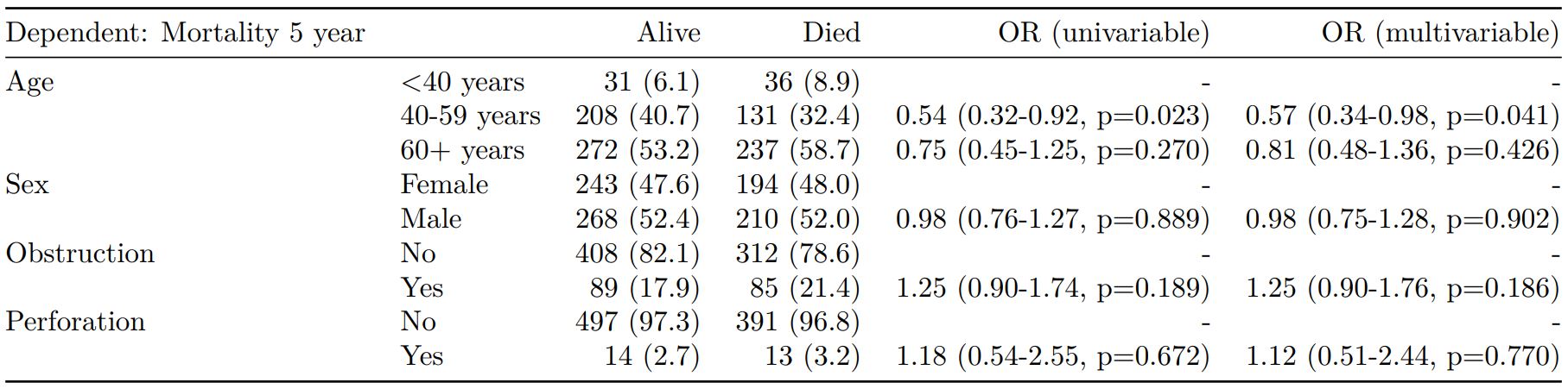
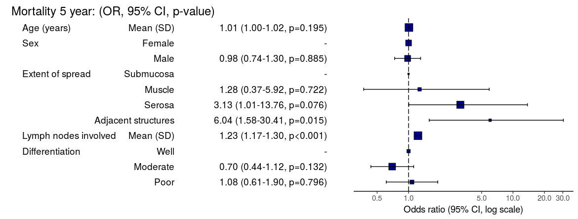
Now examine explanatory variables against outcome. Check plot runs ok.

 
explanatory = c("age", "sex.factor", 
  "extent.factor", "nodes", 
  "differ.factor")
dependent = "mort_5yr"
colon_s %>% 
  finalfit(dependent, explanatory, 
  dependent_label_prefix = "") -> table2
 
 
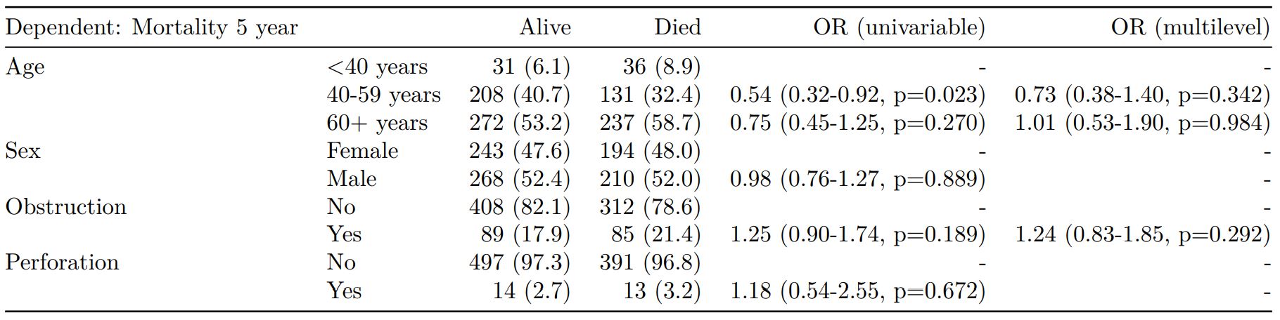
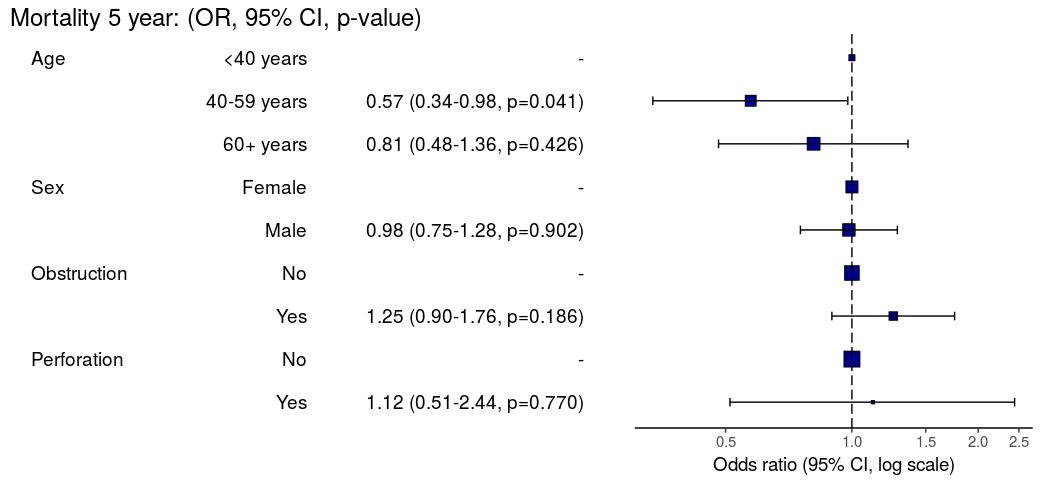
     Mortality 5 year                           Alive        Died           OR (univariable)         OR (multivariable)
          Age (years)           Mean (SD) 59.8 (11.4) 59.9 (12.5)  1.00 (0.99-1.01, p=0.986)  1.01 (1.00-1.02, p=0.195)
                  Sex              Female  243 (47.6)  194 (48.0)                          -                          -
                                     Male  268 (52.4)  210 (52.0)  0.98 (0.76-1.27, p=0.889)  0.98 (0.74-1.30, p=0.885)
     Extent of spread           Submucosa    16 (3.1)     4 (1.0)                          -                          -
                                   Muscle   78 (15.3)    25 (6.2)  1.28 (0.42-4.79, p=0.681)  1.28 (0.37-5.92, p=0.722)
                                   Serosa  401 (78.5)  349 (86.4) 3.48 (1.26-12.24, p=0.027) 3.13 (1.01-13.76, p=0.076)
                      Adjacent structures    16 (3.1)    26 (6.4) 6.50 (1.98-25.93, p=0.004) 6.04 (1.58-30.41, p=0.015)
 Lymph nodes involved           Mean (SD)   2.7 (2.4)   4.9 (4.4)  1.24 (1.18-1.30, p<0.001)  1.23 (1.17-1.30, p<0.001)
      Differentiation                Well   52 (10.5)   40 (10.1)                          -                          -
                                 Moderate  382 (76.9)  269 (68.1)  0.92 (0.59-1.43, p=0.694)  0.70 (0.44-1.12, p=0.132)
                                     Poor   63 (12.7)   86 (21.8)  1.77 (1.05-3.01, p=0.032)  1.08 (0.61-1.90, p=0.796)
 

Odds ratio plot

colon_s %>% 
  or_plot(dependent, explanatory, 
  breaks = c(0.5, 1, 5, 10, 20, 30))

To MS Word via knitr/R Markdown

Important. In most R Markdown set-ups, environment objects require to be saved and loaded to R Markdown document.

# Save objects for knitr/markdown
save(table1, table2, dependent, explanatory, file = "out.rda")

We use RStudio Server Pro set-up on Ubuntu. But these instructions should work fine for most/all RStudio/Markdown default set-ups.

In RStudio, select `File > New File > R Markdown`.

A useful template file is produced by default. Try hitting `knit to Word` on the `knitr` button at the top of the `.Rmd` script window.

Now paste this into the file:

---
title: "Example knitr/R Markdown document"
author: "Ewen Harrison"
date: "22/5/2018"
output:
  word_document: default
---

```{r setup, include=FALSE}
# Load data into global environment. 
library(finalfit)
library(dplyr)
library(knitr)
load("out.rda")
```

## Table 1 - Demographics
```{r table1, echo = FALSE, results='asis'}
kable(table1, row.names=FALSE, align=c("l", "l", "r", "r", "r", "r"))
```

## Table 2 - Association between tumour factors and 5 year mortality
```{r table2, echo = FALSE, results='asis'}
kable(table2, row.names=FALSE, align=c("l", "l", "r", "r", "r", "r"))
```

## Figure 1 - Association between tumour factors and 5 year mortality
```{r figure1, echo = FALSE}
colon_s %>% 
  or_plot(dependent, explanatory)
```

It's ok, but not great.

Create Word template file

Now, edit the Word template. Click on a table. The `style` should be `compact`. Right click > `Modify... > font size = 9`. Alter heading and text styles in the same way as desired. Save this as `template.docx`. Upload to your project folder. Add this reference to the `.Rmd` YAML heading, as below. Make sure you get the space correct.

The plot also doesn't look quite right and it prints with warning messages. Experiment with `fig.width` to get it looking right.

Now paste this into your `.Rmd` file and run:

---
title: "Example knitr/R Markdown document"
author: "Ewen Harrison"
date: "21/5/2018"
output:
  word_document:
    reference_docx: template.docx  
---

```{r setup, include=FALSE}
# Load data into global environment. 
library(finalfit)
library(dplyr)
library(knitr)
load("out.rda")
```

## Table 1 - Demographics
```{r table1, echo = FALSE, results='asis'}
kable(table1, row.names=FALSE, align=c("l", "l", "r", "r", "r", "r"))
```

## Table 2 - Association between tumour factors and 5 year mortality
```{r table2, echo = FALSE, results='asis'}
kable(table2, row.names=FALSE, align=c("l", "l", "r", "r", "r", "r"))
```

## Figure 1 - Association between tumour factors and 5 year mortality
```{r figure1, echo = FALSE, warning=FALSE, message=FALSE, fig.width=10}
colon_s %>% 
  or_plot(dependent, explanatory)
```

This is now looking good for me, and further tweaks can be made.

To PDF via knitr/R Markdown

Default settings for PDF:

---
title: "Example knitr/R Markdown document"
author: "Ewen Harrison"
date: "21/5/2018"
output:
  pdf_document: default
---

```{r setup, include=FALSE}
# Load data into global environment. 
library(finalfit)
library(dplyr)
library(knitr)
load("out.rda")
```

## Table 1 - Demographics
```{r table1, echo = FALSE, results='asis'}
kable(table1, row.names=FALSE, align=c("l", "l", "r", "r", "r", "r"))
```

## Table 2 - Association between tumour factors and 5 year mortality
```{r table2, echo = FALSE, results='asis'}
kable(table2, row.names=FALSE, align=c("l", "l", "r", "r", "r", "r"))
```

## Figure 1 - Association between tumour factors and 5 year mortality
```{r figure1, echo = FALSE}
colon_s %>% 
  or_plot(dependent, explanatory)
```

Again, ok but not great.
[gview file="http://www.datasurg.net/wp-content/uploads/2018/05/example.pdf"]

We can fix the plot in exactly the same way. But the table is off the side of the page. For this we use the `kableExtra` package. Install this in the normal manner. You may also want to alter the margins of your page using `geometry` in the preamble.

---
title: "Example knitr/R Markdown document"
author: "Ewen Harrison"
date: "21/5/2018"
output:
  pdf_document: default
geometry: margin=0.75in
---

```{r setup, include=FALSE}
# Load data into global environment. 
library(finalfit)
library(dplyr)
library(knitr)
library(kableExtra)
load("out.rda")
```

## Table 1 - Demographics
```{r table1, echo = FALSE, results='asis'}
kable(table1, row.names=FALSE, align=c("l", "l", "r", "r", "r", "r"),
						booktabs=TRUE)
```

## Table 2 - Association between tumour factors and 5 year mortality
```{r table2, echo = FALSE, results='asis'}
kable(table2, row.names=FALSE, align=c("l", "l", "r", "r", "r", "r"),
			booktabs=TRUE) %>% 
	kable_styling(font_size=8)
```

## Figure 1 - Association between tumour factors and 5 year mortality
```{r figure1, echo = FALSE, warning=FALSE, message=FALSE, fig.width=10}
colon_s %>% 
  or_plot(dependent, explanatory)
```

This is now looking pretty good for me as well.
[gview file="http://www.datasurg.net/wp-content/uploads/2018/05/example2.pdf"]

There you have it. A pretty quick workflow to get final results into Word and a PDF.

Elegant regression results tables and plots in R: the finalfit package

The finafit package brings together the day-to-day functions we use to generate final results tables and plots when modelling. I spent many years repeatedly manually copying results from R analyses and built these functions to automate our standard healthcare data workflow. It is particularly useful when undertaking a large study involving multiple different regression analyses. When combined with RMarkdown, the reporting becomes entirely automated. Its design follows Hadley Wickham’s tidy tool manifesto.

Installation and Documentation

The full documentation is now here: finalfit.org

The code lives on GitHub.

You can install finalfit from CRAN with:

install.packages("finalfit")

It is recommended that this package is used together with dplyr, which is a dependent.

Some of the functions require rstan and boot. These have been left as Suggests rather than Depends to avoid unnecessary installation. If needed, they can be installed in the normal way:

install.packages("rstan")
install.packages("boot")

To install off-line (or in a Safe Haven), download the zip file and use devtools::install_local().

Main Features

1. Summarise variables/factors by a categorical variable

summary_factorlist() is a wrapper used to aggregate any number of explanatory variables by a single variable of interest. This is often “Table 1” of a published study. When categorical, the variable of interest can have a maximum of five levels. It uses Hmisc::summary.formula().

library(finalfit)
library(dplyr)

# Load example dataset, modified version of survival::colon
data(colon_s)

# Table 1 - Patient demographics by variable of interest ----
explanatory = c("age", "age.factor", 
  "sex.factor", "obstruct.factor")
dependent = "perfor.factor" # Bowel perforation
colon_s %>%
  summary_factorlist(dependent, explanatory,
  p=TRUE, add_dependent_label=TRUE)

See other options relating to inclusion of missing data, mean vs. median for continuous variables, column vs. row proportions, include a total column etc.

summary_factorlist() is also commonly used to summarise any number of variables by an outcome variable (say dead yes/no).

# Table 2 - 5 yr mortality ----
explanatory = c("age.factor", 
  "sex.factor",
  "obstruct.factor")
dependent = 'mort_5yr'
colon_s %>%
  summary_factorlist(dependent, explanatory, 
  p=TRUE, add_dependent_label=TRUE)

Tables can be knitted to PDF, Word or html documents. We do this in RStudio from a .Rmd document. Example chunk:

```{r, echo = FALSE, results='asis'}
knitr::kable(example_table, row.names=FALSE, 
    align=c("l", "l", "r", "r", "r", "r"))
```

2. Summarise regression model results in final table format

The second main feature is the ability to create final tables for linear (lm()), logistic (glm()), hierarchical logistic (lme4::glmer()) and
Cox proportional hazards (survival::coxph()) regression models.

The finalfit() “all-in-one” function takes a single dependent variable with a vector of explanatory variable names (continuous or categorical variables) to produce a final table for publication including summary statistics, univariable and multivariable regression analyses. The first columns are those produced by summary_factorist(). The appropriate regression model is chosen on the basis of the dependent variable type and other arguments passed.

Logistic regression: glm()

Of the form: glm(depdendent ~ explanatory, family="binomial")

explanatory = c("age.factor", "sex.factor", 
  "obstruct.factor", "perfor.factor")
dependent = 'mort_5yr'
colon_s %>%
  finalfit(dependent, explanatory)

Logistic regression with reduced model: glm()

Where a multivariable model contains a subset of the variables included specified in the full univariable set, this can be specified.

explanatory = c("age.factor", "sex.factor", 
  "obstruct.factor", "perfor.factor")
explanatory_multi = c("age.factor", 
  "obstruct.factor")
dependent = 'mort_5yr'
colon_s %>%
  finalfit(dependent, explanatory, 
  explanatory_multi)

Mixed effects logistic regression: lme4::glmer()

Of the form: lme4::glmer(dependent ~ explanatory + (1 | random_effect), family="binomial")

Hierarchical/mixed effects/multilevel logistic regression models can be specified using the argument random_effect. At the moment it is just set up for random intercepts (i.e. (1 | random_effect), but in the future I’ll adjust this to accommodate random gradients if needed (i.e. (variable1 | variable2).

explanatory = c("age.factor", "sex.factor", 
  "obstruct.factor", "perfor.factor")
explanatory_multi = c("age.factor", "obstruct.factor")
random_effect = "hospital"
dependent = 'mort_5yr'
colon_s %>%
  finalfit(dependent, explanatory, 
  explanatory_multi, random_effect)

Cox proportional hazards: survival::coxph()

Of the form: survival::coxph(dependent ~ explanatory)

explanatory = c("age.factor", "sex.factor", 
"obstruct.factor", "perfor.factor")
dependent = "Surv(time, status)"
colon_s %>%
  finalfit(dependent, explanatory)

Add common model metrics to output

metrics=TRUE provides common model metrics. The output is a list of two dataframes. Note chunk specification for output below.

explanatory = c("age.factor", "sex.factor", 
  "obstruct.factor", "perfor.factor")
dependent = 'mort_5yr'
colon_s %>%
  finalfit(dependent, explanatory, 
  metrics=TRUE)
```{r, echo=FALSE, results="asis"}
knitr::kable(table7[[1]], row.names=FALSE, align=c("l", "l", "r", "r", "r"))
knitr::kable(table7[[2]], row.names=FALSE)
```

Rather than going all-in-one, any number of subset models can be manually added on to a summary_factorlist() table using finalfit_merge(). This is particularly useful when models take a long-time to run or are complicated.

Note the requirement for fit_id=TRUE in summary_factorlist(). fit2df extracts, condenses, and add metrics to supported models.

explanatory = c("age.factor", "sex.factor", 
  "obstruct.factor", "perfor.factor")
explanatory_multi = c("age.factor", "obstruct.factor")
random_effect = "hospital"
dependent = 'mort_5yr'

# Separate tables
colon_s %>%
  summary_factorlist(dependent, 
  explanatory, fit_id=TRUE) -> example.summary

colon_s %>%
  glmuni(dependent, explanatory) %>%
  fit2df(estimate_suffix=" (univariable)") -> example.univariable

colon_s %>%
  glmmulti(dependent, explanatory) %>%
  fit2df(estimate_suffix=" (multivariable)") -> example.multivariable

colon_s %>%
  glmmixed(dependent, explanatory, random_effect) %>%
  fit2df(estimate_suffix=" (multilevel)") -> example.multilevel

# Pipe together
example.summary %>%
  finalfit_merge(example.univariable) %>%
  finalfit_merge(example.multivariable) %>%
  finalfit_merge(example.multilevel) %>%
  select(-c(fit_id, index)) %>% # remove unnecessary columns
  dependent_label(colon_s, dependent, prefix="") # place dependent variable label

Bayesian logistic regression: with `stan`

Our own particular rstan models are supported and will be documented in the future. Broadly, if you are running (hierarchical) logistic regression models in Stan with coefficients specified as a vector labelled beta, then fit2df() will work directly on the stanfit object in a similar manner to if it was a glm or glmerMod object.

3. Summarise regression model results in plot

Models can be summarized with odds ratio/hazard ratio plots using or_plot, hr_plot and surv_plot.

OR plot

# OR plot
explanatory = c("age.factor", "sex.factor", 
  "obstruct.factor", "perfor.factor")
dependent = 'mort_5yr'
colon_s %>%
  or_plot(dependent, explanatory)
# Previously fitted models (`glmmulti()` or 
# `glmmixed()`) can be provided directly to `glmfit`

HR plot

# HR plot
explanatory = c("age.factor", "sex.factor", 
  "obstruct.factor", "perfor.factor")
dependent = "Surv(time, status)"
colon_s %>%
  hr_plot(dependent, explanatory, dependent_label = "Survival")
# Previously fitted models (`coxphmulti`) can be provided directly using `coxfit`

Kaplan-Meier survival plots

KM plots can be produced using the library(survminer)

# KM plot
explanatory = c("perfor.factor")
dependent = "Surv(time, status)"
colon_s %>%
  surv_plot(dependent, explanatory, 
  xlab="Time (days)", pval=TRUE, legend="none")

Notes

Use Hmisc::label() to assign labels to variables for tables and plots.

label(colon_s$age.factor) = "Age (years)"

Export dataframe tables directly or to R Markdown knitr::kable().

Note wrapper summary_missing() is also useful. Wraps mice::md.pattern.

colon_s %>%
  summary_missing(dependent, explanatory)

Development will be on-going, but any input appreciated.

Install github package on safe haven server

I’ve had few enquires about how to install the summarizer package on a server without internet access, such as the NHS Safe Havens.

  1. Uploadsummarizer-master.zip from here to server.
  2. Unzip.
  3. Run this:

“`
library(devtools)
source = devtools:::source_pkg(“summarizer-master”)
install(source)

“`

Edit

As per comments, devtools::install_local() has previously failed, but may now also work directly.

P-values from random effects linear regression models

lme4::lmer is a useful frequentist approach to hierarchical/multilevel linear regression modelling. For good reason, the model output only includes t-values and doesn’t include p-values (partly due to the difficulty in estimating the degrees of freedom, as discussed here).

Yes, p-values are evil and we should continue to try and expunge them from our analyses. But I keep getting asked about this. So here is a simple bootstrap method to generate two-sided parametric p-values on the fixed effects coefficients. Interpret with caution.

library(lme4)

# Run model with lme4 example data
fit = lmer(angle ~ recipe + temp + (1|recipe:replicate), cake)

# Model summary
summary(fit)

# lme4 profile method confidence intervals
confint(fit)

# Bootstrapped parametric p-values
boot.out = bootMer(fit, fixef, nsim=1000) #nsim determines p-value decimal places 
p = rbind(
  (1-apply(boot.out$t<0, 2, mean))*2,
  (1-apply(boot.out$t>0, 2, mean))*2)
apply(p, 2, min)

# Alternative "pipe" syntax
library(magrittr)

lmer(angle ~ recipe + temp + (1|recipe:replicate), cake) %>% 
  bootMer(fixef, nsim=100) %$% 
  rbind(
  (1-apply(t<0, 2, mean))*2,
  (1-apply(t>0, 2, mean))*2) %>% 
  apply(2, min)


Prediction is very difficult, especially about the future

As Niels Bohr, the Danish physicist, put it, “prediction is very difficult, especially about the future”. Prognostic models are commonplace and seek to help patients and the surgical team estimate the risk of a specific event, for instance, the recurrence of disease or a complication of surgery. “Decision-support tools” aim to help patients make difficult choices, with the most useful providing personalized estimates to assist in balancing the trade-offs between risks and benefits. As we enter the world of precision medicine, these tools will become central to all our practice.

In the meantime, there are limitations. Overwhelming evidence shows that the quality of reporting of prediction model studies is poor. In some instances, the details of the actual model are considered commercially sensitive and are not published, making the assessment of the risk of bias and potential usefulness of the model difficult.

In this edition of HPB, Beal and colleagues aim to validate the American College of Surgeons National Quality Improvement Program (ACS NSQIP) Surgical Risk Calculator (SRC) using data from 854 gallbladder cancer and extrahepatic cholangiocarcinoma patients from the US Extrahepatic Biliary Malignancy Consortium. The authors conclude that the “estimates of risk were variable in terms of accuracy and generally calculator performance was poor”. The SRC underpredicted the occurrence of all examined end-points (death, readmission, reoperation and surgical site infection) and discrimination and calibration were particularly poor for readmission and surgical site infection. This is not the first report of predictive failures of the SRC. Possible explanations cited previously include small sample size, homogeneity of patients, and too few institutions in the validation set. That does not seem to the case in the current study.

The SRC is a general-purpose risk calculator and while it may be applicable across many surgical domains, it should be used with caution in extrahepatic biliary cancer. It is not clear why the calculator does not provide measures of uncertainty around estimates. This would greatly help patients interpret its output and would go a long way to addressing some of the broader concerns around accuracy.

Radical but conservative liver surgery

Cutting-edge liver surgery is often associated with modern technology such as the robot. In this edition of HPB, Torzilli and colleagues provide a fascinating account of 12 years of “radical but conservative” open liver surgery.

This is extreme parenchymal-sparing hepatectomy (PSH) in 169 patients with colorectal liver metastases. In all cases, tumour was touching or infiltrating portal pedicles or hepatic veins, a situation where most surgeons would advocate a major hepatectomy where possible. The PSH by its nature results in a 0 mm resection margin when the vessel is preserved, which was the aim in many of these procedures. Although this is off-putting, the cut-edge recurrence rate was no higher than average.

PSH in the form of “easy atypicals” is performed by all HPB surgeons. There are two main differences here. First is the aim to detach tumours from intrahepatic vascular structures. For instance, hepatic veins in contact with tumour were preserved and only resected if infiltrated. Even then, they were tangentially incised if possible and reconstructed with a bovine pericardial patch. Second is the careful attention paid to identifying and using communicating hepatic veins. This is well described but used extensively here to allow complete resection of segments while avoiding congestion in the draining region.

Short-term mortality and morbidity rates are comparable with other published series. A median survival of 36 months and 5-year overall survival of around 30% is reasonable given some of these patients may not be offered surgery in certain centres. The authors describe the parenchymal sparing approach “failing” in 14 (10%) patients: 7 (5%) has recurrence at the cut edge and 8 (6%) within segments which would have been removed using a standard approach. 44% of the 55 patients with liver-only recurrence underwent re-resection.

This is not small surgery. The average operating time is 8.5 h with the longest taking 18.5 h. The 66% thoracotomy rate is also notable in an era of minimally invasive surgery and certainly differs from my own practice. This study is challenging and I look forward to the debates that should arise from it.

Preserving liver while removing all the cancer

“Radical-but-conservative” parenchymal-sparing hepatectomy (PSH) for colorectal liver metastases (Torzilli 2017) is increasing reported. The PSH revolution has two potential advantages: avoiding postoperative hepatic failure (POHF) and increasing the possibility of re-do surgery in the common event of future recurrence. However, early series reported worse long-term survival and higher positive margin rates with a parenchymal-sparing approach, with a debate ensuing about the significance of the latter in an era where energy-devices are more commonly employed in liver transection. No randomised controlled trials exist comparing PSH with major hepatectomy and case series are naturally biased by selection.

In this issues of HPB, Lordan and colleagues report a propensity-score matched case-control series of PSH vs. major hepatectomy. The results are striking. The PSH approach was associated with less blood transfusion (10.1 vs 27.7%), fewer major complications (3.8 vs 9.2%), and lower rates of POHF (0 vs 5.5%). Unusually, perioperative mortality (0.8 vs 3.8%) was also lower in the PSH group and longer-term oncologic and survival outcomes were similar.

Results of propensity-matched analyses must always be interpreted with selection bias in mind. Residual confounding always exists: the patients undergoing major hepatectomy almost certainly had undescribed differences from the PSH group and may not have been technically suitable for PSH. Matching did not account for year of surgery, so with PSH becoming more common the generally improved outcomes over time will bias in favour of the parenchymal-sparing approach. Yet putting those concerns aside, there are two salient results. Firstly, PSH promises less POHF and in this series, there was none. Secondly, PSH promises greater opportunity for redo liver surgery. There was 50% liver-only recurrence in both groups. Although not reported by the authors, a greater proportion of PSH patients underwent redo surgery (35/119 (29.4%) vs. 23/130 (17.7%) (p=0.03). Perhaps for some patients, the PSH revolution is delivering some of its promised advantages.

Realistic medicine

Realistic medicine is a useful concept describing healthcare that puts patients at the centre of decision making and treatment, with an aim to reduce harm, waste and unwarranted variation. One of the great challenges in medicine today is supporting patients with incurable disease in their treatment choices. Advising patients on interventions that offer reducing benefits in the face of increasing potential harms, when they may feel obliged to “take all treatments going”, requires honesty, candour and data. Realism is a better term than futility, but they are two sides of the same coin.

In HPB, Kim and colleagues examine survival after recurrence of bile duct cancer. The facts of this disease are always sobering: the median survival after diagnosis of recurrence is 7 months. The study is useful in that the authors have sufficient numbers to examine subgroups of those with recurrence to identify which patients may potentially benefit from salvage treatment (which was mostly chemotherapy). For those with poorly differentiated primary tumours, a short time to recurrence, poor performance status and elevated CA19-9, survival was only a handful of months.

This is a pragmatic non-randomised study with inherent selection bias, but the aim was not to determine the potential benefit of salvage treatment (we await the full publication of studies such as BILCAP). Also, the predictive ability of the model was not particularly high (c-statistic= 0.65). However, it does serve to illustrate the important point that for some very unfortunate patients with poor-prognosis recurrence, survival will be short and they may be better advised to focus on priorities other than chemotherapy. As Atul Gawande remarks in Being Mortal, “We’ve been wrong about what our job is in medicine. We think our job is to ensure health and survival. But really it is larger than that. It is to enable well-being.”

Effect of day of the week on mortality after emergency general surgery

Out latest paper published in the BJS describes short- and long-term outcomes after emergency surgery in Scotland. We looked for a weekend effect and didn’t find one.

  • In around 50,000 emergency general surgery patients, we didn’t find an association between day of surgery or day of admission and death rates;
  • In around 100,000 emergency surgery patients including orthopaedic and gynaecology procedures, we didn’t find an association between day of surgery or day of admission and death rates;
  • In around 500,000 emergency and planned surgery patients, we didn’t find an association between day of surgery or day of admission and death rates.

We also found that emergency surgery performed at weekends, or in those admitted at weekends, was performed a little quicker compared with weekdays.

More details can be found here:

Effect of day of the week on short- and long-term mortality after emergency general surgery
http://onlinelibrary.wiley.com/doi/10.1002/bjs.10507/full

bjs_dow-100

bjs_dow2-100

Press coverage

Broadcast: BBC GOOD MORNING SCOTLAND, HEART FM,

Print: DAILY TELEGRAPH, DAILY MIRROR, METRO, HERALD, HERALD (Leader), SCOTSMAN, THE NATIONAL, YORKSHIRE POST, GLASGOW EVENING TIMES

Online: BBC NEWS ONLINE, DAILY MAILEXPRESS.CO.UK, MIRROR.CO.UKHERALD SCOTLANDTHE COURIERWEBMD.BOOTS.COMNEWS-MEDICAL.NETNEW KERALA (India), BUSINESS STANDARDYAHOO NEWSABERDEEN EVENING EXPRESSBT.COMMEDICAL XPRESS.

Publishing mortality rates for individual surgeons

This is our new analysis of an old topic.In Scotland, individual surgeon outcomes were published as far back as 2006. It wasn’t pursued in Scotland, but has been mandated for surgeons in England since 2013.

This new analysis took the current mortality data and sought to answer a simple question: how useful is this information in detecting differences in outcome at the individual surgeon level?

Well the answer, in short, is not very useful.

We looked at mortality after planned bowel and gullet cancer surgery, hip replacement, and thyroid, obesity and aneurysm surgery. Death rates are relatively low after planned surgery which is testament to hard working NHS teams up and down the country. This together with the fact that individual surgeons perform a relatively small proportion of all these procedures means that death rates are not a good way to detect under performance.

At the mortality rates reported for thyroid (0.08%) and obesity (0.07%) surgery, it is unlikely a surgeon would perform a sufficient number of procedures in his/her entire career to stand a good chance of detecting a mortality rate 5 times the national average.

Surgeon death rates are problematic in more fundamental ways. It is the 21st century and much of surgical care is delivered by teams of surgeons, other doctors, nurses, physiotherapists, pharmacists, dieticians etc. In liver transplantation it is common for one surgeon to choose the donor/recipient pair, for a second surgeon to do the transplant, and for a third surgeon to look after the patient after the operation. Does it make sense to look at the results of individuals? Why not of the team?

It is also important to ensure that analyses adequately account for the increased risk faced by some patients undergoing surgery. If my granny has had a heart attack and has a bad chest, I don’t want her to be deprived of much needed surgery because a surgeon is worried that her high risk might impact on the public perception of their competence. As Harry Burns the former Chief Medical Officer of Scotland said, those with the highest mortality rates may be the heroes of the health service, taking on patients with difficult disease that no one else will face.

We are only now beginning to understand the results of surgery using measures that are more meaningful to patients. These sometimes get called patient-centred outcome measures. Take a planned hip replacement, the aim of the operation is to remove pain and increase mobility. If after 3 months a patient still has significant pain and can’t get out for the groceries, the operation has not been a success. Thankfully death after planned hip replacement is relatively rare and in any case, might have little to do with the quality of the surgery.

Transparency in the results of surgery is paramount and publishing death rates may be a step towards this, even if they may in fact be falsely reassuring. We must use these data as part of a much wider initiative to capture the success and failures of surgery. Only by doing this will we improve the results of surgery and ensure every patient receives the highest quality of care.

Read the full article for free here.

Press coverage

Radio: LBC, Radio Forth

Print:

  • New Scientist
  • Scotsman
  • Daily Mail
  • Express
  • the I

Online:

ONMEDICA, SHROPSHIRESTAR.COM, THE BOLTON NEWSEXPRESSANDSTAR.COMBELFAST TELEGRAPHAOL UKMEDICAL XPRESS, BT.COM, EXPRESS.CO.UK

Having a low blood count increase complications from liver surgery

A low blood count is common with cancer. There are now more studies showing that this can contribute to complications after surgery. Blood transfusion increases blood count but is best avoided in cancer unless the blood count is very low. This new study in the journal HPB shows the effect of anaemia after liver surgery. Here is the editorial highlight I wrote for the journal.

Preoperative anaemia is common and affects 30-60% of patients undergoing major elective surgery. In major non-cardiac surgery, anaemia is associated with increased morbidity and mortality, as well as higher blood transfusion rates.

The importance of preoperative anaemia in liver resection patients is becoming recognised. In this issue, Tohme and colleagues present an evaluation of the American College of Surgeons’ National Surgical Quality Improvement Program (ACS-NSQIP) database.

Of around 13000 patients who underwent elective liver resection from 2005 to 2012, one third were anaemic prior to surgery. After adjustment, anaemia was associated with major complications after surgery (OR 1.21, 1.09-1.33) but not death.

Patients who are anaemic have different characteristics to those who are not, characteristics that are likely to make them more susceptible to complications. While this analysis extensively adjusts for observed factors, residual confounding almost certainly exists.

The question remains, does anaemia itself contribute to the occurrence of complications, or is it just a symptom of greater troubles? The authors rightly highlight the importance of identifying anaemia prior to surgery, but it remains to be seen whether treatment is possible and whether it will result in better patient outcomes.

Perioperative transfusion is independently associated with major complications. Although there is no additive effect in anaemic patients, the benefits of treating anaemia may be offset by the detrimental effect of transfusion. For those with iron deficiency, treatment with intravenous iron may be of use and is currently being studied in an RCT of all major surgery (preventt.lshtm.ac.uk). Results of studies such as these will help determine causal relationships and whether intervention is possible and beneficial.