An alternative presentation of the ProPublica Surgeon Scorecard

ProPublica, an independent investigative journalism organisation, have published surgeon-level complications rates based on Medicare data. I have already highlighted problems with the reporting of the data: surgeons are described as having a “high adjusted rate of complications” if they fall in the red-zone, despite there being too little data to say whether this has happened by chance.

4
This surgeon should not be identified as having a “high adjusted rate of complications” as there are too few cases to estimate the complication rate accurately.

I say again, I fully support transparency and public access to healthcare. But the ProPublica reporting has been quite shocking. I’m not aware of them publishing the number of surgeons out of the 17000 that are statistically different to the average. This is a small handful.

ProPublica could have chosen a different approach. This is a funnel plot and I’ve written about them before.

A funnel plot is a summary of an estimate (such as complication rate) against a measure of the precision of that estimate. In the context of healthcare, a centre or individual outcome is often plotted against patient volume. A horizontal line parallel to the x-axis represents the outcome for the entire population and outcomes for individual surgeons are displayed as points around this. This allows a comparison of individuals with that of the population average, while accounting for the increasing certainty surrounding that outcome as the sample size increases. Limits can be determined, beyond which the chances of getting an individual outcome are low if that individual were really part of the whole population.

In other words, a surgeon above the line has a complication rate different to the average.

I’ve scraped the ProPublica data for gallbladder removal (laparoscopic cholecystectomy) from California, New York and Texas for surgeons highlighted in the red-zone. These are surgeons ProPublica says have high complication rates.

As can be seen from the funnel plot, these surgeons are no where near being outliers. There is insufficient information to say whether any of them are different to average. ProPublica decided to ignore the imprecision with which the complication rates are determined. For red-zone surgeons from these 3 states, none of them have complication rates different to average.

ProPublica_lap_chole_funnel
Black line, population average (4.4%), blue line 95% control limit, red line 99% control limit.

How likely is it that a surgeon with an average complication rate (4.4%) will appear in the red-zone just by chance (>5.2%)? The answer is, pretty likely given the small numbers of cases here: anything up to a 25% chance depending on the number of cases performed. Even at the top of the green-zone (low ACR, 3.9%), there is still around a 1 in 6 chance a surgeon will appear to have a high complication rate just by chance.

chance_of_being_in_redzoneProPublica have failed in their duty to explain these data in a way that can be understood. The surgeon score card should be revised. All “warning explanation points” should be removed for those other than the truly outlying cases.

Data

Download

Git

Link to repository.

Code

# ProPublica Surgeon Scorecard 
# https://projects.propublica.org/surgeons

# Laparoscopic cholecystectomy (gallbladder removal) data
# Surgeons with "high adjusted rate of complications"
# CA, NY, TX only

# Libraries needed ----
library(ggplot2)
library(binom)

# Upload dataframe ----
dat = read.csv("http://www.datasurg.net/wp-content/uploads/2015/07/ProPublica_CA_NY_TX.csv")

# Total number reported
dim(dat)[1] # 59

# Remove duplicate surgeons who operate in more than one hospital
duplicates = which(
    duplicated(dat$Surgeon)
)

dat_unique = dat[-duplicates,]
dim(dat_unique) # 27

# Funnel plot for gallbladder removal adjusted complication rate -------------------------
# Set up blank funnel plot ----
# Set control limits
pop.rate = 0.044 # Mean population ACR, 4.4%
binom_n = seq(5, 100, length.out=40)
ci.90 = binom.confint(pop.rate*binom_n, binom_n, conf.level = 0.90, methods = "wilson")
ci.95 = binom.confint(pop.rate*binom_n, binom_n, conf.level = 0.95, methods = "wilson")
ci.99 = binom.confint(pop.rate*binom_n, binom_n, conf.level = 0.99, methods = "wilson")

theme_set(theme_bw(24))
g1 = ggplot()+
    geom_line(data=ci.95, aes(ci.95$n, ci.95$lower*100), colour = "blue")+ 
    geom_line(data=ci.95, aes(ci.95$n, ci.95$upper*100), colour = "blue")+
    geom_line(data=ci.99, aes(ci.99$n, ci.99$lower*100), colour = "red")+ 
    geom_line(data=ci.99, aes(ci.99$n, ci.99$upper*100), colour = "red")+
    geom_line(aes(x=ci.90$n, y=pop.rate*100), colour="black", size=1)+
    xlab("Case volume")+
    ylab("Adjusted complication rate (%)")+
    scale_colour_brewer("", type = "qual", palette = 6)+
    theme(legend.justification=c(1,1), legend.position=c(1,1))
g1

g1 + 
    geom_point(data=dat_unique, aes(x=Volume, y=ACR), colour="black", alpha=0.6, size = 6, 
                         show_guide=TRUE)+
    geom_point(data=dat_unique, aes(x=Volume, y=ACR, colour=State), alpha=0.6, size=4) +
    ggtitle("Funnel plot of adjusted complication rate in CA, NY, TX")


# Probability of being shown as having high complication rate ----
# At 4.4%, what are the changes of being 5.2% by chance?
n <- seq(15, 150, 1)
average = 1-pbinom(ceiling(n*0.052), n, 0.044)
low = 1-pbinom(ceiling(n*0.052), n, 0.039)

dat_prob = data.frame(n, average, low)

ggplot(melt(dat_prob, id="n"))+
    geom_point(aes(x=n, y=value*100, colour=variable), size=4)+
    scale_x_continuous("Case volume", breaks=seq(10, 150, 10))+
    ylab("Adjusted complication rate (%)")+
    scale_colour_brewer("True complication rate", type="qual", palette = 2, labels=c("Average (4.4%)", "Low (3.9%)"))+
    ggtitle("ProPublica chance of being in high complication rate zone by\nchance when true complication rate \"average\" or \"low\"")+
    theme(legend.position=c(1,0), legend.justification=c(1,0))

The problem with ProPublica’s surgeon scorecards

ProPublica is an organisation performing independent, non-profit investigative journalism in the public interest. Yesterday it published an analysis of surgeon-level complications rates based on Medicare data.

Publication of individual surgeons results is well established in the UK. Transparent, easily accessible healthcare data is essential and initiatives like this are welcomed.

It is important that data are presented in a way that can be clearly understood. Communicating risk is notoriously difficult. This is particularly difficult when it is necessary to describe the precision with which a risk has been estimated.

Unfortunately that is where ProPublica have got it all wrong.

There is an inherent difficulty faced when we dealing with individual surgeon data. In order to be sure that a surgeon has a complication rate higher than average, that surgeon needs to have performed a certain number of that particular procedure. If data are only available on a small number of cases, we can’t be certain whether the surgeon’s complication rate is truly high, or just appears to be high by chance.

If you tossed a coin 10 times and it came up with 7 heads, could you say whether the coin was fair or biased? With only 10 tosses we don’t know.

Similarly, if a surgeon performs 10 operations and has 1 complication, can we sure that their true complication rate is 10%, rather than 5% or 20%? With only 10 operations we don’t know.

The presentation of the ProPublica data is really concerning. Here’s why.

For a given hospital, data are presented for individual surgeons. Bands are provided which define “low”, “medium” and “high” adjusted complication rates. If the adjusted complication rate for an individual surgeon falls within the red-zone, they are described as having a “high adjusted rate of complications”.

1How confident can we be that a surgeon in the red-zone truly has a high complication rate? To get a handle on this, we need to turn to an off-putting statistical concept called a “confidence interval”. As it’s name implies, a confidence interval tells us what degree of confidence we can treat the estimated complication rate.

2If the surgeon has done many procedures, the confidence interval will be narrow. If we only have data on a few procedures, the confidence interval will be wide.

To be confident that a surgeon has a high complication rate, the 95% confidence interval needs to entirely lie in the red-zone.

A surgeon should be highlighted as having a high complication rate if and only if the confidence interval lies entirely in the red-zone.

Here is an example. This surgeon performs the procedure to remove the gallbladder (cholecystectomy). There are data on 20 procedures for this individual surgeon. The estimated complication rate is 4.7%. But the 95% confidence interval goes from the green-zone all the way to the red-zone. Due to the small number of procedures, all we can conclude is that this surgeon has either a low, medium, or high adjusted complication rate. Not very useful.

8Here are some other examples.

Adjusted complication rate: 1.5% on 339 procedures. Surgeon has low or medium complication rate. They are unlikely to have a high complication rate.

5Adjusted complication rate: 4.0% on 30 procedures. Surgeon has low or medium or high complication rate. Note due to the low numbers of cases, the analysis correctly suggests an estimated complication rate, despite the fact this surgeon has not had any complications for the 30 procedures.
3Adjusted complication rate: 5.4% on 21 procedures. ProPublica conclusion: surgeon has high adjusted complication rate. Actual conclusion: surgeon has low, medium or high complication rate.
4Adjusted complication rate: 6.6% on 22 procedures. ProPublica conclusion: surgeon has high adjusted complication rate. Actual conclusion: surgeon has medium or high complication rate, but is unlikely to have a low complication rate.
6Adjusted complication rate: 7.6% on 86 procedures. ProPublica conclusion: surgeon has high adjusted complication rate. Actual conclusion: surgeon has high complication rate. This is one of the few examples in the dataset, where the analysis suggest this surgeon does have a high likelihood of having a high complication rate.

7In the UK, only this last example would to highlighted as concerning. That is because we have no idea whether surgeons who happen to fall into the red-zone are truly different to average.

The analysis above does not deal with issues others have highlighted: that this is Medicare data only, that important data may be missing , that the adjustment for patient case mix may be inadequate, and that the complications rates seem different to what would be expected.

ProPublica have not moderated the language used in reporting these data. My view is that the data are being misrepresented.

ProPublica should highlight cases like the last mentioned above. For all the others, all that can be concluded is that there are too few cases to be able to make a judgement on whether the surgeon’s complication rate is different to average.

RStudio and GitHub

Version control has become essential for me keeping track of projects, as well as collaborating. It allows backup of scripts and easy collaboration on complex projects. RStudio works really well with Git, an open source open source distributed version control system, and GitHub, a web-based Git repository hosting service. I was always forget how to set up a repository, so here’s a reminder.

This example is done on RStudio Server, but the same procedure can be used for RStudio desktop. Git or similar needs to be installed first, which is straight forward to do.

Setup Git on RStudio and Associate with GitHub

In RStudio, Tools -> Version Control, select Git.

In RStudio, Tools -> Global Options, select Git//SVN tab. Ensure the path to the Git executable is correct. This is particularly important in Windows where it may not default correctly (e.g. C:/Program Files (x86)/Git/bin/git.exe).
1Now hit, Create RSA Key …

2_rsaClose this window.

Click, View public key, and copy the displayed public key.

4_rsaIf you haven’t already, create a GitHub account. Open your account settings and click the SSH keys tab. Click Add SSH key. Paste in the public key you have copied from RStudio.

6_add_keyTell Git who you are. Remember Git is a piece of software running on your own computer. This is distinct to GitHub, which is the repository website. In RStudio, click Tools -> Shell … . Enter:

git config --global user.email "[email protected]"
git config --global user.name "ewenharrison"

Use your GitHub username.

10_who_are_you

Create New project AND git

In RStudio, click New project as normal. Click New Directory.

7_new_project

Name the project and check Create a git repository.

8_new_project_with_git

Now in RStudio, create a new script which you will add to your repository.

9_test_scriptAfter saving your new script (test.R), it should appear in the Git tab on the Environment / history panel.

11_initial_commitClick the file you wish to add, and the status should turn to a green ‘A’. Now click Commit and enter an identifying message in Commit message.

12_inital_commit2You have now committed the current version of this file to your repository on your computer/server. In the future you may wish to create branches to organise your work and help when collaborating.

Now you want to push the contents of this commit to GitHub, so it is also backed-up off site and available to collaborators. In GitHub, create a New repository, called here test.

5_create_git In RStudio, again click Tools -> Shell … . Enter:

git remote add origin https://github.com/ewenharrison/test.git
git config remote.origin.url [email protected]:ewenharrison/test.git
git pull -u origin master
git push -u origin master

13_push_pullYou have now pushed your commit to GitHub, and should be able to see your files in your GitHub account. The Pull Push buttons in RStudio will now also work. Remember, after each Commit, you have to Push to GitHub, this doesn’t happen automatically.

Clone an existing GitHub project to new RStudio project

In RStudio, click New project as normal. Click Version Control.

7_new_projectIn Clone Git Repository, enter the GitHub repository URL as per below. Change the project directory name if necessary.

14_new_version_controlIn RStudio, again click Tools -> Shell … . Enter:

git config remote.origin.url [email protected]:ewenharrison/test.git

Interested in international trials? Take part in GlobalSurg.

GlobalSurg: Global Surgery results to be published soon

The GlobalSurg project is continuing to be a great experience.

The first cohort study reports data from patients undergoing emergency abdominal surgery across the world.

10,745 patients from 357 centres across 58 countries.

Around half are from high (n=6538, 60.8%) and half from low/middle (n=4207, 39.2%) human development index (HDI) settings. We are limited in what findings we can release prior to formal publication. But here are some of the areas we have looked at.

  • Appendicectomy is the most commonly performed operation across all countries (HDI: high 38.1%, middle 52.8%, low 38.2%)
  • Trauma is the indication for surgery in a higher proportion of cases in middle and low HDI countries (10.0% and 12.1% respectively) than in HDI countries (2.2%).
  • Use of midline laparotomy increased across development indices (high 27.3%, middle 29.0%, low 41.4%).

R Graphics Output

7 day NHS

High quality care for patients seven days a week seems like a good idea to me. There is nothing worse than going round the ward on Saturday or Sunday and having to tell patients that they will get their essential test or treatment on Monday.

It was stated in the Queen’s Speech this year that seven day services would be implemented in England as part of a new five-year plan.

In England my Government will secure the future of the National Health Service by implementing the National Health Service’s own five-year plan, by increasing the health budget, integrating healthcare and social care, and ensuring the National Health Service works on a seven day basis.

Work has started in pilot trusts. Of course funding is the biggest issue and details are sketchy. Some hope that the provision of weekend services will allow patients to be discharged quicker and so save money. With the high capital cost of expensive equipment like MRI scanners, it makes financial sense to ‘sweat the assets’ more at weekends where workload is growing or consolidated across fewer providers.

But that may be wishful thinking. The greatest cost to the NHS is staffing and weekend working inevitably means more staff. Expensive medically qualified staff at that. It is in this regard that the plan seems least developed: major areas of the NHS cannot recruit to posts at the moment. Emergency medicine and acute medicine for instance. Where are these weekend working individuals going to come from?

I thought I’d look at our operating theatre utilisation across the week. These are data from the middle of 2010 to present and do not include emergency/unplanned operating. The first plot shows the spread of total hours of operating by day of the week. How close are we to a 7 day NHS?

Well, 3 days short.

I don’t know why we are using are operating theatres less on Fridays. Surgeons in the past may have preferred not to operate on a Friday, avoiding those crucial first post-operative days being on the weekend. But surely that is not still the case? Yet there has been no change in this pattern over the last 4 years.

Here’s a thought. Perhaps until weekend NHS services are equivalent to weekdays, it is safer not to perform elective surgery on a Friday? It is worse than I thought.

elective_theatre_by_wdayelective_theatre_mon_fri

Journal bans p-values

Editors from the journal Basic and Applied Social Psychology have banned p-values. Or rather null hypothesis significance testing – which includes all the common statistical tests usually reported in studies.

A bold move and an interesting one. In an editorial, the new editor David Trafimow states,

null hypothesis significance testing procedure has been shown to be logically invalid and to provide little information about the actual likelihood of either the null or experimental hypothesis.

He seems to be on a mission and cites his own paper from 12 years ago in support of the position.

So what should authors provide instead to support or refute a hypothesis? Strong descriptive statistics including effect sizesl and the presentation of frequency or distributional data is encouraged. Which sounds reasonable. And larger sample sizes are also required. Ah, were it that easy.

Bayesian approaches are encouraged but not required.

Challenging the dominance of poorly considered p-value is correct. I’d like to see a medical journal do the same.

Bayesian statistics and clinical trial conclusions: Why the OPTIMSE study should be considered positive

Statistical approaches to randomised controlled trial analysis

The statistical approach used in the design and analysis of the vast majority of clinical studies is often referred to as classical or frequentist. Conclusions are made on the results of hypothesis tests with generation of p-values and confidence intervals, and require that the correct conclusion be drawn with a high probability among a notional set of repetitions of the trial.

Bayesian inference is an alternative, which treats conclusions probabilistically and provides a different framework for thinking about trial design and conclusions. There are many differences between the two, but for this discussion there are two obvious distinctions with the Bayesian approach. The first is that prior knowledge can be accounted for to a greater or lesser extent, something life scientists sometimes have difficulty reconciling. Secondly, the conclusions of a Bayesian analysis often focus on the decision that requires to be made, e.g. should this new treatment be used or not.

There are pros and cons to both sides, nicely discussed here, but I would argue that the results of frequentist analyses are too often accepted with insufficient criticism. Here’s a good example.

OPTIMSE: Optimisation of Cardiovascular Management to Improve Surgical Outcome

Optimising the amount of blood being pumped out of the heart during surgery may improve patient outcomes. By specifically measuring cardiac output in the operating theatre and using it to guide intravenous fluid administration and the use of drugs acting on the circulation, the amount of oxygen that is delivered to tissues can be increased.

It sounds like common sense that this would be a good thing, but drugs can have negative effects, as can giving too much intravenous fluid. There are also costs involved, is the effort worth it? Small trials have suggested that cardiac output-guided therapy may have benefits, but the conclusion of a large Cochrane review was that the results remain uncertain.

A well designed and run multi-centre randomised controlled trial was performed to try and determine if this intervention was of benefit (OPTIMSE: Optimisation of Cardiovascular Management to Improve Surgical Outcome).

Patients were randomised to a cardiac output–guided hemodynamic therapy algorithm for intravenous fluid and a drug to increase heart muscle contraction (the inotrope, dopexamine) during and 6 hours following surgery (intervention group) or to usual care (control group).

The primary outcome measure was the relative risk (RR) of a composite of 30-day moderate or major complications and mortality.

OPTIMSE: reported results

Focusing on the primary outcome measure, there were 158/364 (43.3%) and 134/366 (36.6%) patients with complication/mortality in the control and intervention group respectively. Numerically at least, the results appear better in the intervention group compared with controls.

Using the standard statistical approach, the relative risk (95% confidence interval) = 0.84 (0.70-1.01), p=0.07 and absolute risk difference = 6.8% (−0.3% to 13.9%), p=0.07. This is interpreted as there being insufficient evidence that the relative risk for complication/death is different to 1.0 (all analyses replicated below). The authors reasonably concluded that:

In a randomized trial of high-risk patients undergoing major gastrointestinal surgery, use of a cardiac output–guided hemodynamic therapy algorithm compared with usual care did not reduce a composite outcome of complications and 30-day mortality.

A difference does exist between the groups, but is not judged to be a sufficient difference using this conventional approach.

OPTIMSE: Bayesian analysis

Repeating the same analysis using Bayesian inference provides an alternative way to think about this result. What are the chances the two groups actually do have different results? What are the chances that the two groups have clinically meaningful differences in results? What proportion of patients stand to benefit from the new intervention compared with usual care?

With regard to prior knowledge, this analysis will not presume any prior information. This makes the point that prior information is not always necessary to draw a robust conclusion. It may be very reasonable to use results from pre-existing meta-analyses to specify a weak prior, but this has not been done here. Very grateful to John Kruschke for the excellent scripts and book, Doing Bayesian Data Analysis.

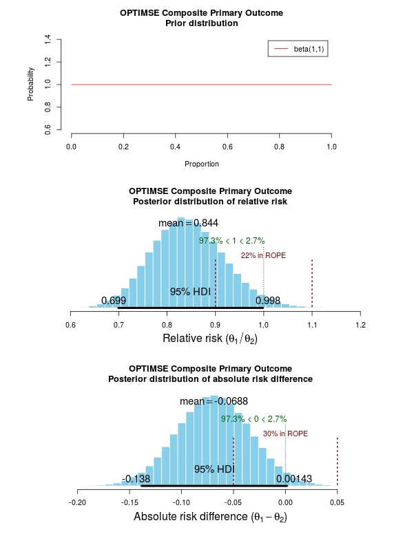
The results of the analysis are presented in the graph below. The top panel is the prior distribution. All proportions for the composite outcome in both the control and intervention group are treated as equally likely.

The middle panel contains the main findings. This is the posterior distribution generated in the analysis for the relative risk of the composite primary outcome (technical details in script below).

The mean relative risk = 0.84 which as expected is the same as the frequentist analysis above. Rather than confidence intervals, in Bayesian statistics a credible interval or region is quoted (HDI = highest density interval is the same). This is philosphically different to a confidence interval and says:

Given the observed data, there is a 95% probability that the true RR falls within this credible interval.

This is a subtle distinction to the frequentist interpretation of a confidence interval:

Were I to repeat this trial multiple times and compute confidence intervals, there is a 95% probability that the true RR would fall within these confidence intervals.

This is an important distinction and can be extended to make useful probabilistic statements about the result.

The figures in green give us the proportion of the distribution above and below 1.0. We can therefore say:

The probability that the intervention group has a lower incidence of the composite endpoint is 97.3%.

It may be useful to be more specific about the size of difference between the control and treatment group that would be considered equivalent, e.g. 10% above and below a relative risk = 1.0. This is sometimes called the region of practical equivalence (ROPE; red text on plots). Experts would determine what was considered equivalent based on many factors. We could therefore say:

The probability of the composite end-point for the control and intervention group being equivalent is 22%.

Or, the probability of a clinically relevant difference existing in the composite endpoint between control and intervention groups is 78%

optimise_primary_bayesFinally, we can use the 200 000 estimates of the probability of complication/death in the control and intervention groups that were generated in the analysis (posterior prediction). In essence, we can act like these are 2 x 200 000 patients. For each “patient pair”, we can use their probability estimates and perform a random draw to simulate the occurrence of complication/death. It may be useful then to look at the proportion of “patients pairs” where the intervention patient didn’t have a complication but the control patient did:

Using posterior prediction on the generated Bayesian model, the probability that a patient in the intervention group did not have a complication/death when a patient in the control group did have a complication/death is 28%.

Conclusion

On the basis of a standard statistical analysis, the OPTIMISE trial authors reasonably concluded that the use of the intervention compared with usual care did not reduce a composite outcome of complications and 30-day mortality.

Using a Bayesian approach, it could be concluded with 97.3% certainty that use of the intervention compared with usual care reduces the composite outcome of complications and 30-day mortality; that with 78% certainty, this reduction is clinically significant; and that in 28% of patients where the intervention is used rather than usual care, complication or death may be avoided.

# OPTIMISE trial in a Bayesian framework
# JAMA. 2014;311(21):2181-2190. doi:10.1001/jama.2014.5305
# Ewen Harrison
# 15/02/2015

# Primary outcome: composite of 30-day moderate or major complications and mortality
N1 <- 366
y1 <- 134
N2 <- 364
y2 <- 158
# N1 is total number in the Cardiac Output–Guided Hemodynamic Therapy Algorithm (intervention) group
# y1 is number with the outcome in the Cardiac Output–Guided Hemodynamic Therapy Algorithm (intervention) group
# N2 is total number in usual care (control) group
# y2 is number with the outcome in usual care (control) group

# Risk ratio
(y1/N1)/(y2/N2)

library(epitools)
riskratio(c(N1-y1, y1, N2-y2, y2), rev="rows", method="boot", replicates=100000)

# Using standard frequentist approach
# Risk ratio (bootstrapped 95% confidence intervals) = 0.84 (0.70-1.01) 
# p=0.07 (Fisher exact p-value)

# Reasonably reported as no difference between groups.

# But there is a difference, it just not judged significant using conventional
# (and much criticised) wisdom.

# Bayesian analysis of same ratio
# Base script from John Krushcke, Doing Bayesian Analysis

#------------------------------------------------------------------------------
source("~/Doing_Bayesian_Analysis/openGraphSaveGraph.R")
source("~/Doing_Bayesian_Analysis/plotPost.R")
require(rjags) # Kruschke, J. K. (2011). Doing Bayesian Data Analysis, Academic Press / Elsevier.
#------------------------------------------------------------------------------
# Important
# The model will be specified with completely uninformative prior distributions (beta(1,1,).
# This presupposes that no pre-exisiting knowledge exists as to whehther a difference
# may of may not exist between these two intervention. 

# Plot Beta(1,1)
# 3x1 plots
par(mfrow=c(3,1))
# Adjust size of prior plot
par(mar=c(5.1,7,4.1,7))
plot(seq(0, 1, length.out=100), dbeta(seq(0, 1, length.out=100), 1, 1), 
         type="l", xlab="Proportion",
         ylab="Probability", 
         main="OPTIMSE Composite Primary Outcome\nPrior distribution", 
         frame=FALSE, col="red", oma=c(6,6,6,6))
legend("topright", legend="beta(1,1)", lty=1, col="red", inset=0.05)

# THE MODEL.
modelString = "
# JAGS model specification begins here...
model {
# Likelihood. Each complication/death is Bernoulli. 
for ( i in 1 : N1 ) { y1[i] ~ dbern( theta1 ) }
for ( i in 1 : N2 ) { y2[i] ~ dbern( theta2 ) }
# Prior. Independent beta distributions.
theta1 ~ dbeta( 1 , 1 )
theta2 ~ dbeta( 1 , 1 )
}
# ... end JAGS model specification
" # close quote for modelstring

# Write the modelString to a file, using R commands:
writeLines(modelString,con="model.txt")


#------------------------------------------------------------------------------
# THE DATA.

# Specify the data in a form that is compatible with JAGS model, as a list:
dataList =  list(
    N1 = N1 ,
    y1 = c(rep(1, y1), rep(0, N1-y1)),
    N2 = N2 ,
    y2 = c(rep(1, y2), rep(0, N2-y2))
)

#------------------------------------------------------------------------------
# INTIALIZE THE CHAIN.

# Can be done automatically in jags.model() by commenting out inits argument.
# Otherwise could be established as:
# initsList = list( theta1 = sum(dataList$y1)/length(dataList$y1) , 
#                   theta2 = sum(dataList$y2)/length(dataList$y2) )

#------------------------------------------------------------------------------
# RUN THE CHAINS.

parameters = c( "theta1" , "theta2" )     # The parameter(s) to be monitored.
adaptSteps = 500              # Number of steps to "tune" the samplers.
burnInSteps = 1000            # Number of steps to "burn-in" the samplers.
nChains = 3                   # Number of chains to run.
numSavedSteps=200000           # Total number of steps in chains to save.
thinSteps=1                   # Number of steps to "thin" (1=keep every step).
nIter = ceiling( ( numSavedSteps * thinSteps ) / nChains ) # Steps per chain.
# Create, initialize, and adapt the model:
jagsModel = jags.model( "model.txt" , data=dataList , # inits=initsList , 
        n.chains=nChains , n.adapt=adaptSteps )
# Burn-in:
cat( "Burning in the MCMC chain...\n" )
update( jagsModel , n.iter=burnInSteps )
# The saved MCMC chain:
cat( "Sampling final MCMC chain...\n" )
codaSamples = coda.samples( jagsModel , variable.names=parameters , 
        n.iter=nIter , thin=thinSteps )
# resulting codaSamples object has these indices: 
#   codaSamples[[ chainIdx ]][ stepIdx , paramIdx ]

#------------------------------------------------------------------------------
# EXAMINE THE RESULTS.

# Convert coda-object codaSamples to matrix object for easier handling.
# But note that this concatenates the different chains into one long chain.
# Result is mcmcChain[ stepIdx , paramIdx ]
mcmcChain = as.matrix( codaSamples )

theta1Sample = mcmcChain[,"theta1"] # Put sampled values in a vector.
theta2Sample = mcmcChain[,"theta2"] # Put sampled values in a vector.

# Plot the chains (trajectory of the last 500 sampled values).
par( pty="s" )
chainlength=NROW(mcmcChain)
plot( theta1Sample[(chainlength-500):chainlength] ,
            theta2Sample[(chainlength-500):chainlength] , type = "o" ,
            xlim = c(0,1) , xlab = bquote(theta[1]) , ylim = c(0,1) ,
            ylab = bquote(theta[2]) , main="JAGS Result" , col="skyblue" )

# Display means in plot.
theta1mean = mean(theta1Sample)
theta2mean = mean(theta2Sample)
if (theta1mean > .5) { xpos = 0.0 ; xadj = 0.0
} else { xpos = 1.0 ; xadj = 1.0 }
if (theta2mean > .5) { ypos = 0.0 ; yadj = 0.0
} else { ypos = 1.0 ; yadj = 1.0 }
text( xpos , ypos ,
            bquote(
                "M=" * .(signif(theta1mean,3)) * "," * .(signif(theta2mean,3))
            ) ,adj=c(xadj,yadj) ,cex=1.5  )

# Plot a histogram of the posterior differences of theta values.
thetaRR = theta1Sample / theta2Sample # Relative risk
thetaDiff = theta1Sample - theta2Sample # Absolute risk difference

par(mar=c(5.1, 4.1, 4.1, 2.1))
plotPost( thetaRR , xlab= expression(paste("Relative risk (", theta[1]/theta[2], ")")) , 
    compVal=1.0, ROPE=c(0.9, 1.1),
    main="OPTIMSE Composite Primary Outcome\nPosterior distribution of relative risk")
plotPost( thetaDiff , xlab=expression(paste("Absolute risk difference (", theta[1]-theta[2], ")")) ,
    compVal=0.0, ROPE=c(-0.05, 0.05),
    main="OPTIMSE Composite Primary Outcome\nPosterior distribution of absolute risk difference")

#-----------------------------------------------------------------------------
# Use posterior prediction to determine proportion of cases in which 
# using the intervention would result in no complication/death 
# while not using the intervention would result in complication death 

chainLength = length( theta1Sample )

# Create matrix to hold results of simulated patients:
yPred = matrix( NA , nrow=2 , ncol=chainLength ) 

# For each step in chain, use posterior prediction to determine outcome
for ( stepIdx in 1:chainLength ) { # step through the chain
    # Probability for complication/death for each "patient" in intervention group:
    pDeath1 = theta1Sample[stepIdx]
    # Simulated outcome for each intervention "patient"
    yPred[1,stepIdx] = sample( x=c(0,1), prob=c(1-pDeath1,pDeath1), size=1 )
    # Probability for complication/death for each "patient" in control group:
    pDeath2 = theta2Sample[stepIdx]
    # Simulated outcome for each control "patient"
    yPred[2,stepIdx] = sample( x=c(0,1), prob=c(1-pDeath2,pDeath2), size=1 )
}

# Now determine the proportion of times that the intervention group has no complication/death
# (y1 == 0) and the control group does have a complication or death (y2 == 1))
(pY1eq0andY2eq1 = sum( yPred[1,]==0 & yPred[2,]==1 ) / chainLength)
(pY1eq1andY2eq0 = sum( yPred[1,]==1 & yPred[2,]==0 ) / chainLength)
(pY1eq0andY2eq0 = sum( yPred[1,]==0 & yPred[2,]==0 ) / chainLength)
(pY10eq1andY2eq1 = sum( yPred[1,]==1 & yPred[2,]==1 ) / chainLength)

# Conclusion: in 27% of cases based on these probabilities,
# a patient in the intervention group would not have a complication,
# when a patient in control group did. 

House of God and bile leak after liver resection

While death after liver resection is reported at ever lower levels, complication rates remain stubbornly high. Morbidity is associated with longer intensive care and hospital stay, and poorer oncological outcomes. Variability in the reported rate of complications may partly be due to differences in definitions. The International Study Group for Liver Surgery (ISGLS) has now published definitions in three areas: liver failure and haemorrhage after hepatectomy, and bile leak after liver and pancreas surgery. These have stimulated debate and different predictive models vie for supremacy. In HPB January 2015, the ISGLS use their definition and grading system to prospectively evaluate bile leak after liver resection.

Of 949 patients in 11 centres undergoing liver resection for predominately colorectal liver metastases, 7.3% were diagnosed with a bile leak. Of these, just over half required something done about it. “If you don’t take a temperature you can’t find a fever”, a medical truism from Samuel Shem’s 1978 novel The House of God, equally applies here: grade A bile leaks requiring no/little change in patients’ management are only diagnosed in the presence of an abdominal drain. Of course, a patient without a drain found to have a bile leak, by definition, has a grade B leak. Yet, even in those with seemingly inconsequential grade A bile leaks, a greater number and severity of other complications were seen, together with a longer hospital stay (median 14 versus 7 days on average). Indeed, bile leak was significantly associated with intra-operative blood loss which may explain these poor outcomes.

There is little strong evidence supporting drainage after liver resection, yet in this series drains were used in 64% of patients. In nearly half of patients with a bile leak and a drain, there was no significant change in the clinical course; the authors suggest that up to 94% of patients did not benefit from intra-operative drainage.

In this up-to-date series, the overall complication rate of 38% is striking. Although only 8.8% of complications were classified as severe, this rate is not improving. Interventions to reduce this rate should surely be a priority in seeking to improve long-term liver resection outcomes.

From HPB January 2015

Considerations in the Early Termination of Clinical Trials in Surgery

One of the most difficult situations when running a clinical trial is the decision to terminate the trial early. But it shouldn’t be a difficult decision. With clear stopping rules defined before the trial starts, it should be straightforward to determine when the effect size is large enough that no further patients require to be randomised to definitively answer the question.

Whether there is benefit to leaving a temporary plastic tube drain in the belly after an operation to remove the head of the pancreas is controversial. It may help diagnose and treat the potential disaster that occurs when the join between pancreas and bowel leaks. Others think that the presence of the drain may in fact make a leak more likely.

This question was tackled in an important randomised clinical trial.

A randomised prospective multicenter trial of pancreaticoduodenectomy with and without routine intraperitoneal drainage

The trial was stopped early because there were more deaths in the group who didn’t have a drain. The question that remains: was it the absence of the drain which caused the deaths? As important, was stopping the trial at this point the correct course of action?

My feeling, the lack of a drain was not definitively demonstrated to be the cause of the deaths. And I think the trial was stopped too early. Difficult issues discussed in our letter in Annals of Surgery about it.

Ethics and statistics collide in decisions relating to the early termination of clinical trials. Investigators have a fundamental responsibility to stop a trial where an excess of harm is seen in one of the arms. Decisions on stopping are not straightforward and must balance the potential risk to trial patients against the likelihood that in fact there is no difference in outcome between groups. Indeed, in early termination, the potential loss of generalizable knowledge may itself harm future patients.

We therefore read with interest the article by Van Buren and colleagues (1) and congratulate the authors on the first multicenter randomized trial on the controversial topic of surgical drains after pancreaticoduodenectomy. As the authors report, the trial was stopped by the Data Safety Monitoring Board after only 18% recruitment due to a numerical excess of deaths in the “no-drain” arm.

We would be interested in learning from the process that led to the decision to terminate the trial. A common method to monitor adverse events advocated by the CONSORT group is to define formal sequential stopping rules based on the limit of acceptable adverse event rates (2). These guidelines suggest that authors report the number of planned “looks” at the data, the statistical methods used including any formal stopping rules, and whether these were planned before trial commencement.

This information is often not included in published trial reports, even when early termination has occurred (3). We feel that in the context of important surgical trials, these guidelines should be adhered to.

Early termination can reduce the statistical power of a trial. This can be addressed by examining results as data accumulate, preferably by an independent data monitoring committee. However, performing multiple statistical examinations of accumulating data without appropriate correction can lead to erroneous results and interpretation (4). For example, if accumulating data from a trial are examined at 5 interim analyses that use a P value of 0.05, the overall false-positive rate is nearer to 19% than to the nominal 5%.

Several group sequential statistical methods are available to adjust for multiple analyses (5,6) and their use should be prespecified in the trial protocol. Stopping rules may be formed by 2 broad methods, either using a Bayesian approach to evaluate the proportion of patients with adverse effects or using a hypothesis testing approach with a sequential probability ratio test to determine whether the acceptable adverse effects rate has been exceeded. Data are compared at each interim analysis and decisions based on prespecified criteria. As an example, stopping rules for harm from a recent study used modified Haybittle-Peto boundaries of 3 SDs in the first half of the study and 2 SDs in the second half (7). The study of Van Buren and colleagues is reported to have been stopped after 18% recruitment due to an excess of 6 deaths in the “no-drain” arm. The relative risk of death at 90 days in the “no-drain” group versus the “drain” group was 3.94 (95% confidence interval, 0.87–17.90), equivalent to a difference of 1.78 SD. The primary outcome measure was any grade 2 complication or more and had a relative risk of 1.32 (5% confidence interval, 1.00–1.75), or 1.95 SD.

The decision to terminate a trial early is not based on statistics alone. Judgements must be made using all the available evidence, including the biological and clinical plausibility of harm and the findings of previous studies. Statistical considerations should therefore be used as a starting point for decisions, rather than a definitive rule.

The Data Safety Monitoring Board for the study of Van Buren and colleagues clearly felt that there was no option other than to terminate the trial. However, at least on statistical grounds, this occurred very early in the trial using conservative criteria. The question remains therefore is the totality of evidence convincing that the question posed has been unequivocally answered? We would suggest that this is not the case. In general terms, stopping a clinical trial early is a rare event that sends out a message that, because of the “sensational” effect, may have greater impact on the medical community than intended, making future studies in that area challenging.

1. Van Buren G, Bloomston M, Hughes SJ, et al. A randomised prospective multicenter trial of pancreaticoduodenectomy with and without routine intraperitoneal drainage. Ann Surg. 2014;259: 605–612.

2. Moher D, Hopewell S, Schulz KF, et al. CONSORT 2010 explanation and elaboration: updated guidelines for reporting parallel group randomised trial. BMJ. 2010;340:c869.

3. Montori VM, Devereaux PJ, Adhikari NK, et al. Randomized trials stopped early for benefit: a systematic review. JAMA. 2005;294:2203–2209.

4. Geller NL, Pocock SJ. Interim analyses in randomized clinical trials: ramifications and guidelines for practitioners. Biometrics. 1987;43:213–223.

5. Pocock SJ. When to stop a clinical trial. BMJ. 1992;305:235–240.

6. Berry DA. Interim analyses in clinical trials: classical vs. Bayesian approaches. Stat Med. 1985;4:521– 526.

7. Connolly SJ, Pogue J, Hart RG, et al. Effect of clopidogrel added to aspirin in patients with atrial fibrillation. N Engl J Med. 2009;360:2066– 2078.

Investigator contact details should continue to be available after completion of clinical trials

ClinicalTrials.gov front page

Why oh why does the National Library for Medicine remove investigator contact details from clinicaltrials.gov after completion of a trial. We need to contact them  to ask why their trial is not published!

BMJ letter from us on the subject:

For successful translation of results from research into practice there must also be timely dissemination of research findings (1). The Food and Drug Administration Amendments Act requires trials that are subject to mandatory reporting to post results within 12 months of study completion on ClinicalTrials.gov (2). Despite this initiative, less than a quarter of trial investigators comply (3).

Maruani and colleagues report that email reminders of the legal requirement to post results significantly improve reporting at six months (4). Any intervention that increases dissemination of clinical trial results is welcome and the authors should be commended for their efforts.

However, we do not understand the authors’ described methods. They report that the cohort included trials “that had available contact details (email addresses) of responsible parties”, and go on to state that they “extracted the email addresses of responsible parties from ClinicalTrials.gov”. In the discussion they highlight “the need for updating email addresses of responsible parties in ClinicalTrials.gov”.

We would be interested to know how this is possible as all email addresses for completed trials are removed from ClinicalTrials.gov as a matter of policy by the National Library of Medicine (Table 1).

We asked the National Library of Medicine (NLM) to comment on this. In addition, we asked what advice they would give a patient who had taken part in a completed clinical trial, and wished to contact the investigators to enquire about trial results. They responded:
“If the record is closed or completed, we remove all contact information in the location and contact section since there is no reason why a potential patient would need to contact them.”

The NLM will not provide contact email addresses on request, despite these previously being available on ClinicalTrials.gov while the trial was recruiting.

The removal of previously published contact information from ClinicalTrials.gov has important implications for transparency in trial reporting. Interventions, such as that proposed by Maruani, cannot be delivered at scale while this practice exists. Searching for contact details manually with Google or Pubmed is difficult at best and impossible for many, who may include patients that have participated in a study and wish to contact the investigators about trial results.

References
1. Ross JS, Tse T, Zarin DA, Xu H, Zhou L, Krumholz HM. Publication of NIH funded trials registered in ClinicalTrials.gov: cross sectional analysis. Bmj 2012;344: d7292.
2. Zarin DA, Tse T, Williams RJ, Califf RM, Ide NC. The ClinicalTrials.gov results database–update and key issues. N Engl J Med 2011;364(9): 852-860.
3. Prayle AP, Hurley MN, Smyth AR. Compliance with mandatory reporting of clinical trial results on ClinicalTrials.gov: cross sectional study. Bmj 2012;344: d7373.
4. Maruani A, Boutron I, Baron G, Ravaud P. Impact of sending email reminders of the legal requirement for posting results on ClinicalTrials.gov: cohort embedded pragmatic randomized controlled trial. Bmj 2014;349: g5579.