As Niels Bohr, the Danish physicist, put it, “prediction is very difficult, especially about the future”. Prognostic models are commonplace and seek to help patients and the surgical team estimate the risk of a specific event, for instance, the recurrence of disease or a complication of surgery. “Decision-support tools” aim to help patients make difficult choices, with the most useful providing personalized estimates to assist in balancing the trade-offs between risks and benefits. As we enter the world of precision medicine, these tools will become central to all our practice.
In the meantime, there are limitations. Overwhelming evidence shows that the quality of reporting of prediction model studies is poor. In some instances, the details of the actual model are considered commercially sensitive and are not published, making the assessment of the risk of bias and potential usefulness of the model difficult.
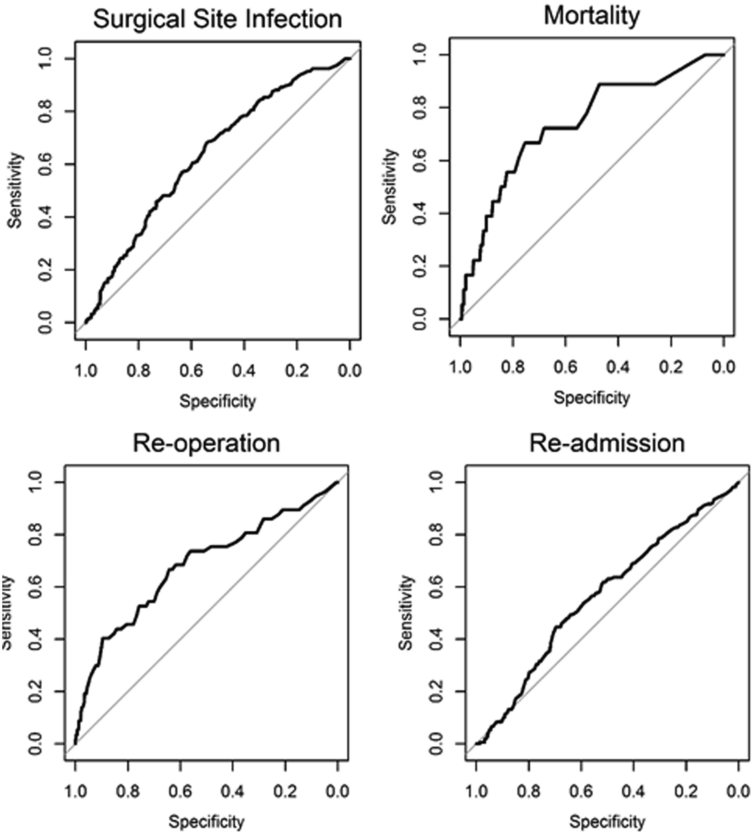
In this edition of HPB, Beal and colleagues aim to validate the American College of Surgeons National Quality Improvement Program (ACS NSQIP) Surgical Risk Calculator (SRC) using data from 854 gallbladder cancer and extrahepatic cholangiocarcinoma patients from the US Extrahepatic Biliary Malignancy Consortium. The authors conclude that the “estimates of risk were variable in terms of accuracy and generally calculator performance was poor”. The SRC underpredicted the occurrence of all examined end-points (death, readmission, reoperation and surgical site infection) and discrimination and calibration were particularly poor for readmission and surgical site infection. This is not the first report of predictive failures of the SRC. Possible explanations cited previously include small sample size, homogeneity of patients, and too few institutions in the validation set. That does not seem to the case in the current study.
The SRC is a general-purpose risk calculator and while it may be applicable across many surgical domains, it should be used with caution in extrahepatic biliary cancer. It is not clear why the calculator does not provide measures of uncertainty around estimates. This would greatly help patients interpret its output and would go a long way to addressing some of the broader concerns around accuracy.
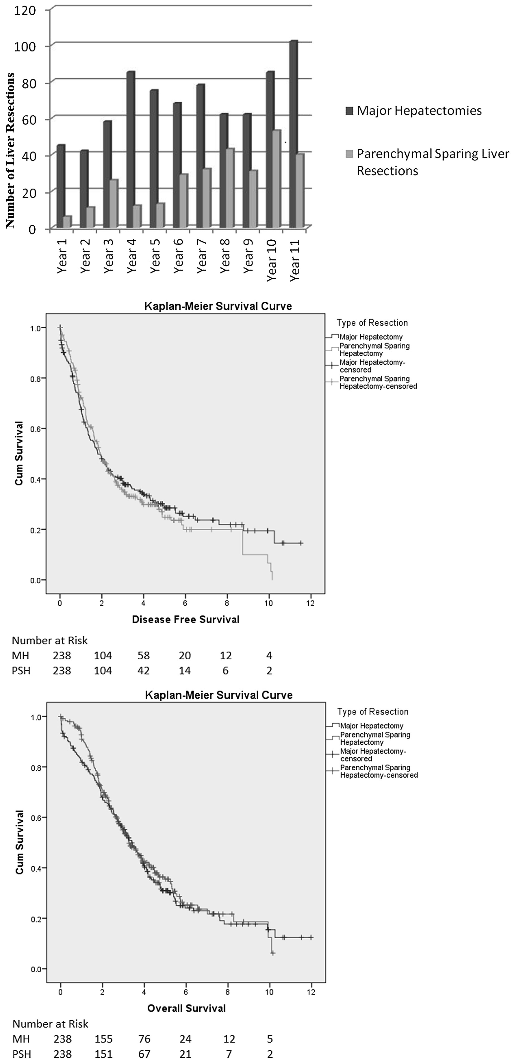
“Radical-but-conservative” parenchymal-sparing hepatectomy (PSH) for colorectal liver metastases (Torzilli 2017) is increasing reported. The PSH revolution has two potential advantages: avoiding postoperative hepatic failure (POHF) and increasing the possibility of re-do surgery in the common event of future recurrence. However, early series reported worse long-term survival and higher positive margin rates with a parenchymal-sparing approach, with a debate ensuing about the significance of the latter in an era where energy-devices are more commonly employed in liver transection. No randomised controlled trials exist comparing PSH with major hepatectomy and case series are naturally biased by selection.
In this issues of HPB, Lordan and colleagues report a propensity-score matched case-control series of PSH vs. major hepatectomy. The results are striking. The PSH approach was associated with less blood transfusion (10.1 vs 27.7%), fewer major complications (3.8 vs 9.2%), and lower rates of POHF (0 vs 5.5%). Unusually, perioperative mortality (0.8 vs 3.8%) was also lower in the PSH group and longer-term oncologic and survival outcomes were similar.
Results of propensity-matched analyses must always be interpreted with selection bias in mind. Residual confounding always exists: the patients undergoing major hepatectomy almost certainly had undescribed differences from the PSH group and may not have been technically suitable for PSH. Matching did not account for year of surgery, so with PSH becoming more common the generally improved outcomes over time will bias in favour of the parenchymal-sparing approach. Yet putting those concerns aside, there are two salient results. Firstly, PSH promises less POHF and in this series, there was none. Secondly, PSH promises greater opportunity for redo liver surgery. There was 50% liver-only recurrence in both groups. Although not reported by the authors, a greater proportion of PSH patients underwent redo surgery (35/119 (29.4%) vs. 23/130 (17.7%) (p=0.03). Perhaps for some patients, the PSH revolution is delivering some of its promised advantages.
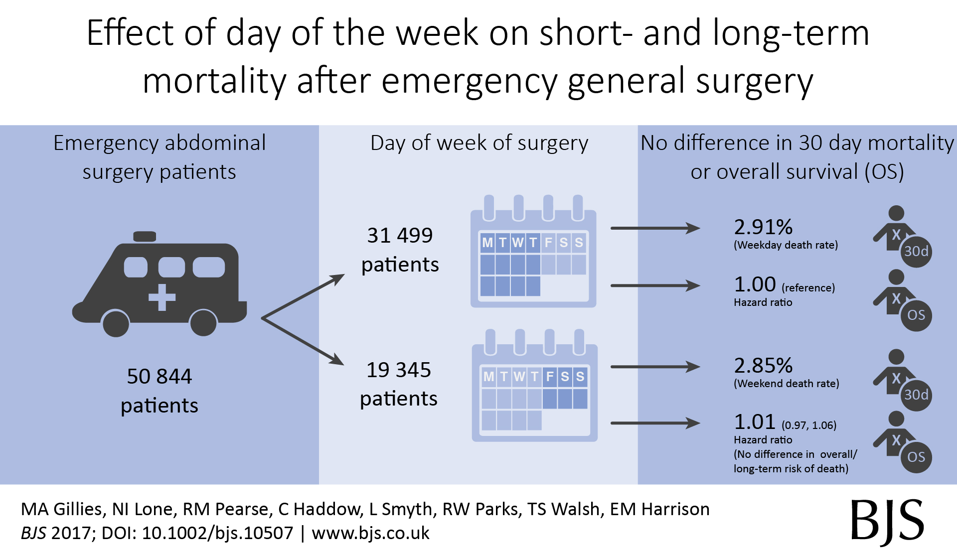
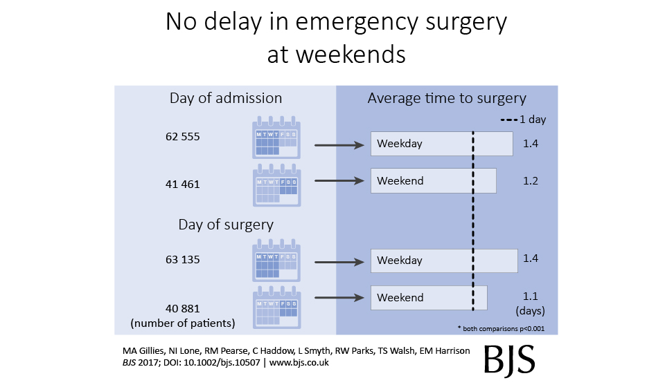
Out latest paper published in the BJS describes short- and long-term outcomes after emergency surgery in Scotland. We looked for a weekend effect and didn’t find one.
In around 50,000 emergency general surgery patients, we didn’t find an association between day of surgery or day of admission and death rates;
In around 100,000 emergency surgery patients including orthopaedic and gynaecology procedures, we didn’t find an association between day of surgery or day of admission and death rates;
In around 500,000 emergency and planned surgery patients, we didn’t find an association between day of surgery or day of admission and death rates.
We also found that emergency surgery performed at weekends, or in those admitted at weekends, was performed a little quicker compared with weekdays.
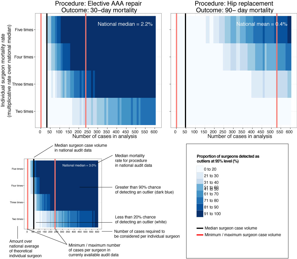
This is our new analysis of an old topic.In Scotland, individual surgeon outcomes were published as far back as 2006. It wasn’t pursued in Scotland, but has been mandated for surgeons in England since 2013.
This new analysis took the current mortality data and sought to answer a simple question: how useful is this information in detecting differences in outcome at the individual surgeon level?
Well the answer, in short, is not very useful.
We looked at mortality after planned bowel and gullet cancer surgery, hip replacement, and thyroid, obesity and aneurysm surgery. Death rates are relatively low after planned surgery which is testament to hard working NHS teams up and down the country. This together with the fact that individual surgeons perform a relatively small proportion of all these procedures means that death rates are not a good way to detect under performance.
At the mortality rates reported for thyroid (0.08%) and obesity (0.07%) surgery, it is unlikely a surgeon would perform a sufficient number of procedures in his/her entire career to stand a good chance of detecting a mortality rate 5 times the national average.
Surgeon death rates are problematic in more fundamental ways. It is the 21st century and much of surgical care is delivered by teams of surgeons, other doctors, nurses, physiotherapists, pharmacists, dieticians etc. In liver transplantation it is common for one surgeon to choose the donor/recipient pair, for a second surgeon to do the transplant, and for a third surgeon to look after the patient after the operation. Does it make sense to look at the results of individuals? Why not of the team?
It is also important to ensure that analyses adequately account for the increased risk faced by some patients undergoing surgery. If my granny has had a heart attack and has a bad chest, I don’t want her to be deprived of much needed surgery because a surgeon is worried that her high risk might impact on the public perception of their competence. As Harry Burns the former Chief Medical Officer of Scotland said, those with the highest mortality rates may be the heroes of the health service, taking on patients with difficult disease that no one else will face.
We are only now beginning to understand the results of surgery using measures that are more meaningful to patients. These sometimes get called patient-centred outcome measures. Take a planned hip replacement, the aim of the operation is to remove pain and increase mobility. If after 3 months a patient still has significant pain and can’t get out for the groceries, the operation has not been a success. Thankfully death after planned hip replacement is relatively rare and in any case, might have little to do with the quality of the surgery.
Transparency in the results of surgery is paramount and publishing death rates may be a step towards this, even if they may in fact be falsely reassuring. We must use these data as part of a much wider initiative to capture the success and failures of surgery. Only by doing this will we improve the results of surgery and ensure every patient receives the highest quality of care.
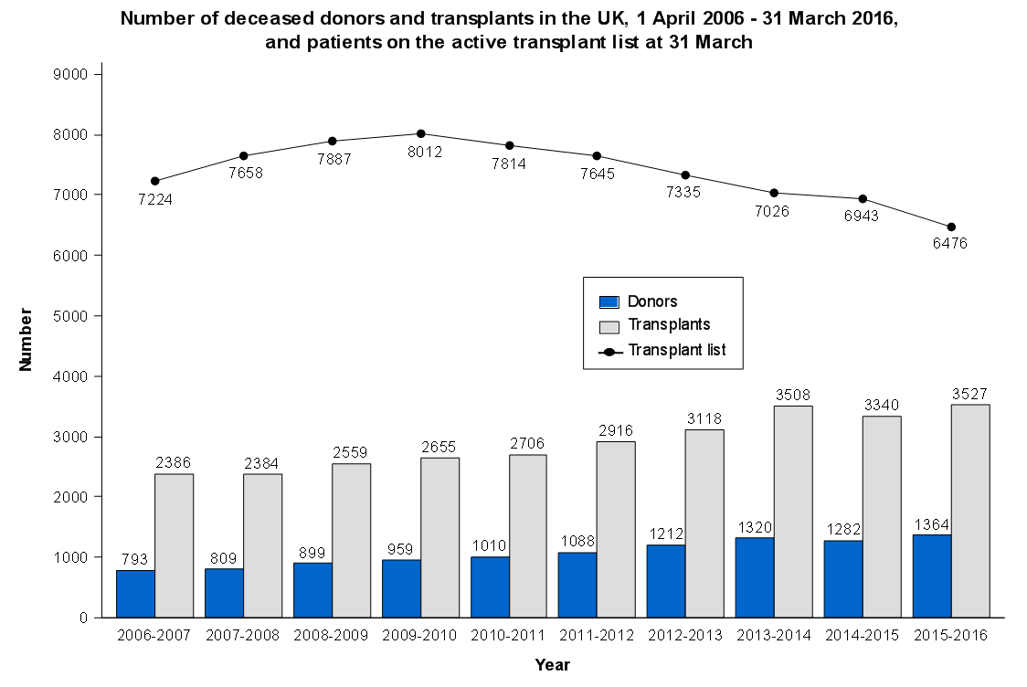
If you have a hunger for statistics on organ transplantation, check out NHS Blood and Transplant. There are regularly updated and reflect what is actually happening in UK transplant today. We should have a competition for novel ways of presenting these visually. Ideas?!
ProPublica, an independent investigative journalism organisation, have published surgeon-level complications rates based on Medicare data. I have already highlighted problems with the reporting of the data: surgeons are described as having a “high adjusted rate of complications” if they fall in the red-zone, despite there being too little data to say whether this has happened by chance.
This surgeon should not be identified as having a “high adjusted rate of complications” as there are too few cases to estimate the complication rate accurately.
I say again, I fully support transparency and public access to healthcare. But the ProPublica reporting has been quite shocking. I’m not aware of them publishing the number of surgeons out of the 17000 that are statistically different to the average. This is a small handful.
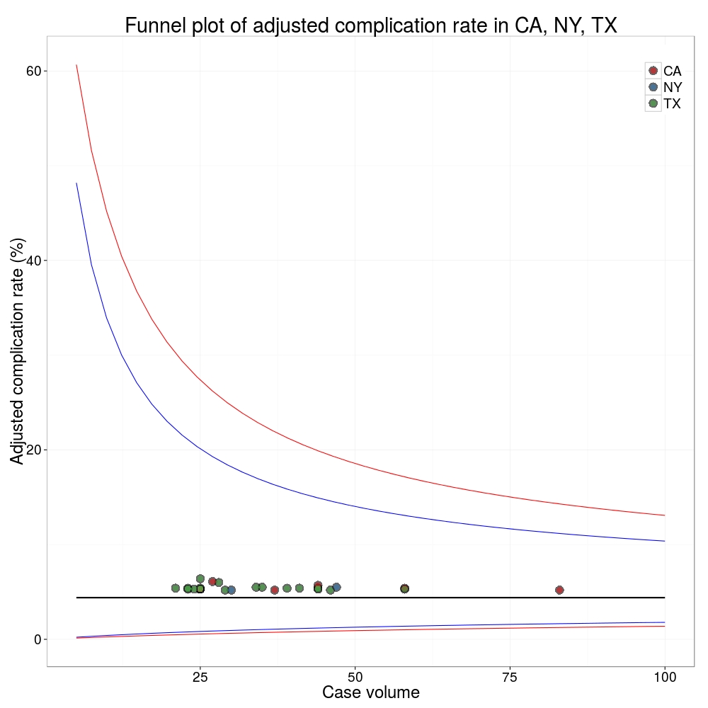
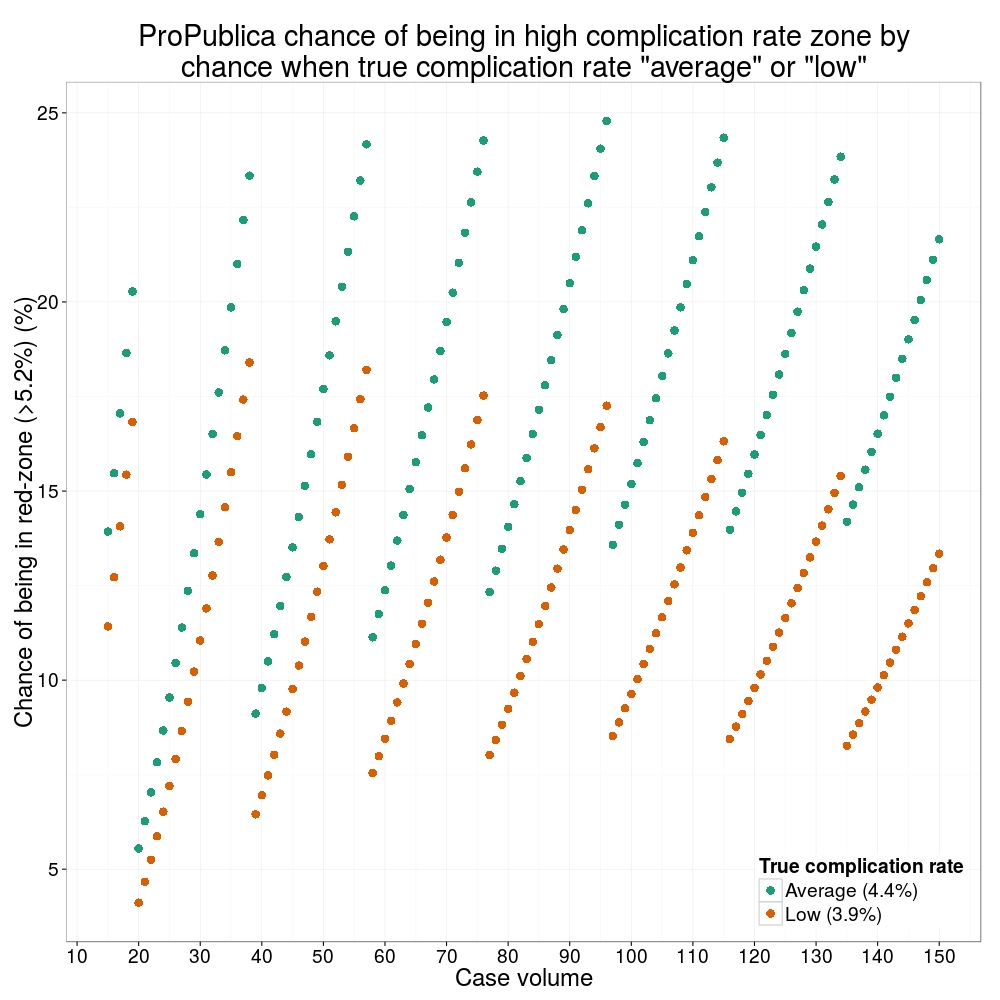
ProPublica could have chosen a different approach. This is a funnel plot and I’ve written about them before.
A funnel plot is a summary of an estimate (such as complication rate) against a measure of the precision of that estimate. In the context of healthcare, a centre or individual outcome is often plotted against patient volume. A horizontal line parallel to the x-axis represents the outcome for the entire population and outcomes for individual surgeons are displayed as points around this. This allows a comparison of individuals with that of the population average, while accounting for the increasing certainty surrounding that outcome as the sample size increases. Limits can be determined, beyond which the chances of getting an individual outcome are low if that individual were really part of the whole population.
In other words, a surgeon above the line has a complication rate different to the average.
I’ve scraped the ProPublica data for gallbladder removal (laparoscopic cholecystectomy) from California, New York and Texas for surgeons highlighted in the red-zone. These are surgeons ProPublica says have high complication rates.
As can be seen from the funnel plot, these surgeons are no where near being outliers. There is insufficient information to say whether any of them are different to average. ProPublica decided to ignore the imprecision with which the complication rates are determined. For red-zone surgeons from these 3 states, none of them have complication rates different to average.
Black line, population average (4.4%), blue line 95% control limit, red line 99% control limit.
How likely is it that a surgeon with an average complication rate (4.4%) will appear in the red-zone just by chance (>5.2%)? The answer is, pretty likely given the small numbers of cases here: anything up to a 25% chance depending on the number of cases performed. Even at the top of the green-zone (low ACR, 3.9%), there is still around a 1 in 6 chance a surgeon will appear to have a high complication rate just by chance.
ProPublica have failed in their duty to explain these data in a way that can be understood. The surgeon score card should be revised. All “warning explanation points” should be removed for those other than the truly outlying cases.
ProPublica is an organisation performing independent, non-profit investigative journalism in the public interest. Yesterday it published an analysis of surgeon-level complications rates based on Medicare data.
Publication of individual surgeons results is well established in the UK. Transparent, easily accessible healthcare data is essential and initiatives like this are welcomed.
It is important that data are presented in a way that can be clearly understood. Communicating risk is notoriously difficult. This is particularly difficult when it is necessary to describe the precision with which a risk has been estimated.
Unfortunately that is where ProPublica have got it all wrong.
There is an inherent difficulty faced when we dealing with individual surgeon data. In order to be sure that a surgeon has a complication rate higher than average, that surgeon needs to have performed a certain number of that particular procedure. If data are only available on a small number of cases, we can’t be certain whether the surgeon’s complication rate is truly high, or just appears to be high by chance.
If you tossed a coin 10 times and it came up with 7 heads, could you say whether the coin was fair or biased? With only 10 tosses we don’t know.
Similarly, if a surgeon performs 10 operations and has 1 complication, can we sure that their true complication rate is 10%, rather than 5% or 20%? With only 10 operations we don’t know.
The presentation of the ProPublica data is really concerning. Here’s why.
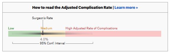
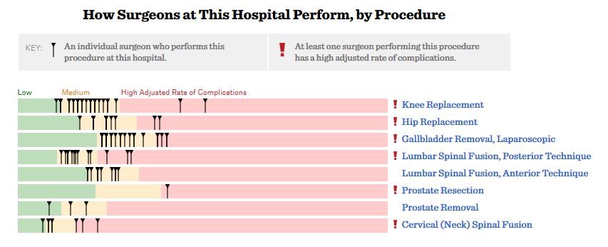
For a given hospital, data are presented for individual surgeons. Bands are provided which define “low”, “medium” and “high” adjusted complication rates. If the adjusted complication rate for an individual surgeon falls within the red-zone, they are described as having a “high adjusted rate of complications”.
How confident can we be that a surgeon in the red-zone truly has a high complication rate? To get a handle on this, we need to turn to an off-putting statistical concept called a “confidence interval”. As it’s name implies, a confidence interval tells us what degree of confidence we can treat the estimated complication rate.
If the surgeon has done many procedures, the confidence interval will be narrow. If we only have data on a few procedures, the confidence interval will be wide.
To be confident that a surgeon has a high complication rate, the 95% confidence interval needs to entirely lie in the red-zone.
A surgeon should be highlighted as having a high complication rate if and only if the confidence interval lies entirely in the red-zone.
Here is an example. This surgeon performs the procedure to remove the gallbladder (cholecystectomy). There are data on 20 procedures for this individual surgeon. The estimated complication rate is 4.7%. But the 95% confidence interval goes from the green-zone all the way to the red-zone. Due to the small number of procedures, all we can conclude is that this surgeon has either a low, medium, or high adjusted complication rate. Not very useful.
Here are some other examples.
Adjusted complication rate: 1.5% on 339 procedures. Surgeon has low or medium complication rate. They are unlikely to have a high complication rate.
Adjusted complication rate: 4.0% on 30 procedures. Surgeon has low or medium or high complication rate. Note due to the low numbers of cases, the analysis correctly suggests an estimated complication rate, despite the fact this surgeon has not had any complications for the 30 procedures. Adjusted complication rate: 5.4% on 21 procedures. ProPublica conclusion: surgeon has high adjusted complication rate. Actual conclusion: surgeon has low, medium or high complication rate. Adjusted complication rate: 6.6% on 22 procedures. ProPublica conclusion: surgeon has high adjusted complication rate. Actual conclusion: surgeon has medium or high complication rate, but is unlikely to have a low complication rate. Adjusted complication rate: 7.6% on 86 procedures. ProPublica conclusion: surgeon has high adjusted complication rate. Actual conclusion: surgeon has high complication rate. This is one of the few examples in the dataset, where the analysis suggest this surgeon does have a high likelihood of having a high complication rate.
In the UK, only this last example would to highlighted as concerning. That is because we have no idea whether surgeons who happen to fall into the red-zone are truly different to average.
The analysis above does not deal with issues others have highlighted: that this is Medicare data only, that important data may be missing , that the adjustment for patient case mix may be inadequate, and that the complications rates seem different to what would be expected.
ProPublica have not moderated the language used in reporting these data. My view is that the data are being misrepresented.
ProPublica should highlight cases like the last mentioned above. For all the others, all that can be concluded is that there are too few cases to be able to make a judgement on whether the surgeon’s complication rate is different to average.
Version control has become essential for me keeping track of projects, as well as collaborating. It allows backup of scripts and easy collaboration on complex projects. RStudio works really well with Git, an open source open source distributed version control system, and GitHub, a web-based Git repository hosting service. I was always forget how to set up a repository, so here’s a reminder.
This example is done on RStudio Server, but the same procedure can be used for RStudio desktop. Git or similar needs to be installed first, which is straight forward to do.
Setup Git on RStudio and Associate with GitHub
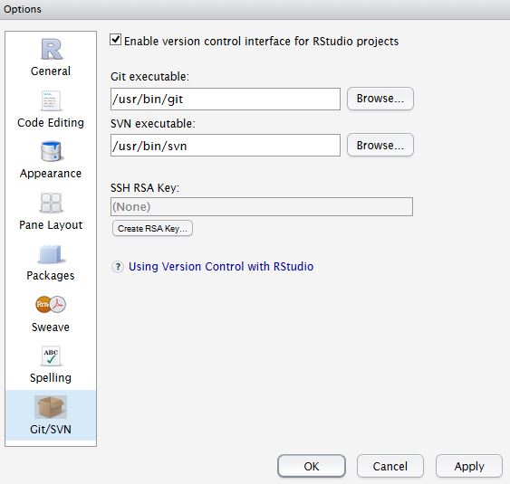
In RStudio, Tools -> Version Control, select Git.
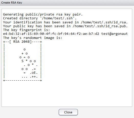
In RStudio, Tools -> Global Options, select Git//SVN tab. Ensure the path to the Git executable is correct. This is particularly important in Windows where it may not default correctly (e.g. C:/Program Files (x86)/Git/bin/git.exe). Now hit, Create RSA Key …
Close this window.
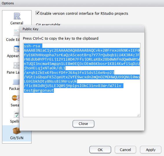
Click, View public key, and copy the displayed public key.
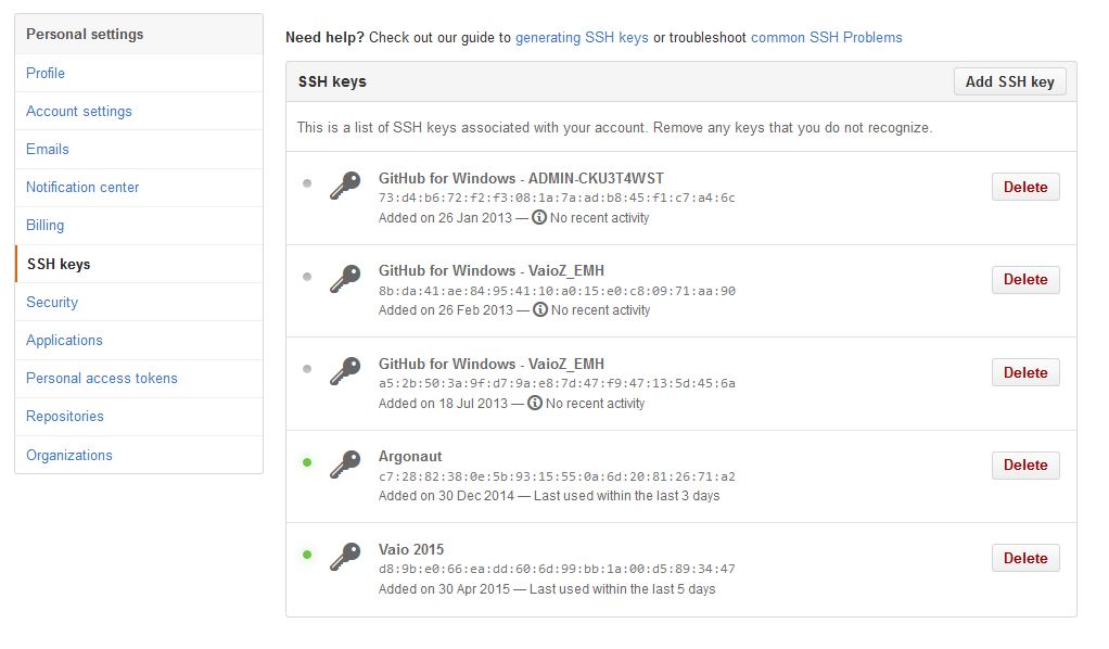
If you haven’t already, create a GitHub account. Open your account settings and click the SSH keys tab. Click Add SSH key. Paste in the public key you have copied from RStudio.
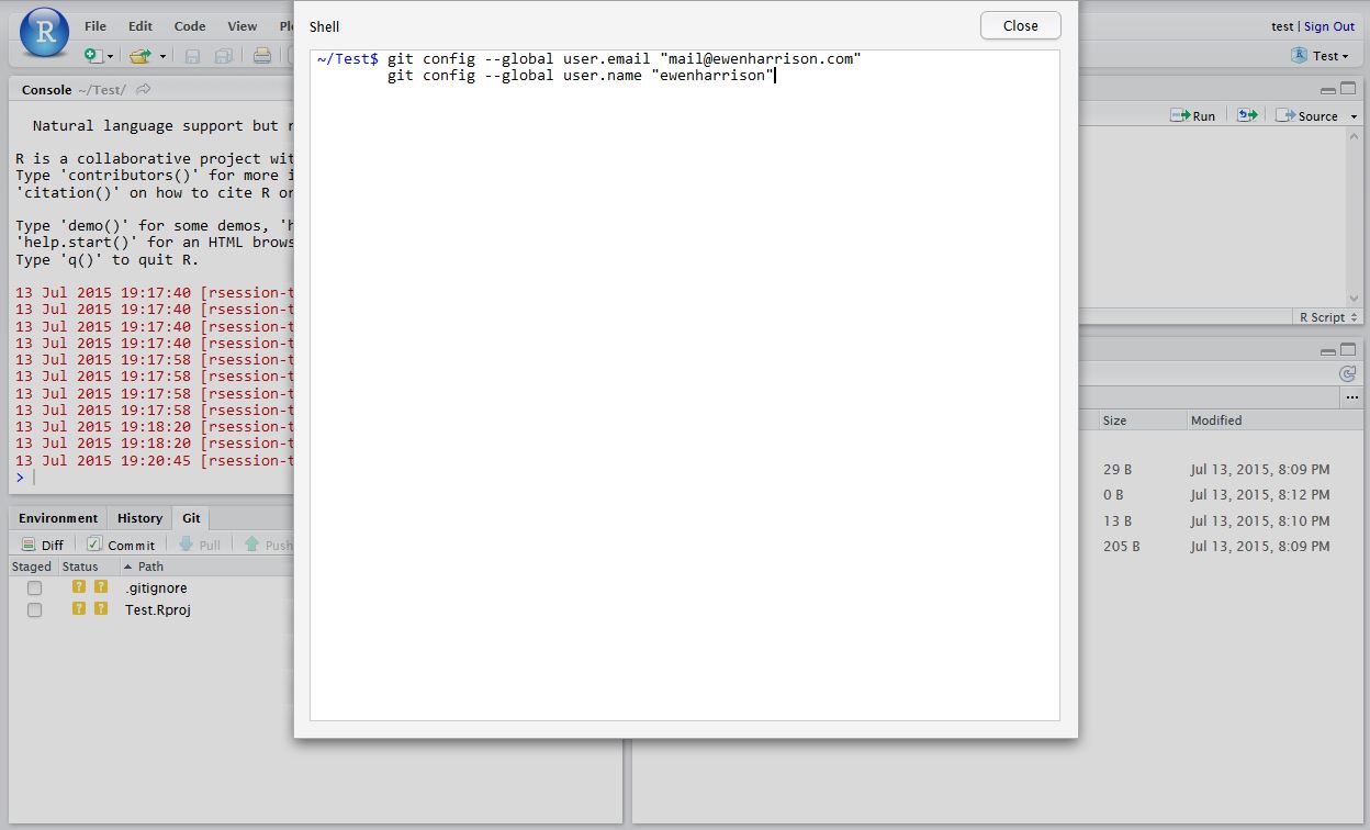
Tell Git who you are. Remember Git is a piece of software running on your own computer. This is distinct to GitHub, which is the repository website. In RStudio, click Tools -> Shell … . Enter:
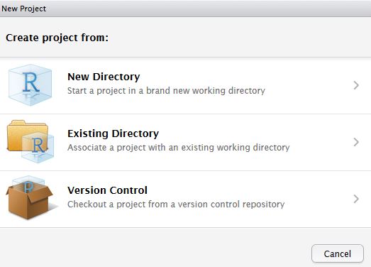
In RStudio, click New project as normal. Click New Directory.
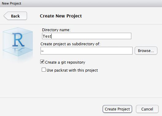
Name the project and check Create a git repository.
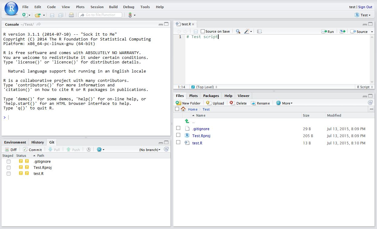
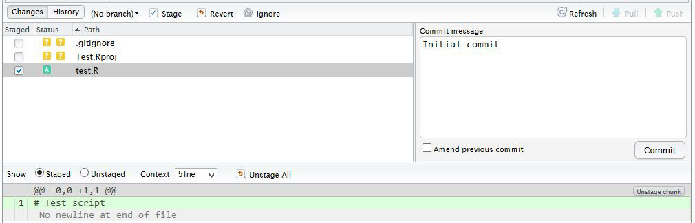
Now in RStudio, create a new script which you will add to your repository.
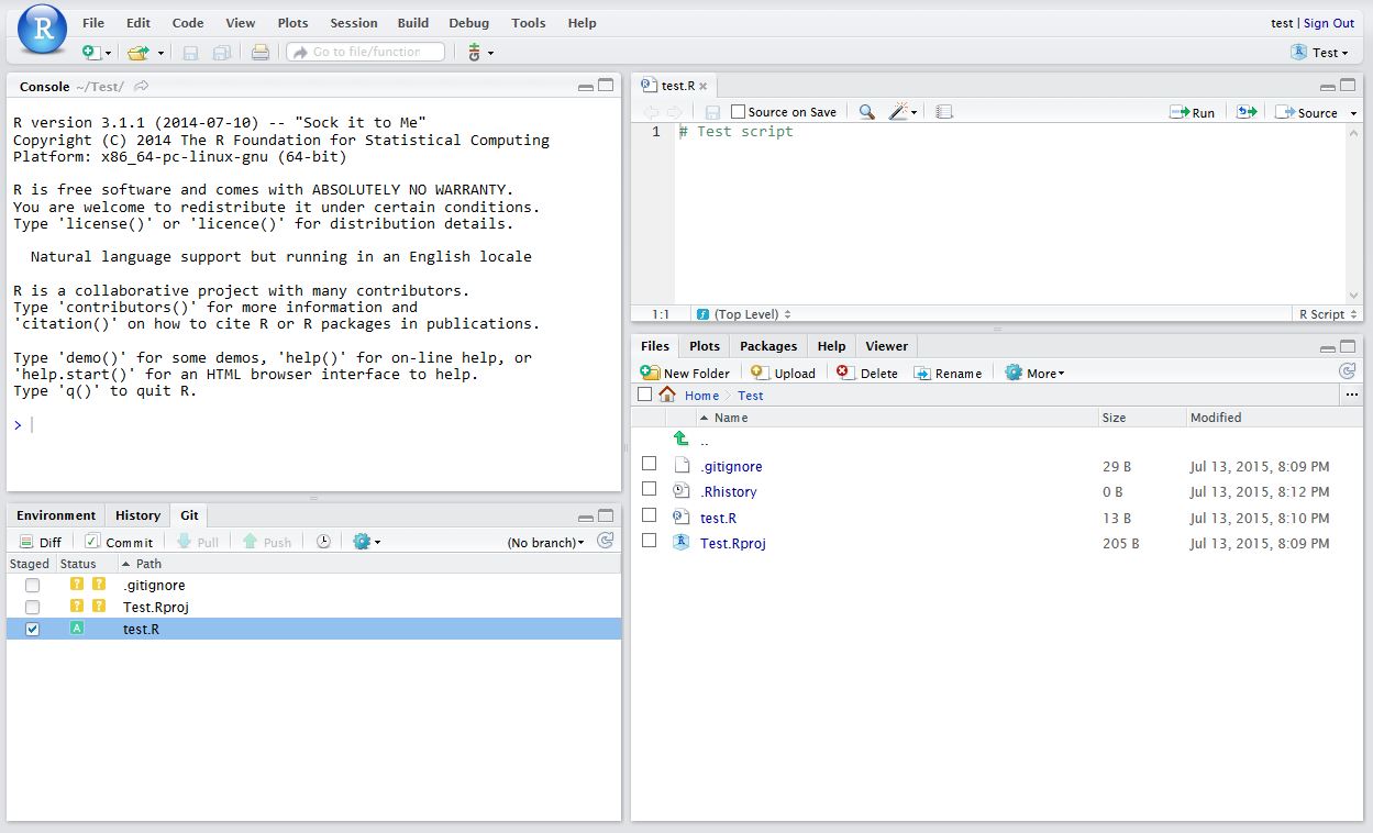
After saving your new script (test.R), it should appear in the Git tab on the Environment / history panel.
Click the file you wish to add, and the status should turn to a green ‘A’. Now click Commit and enter an identifying message in Commit message.
You have now committed the current version of this file to your repository on your computer/server. In the future you may wish to create branches to organise your work and help when collaborating.
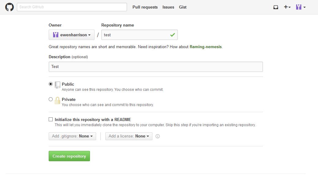
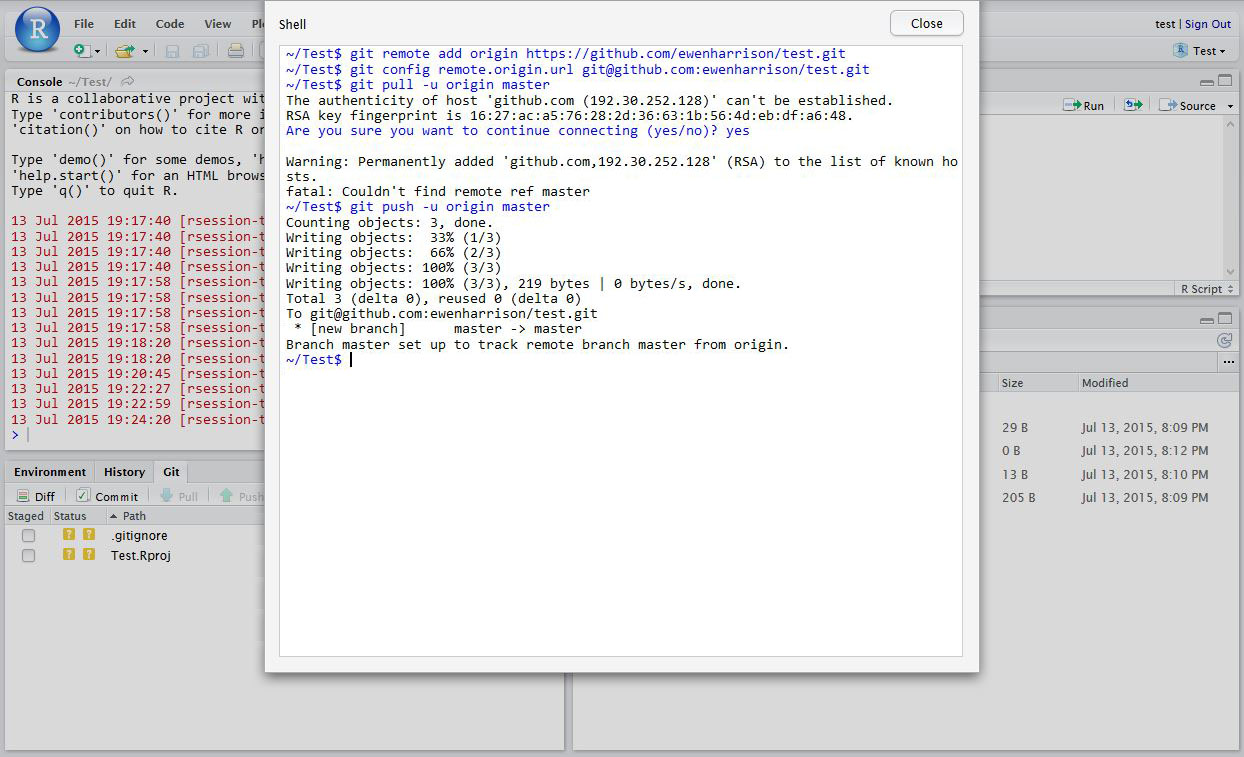
Now you want to push the contents of this commit to GitHub, so it is also backed-up off site and available to collaborators. In GitHub, create a New repository, called here test.
You have now pushed your commit to GitHub, and should be able to see your files in your GitHub account. The Pull Push buttons in RStudio will now also work. Remember, after each Commit, you have to Push to GitHub, this doesn’t happen automatically.
Clone an existing GitHub project to new RStudio project
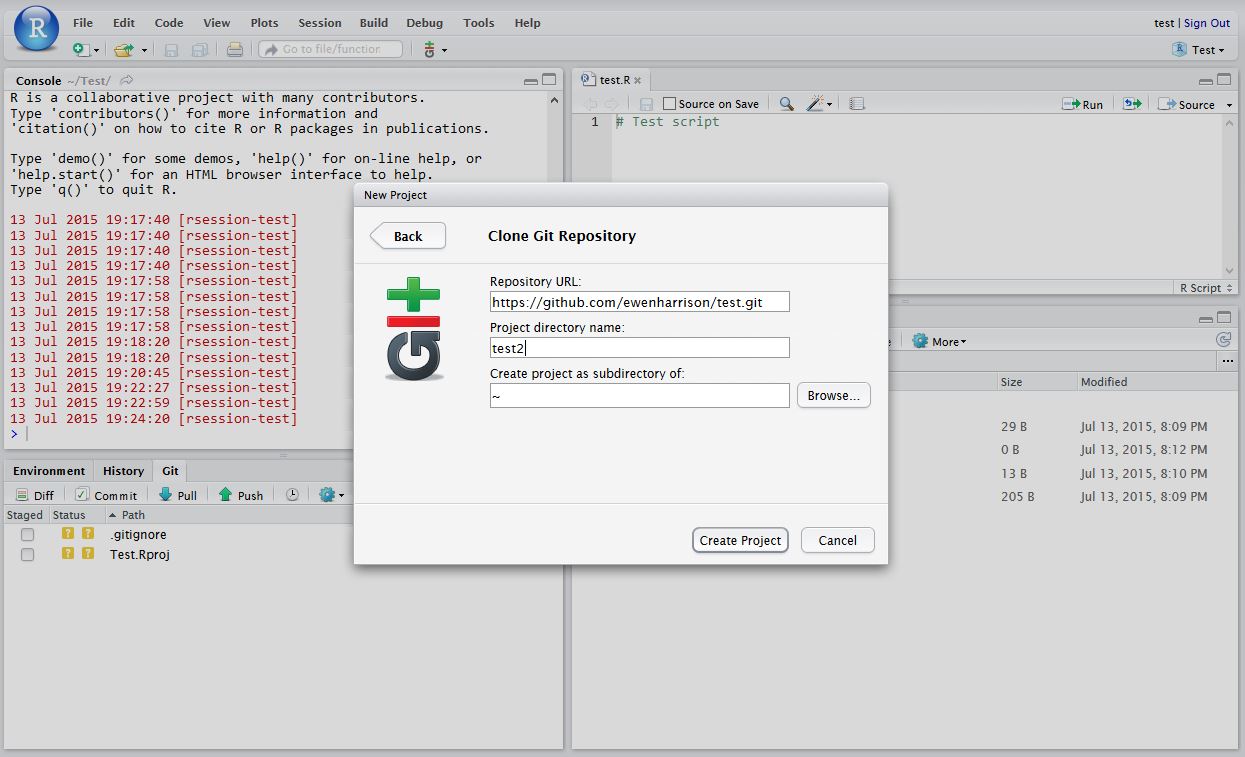
In RStudio, click New project as normal. Click Version Control.
In Clone Git Repository, enter the GitHub repository URL as per below. Change the project directory name if necessary.
High quality care for patients seven days a week seems like a good idea to me. There is nothing worse than going round the ward on Saturday or Sunday and having to tell patients that they will get their essential test or treatment on Monday.
It was stated in the Queen’s Speech this year that seven day services would be implemented in England as part of a new five-year plan.
In England my Government will secure the future of the National Health Service by implementing the National Health Service’s own five-year plan, by increasing the health budget, integrating healthcare and social care, and ensuring the National Health Service works on a seven day basis.
Work has started in pilot trusts. Of course funding is the biggest issue and details are sketchy. Some hope that the provision of weekend services will allow patients to be discharged quicker and so save money. With the high capital cost of expensive equipment like MRI scanners, it makes financial sense to ‘sweat the assets’ more at weekends where workload is growing or consolidated across fewer providers.
But that may be wishful thinking. The greatest cost to the NHS is staffing and weekend working inevitably means more staff. Expensive medically qualified staff at that. It is in this regard that the plan seems least developed: major areas of the NHS cannot recruit to posts at the moment. Emergency medicine and acute medicine for instance. Where are these weekend working individuals going to come from?
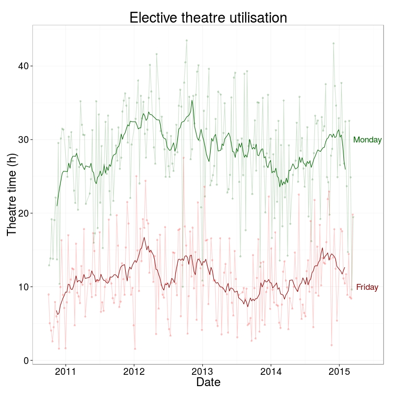
I thought I’d look at our operating theatre utilisation across the week. These are data from the middle of 2010 to present and do not include emergency/unplanned operating. The first plot shows the spread of total hours of operating by day of the week. How close are we to a 7 day NHS?
Well, 3 days short.
I don’t know why we are using are operating theatres less on Fridays. Surgeons in the past may have preferred not to operate on a Friday, avoiding those crucial first post-operative days being on the weekend. But surely that is not still the case? Yet there has been no change in this pattern over the last 4 years.
Here’s a thought. Perhaps until weekend NHS services are equivalent to weekdays, it is safer not to perform elective surgery on a Friday? It is worse than I thought.
Very pleased to to announce that the GlobalSurg protocol has just been published in BMJ Open. As well as this, the study was registered at ClinicalTrials.gov on the 29 June 2014. Both of these are important to ensure transparency and that the protocol doesn’t change after the start of data commencement.
The recent publication of the Ontario experience in the introduction of Surgical Safety Checklists has caused a bit of a stooshie.
Checklists have consistently been shown to be associated with a reduction in death and complications following surgery. Since the publication of Atul Gawande’s seminal paper in 2009, checklists have been successfully introduced in a number of countries including Scotland. David Urbach and Nancy Baxter’s New England Journal of Medicine publication stands apart: the checklist made no difference.
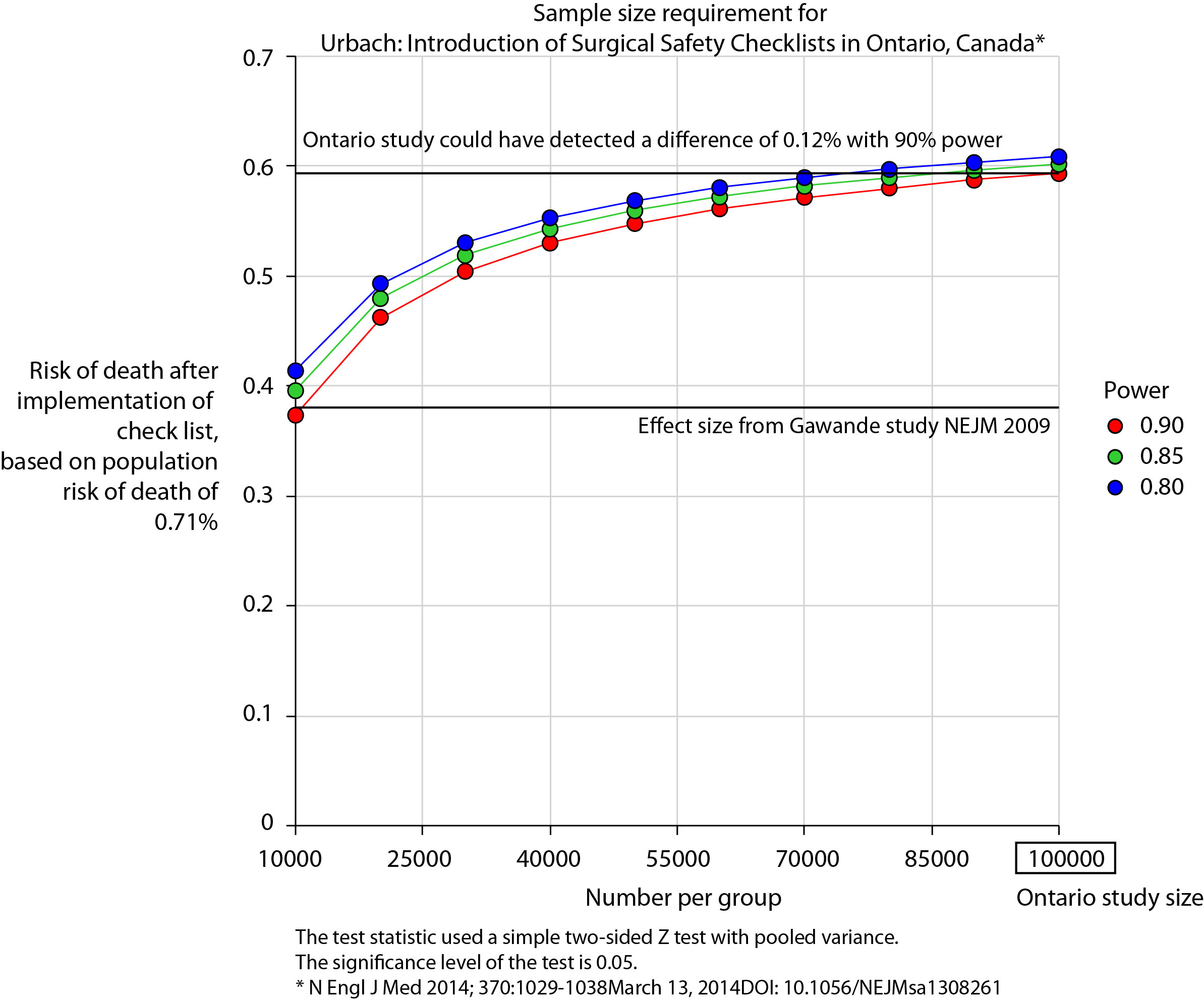
Atul Gawande himself responded quickly asking two important questions. Firstly, were there sufficient patients included in the study to show a difference? Secondly, was the implementation robust and was the programme in place for long enough to expect a difference be seen.
He and others have reported the power of the study to be low – about 40% – meaning that were the study to be repeated multiple times and a true difference in mortality actually did exist, the chance of detecting it would be 40%. But power calculations performed after the event (post hoc) are completely meaningless – when no effect is seen in a study, the power is low by definition (mathsy explanation here).
There is no protocol provided with the Ontario study, so it is not clear if an estimate of the required sample size had been performed. Were it done, it may have gone something like this.
The risk of death in the Ontario population is 0.71%. This could have been determined from the same administrative dataset that the study used. Say we expect a similar reduction in death following checklist introduction as Gawande showed in 2009, 1.5% to 0.8%. For the Ontario population, this would be equivalent to an expected risk of death of 0.38%. This may or may not be reasonable. It is not clear that the “checklist effect” is the same across patients or procedures of different risks. Accepting this assumption for now, the study would have only required around 8000 patients per group to show a significant difference. The study actually included over 100000 patients per group. In fact, it was powered to show very small differences in the risk of death – a reduction of around 0.1% would probably have been detected.
Similar conclusions can be drawn for complication rate. Gawande showed a reduction from 11% to 7%, equivalent in Ontario to a reduction from 3.86% to 2.46%. The Ontario study was likely to show a reduction to 3.59% (at 90% power).
The explanation for the failure to show a difference does not lie in the numbers.
So assuming then that checklists do work, this negative result stems either from a failure of implementation – checklists were not being used or not being used properly – or a difference in the effect of checklists in this population. The former seems most likely. The authors report that …
… available data did not permit us to determine whether a checklist was used in a particular procedure, and we were unable to measure compliance with checklists at monthly intervals in our analysis. However, reported compliance with checklists is extraordinarily high …
Quality improvement interventions need sufficient time for introduction. In this study, only a minimum of 3 months was allowed which seems crazily short. Teams need to want to do it. In my own hospital there was a lot of grumbling (including from me) before acceptance. When I worked in the Netherlands, SURPASS was introduced. In this particular hospital it was delivered via the electronic patient record. A succession of electronic “baton passes” meant that a patient could not get to the operating theatre without a comprehensive series of checklists being completed. I like this use of technology to deliver safety. With robust implementation, training, and acceptance by staff, maybe the benefits of checklists will also be seen in Ontario.