An alternative presentation of the ProPublica Surgeon Scorecard

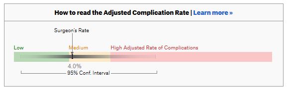
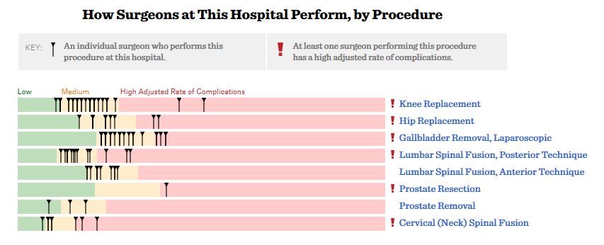
ProPublica, an independent investigative journalism organisation, have published surgeon-level complications rates based on Medicare data. I have already highlighted problems with the reporting of the data: surgeons are described as having a “high adjusted rate of complications” if they fall in the red-zone, despite there being too little data to say whether this has happened by chance.

4
This surgeon should not be identified as having a “high adjusted rate of complications” as there are too few cases to estimate the complication rate accurately.

I say again, I fully support transparency and public access to healthcare. But the ProPublica reporting has been quite shocking. I’m not aware of them publishing the number of surgeons out of the 17000 that are statistically different to the average. This is a small handful.

ProPublica could have chosen a different approach. This is a funnel plot and I’ve written about them before.

A funnel plot is a summary of an estimate (such as complication rate) against a measure of the precision of that estimate. In the context of healthcare, a centre or individual outcome is often plotted against patient volume. A horizontal line parallel to the x-axis represents the outcome for the entire population and outcomes for individual surgeons are displayed as points around this. This allows a comparison of individuals with that of the population average, while accounting for the increasing certainty surrounding that outcome as the sample size increases. Limits can be determined, beyond which the chances of getting an individual outcome are low if that individual were really part of the whole population.

In other words, a surgeon above the line has a complication rate different to the average.

I’ve scraped the ProPublica data for gallbladder removal (laparoscopic cholecystectomy) from California, New York and Texas for surgeons highlighted in the red-zone. These are surgeons ProPublica says have high complication rates.

As can be seen from the funnel plot, these surgeons are no where near being outliers. There is insufficient information to say whether any of them are different to average. ProPublica decided to ignore the imprecision with which the complication rates are determined. For red-zone surgeons from these 3 states, none of them have complication rates different to average.

ProPublica_lap_chole_funnel
Black line, population average (4.4%), blue line 95% control limit, red line 99% control limit.

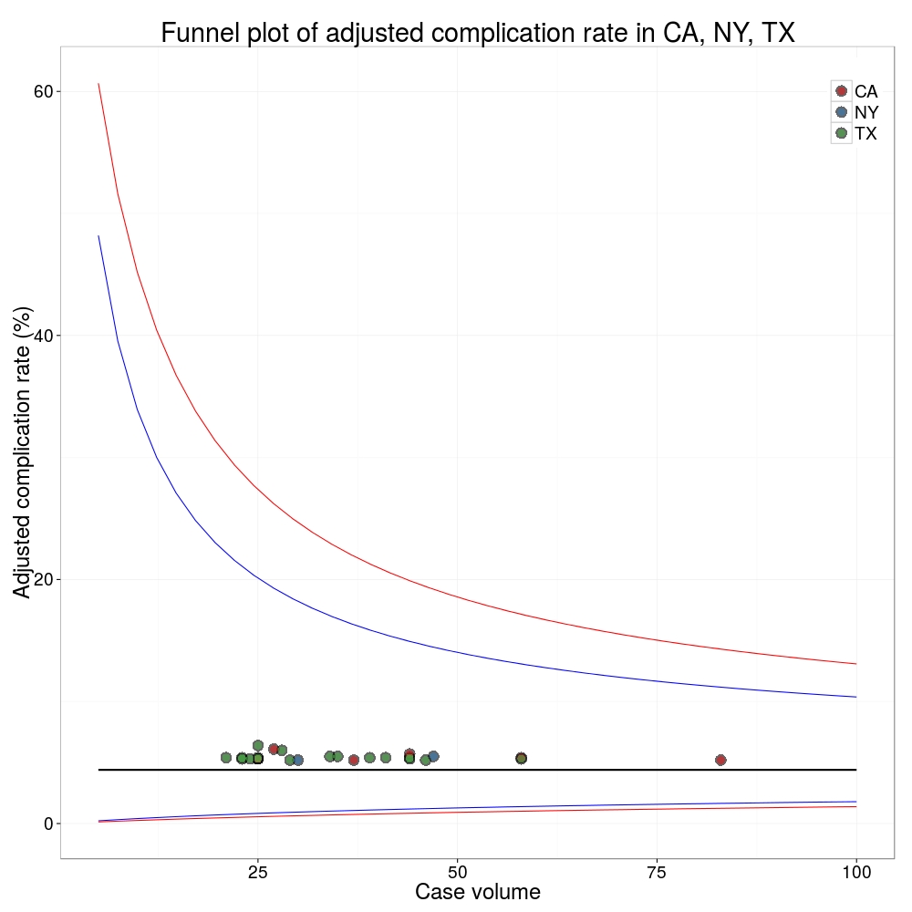
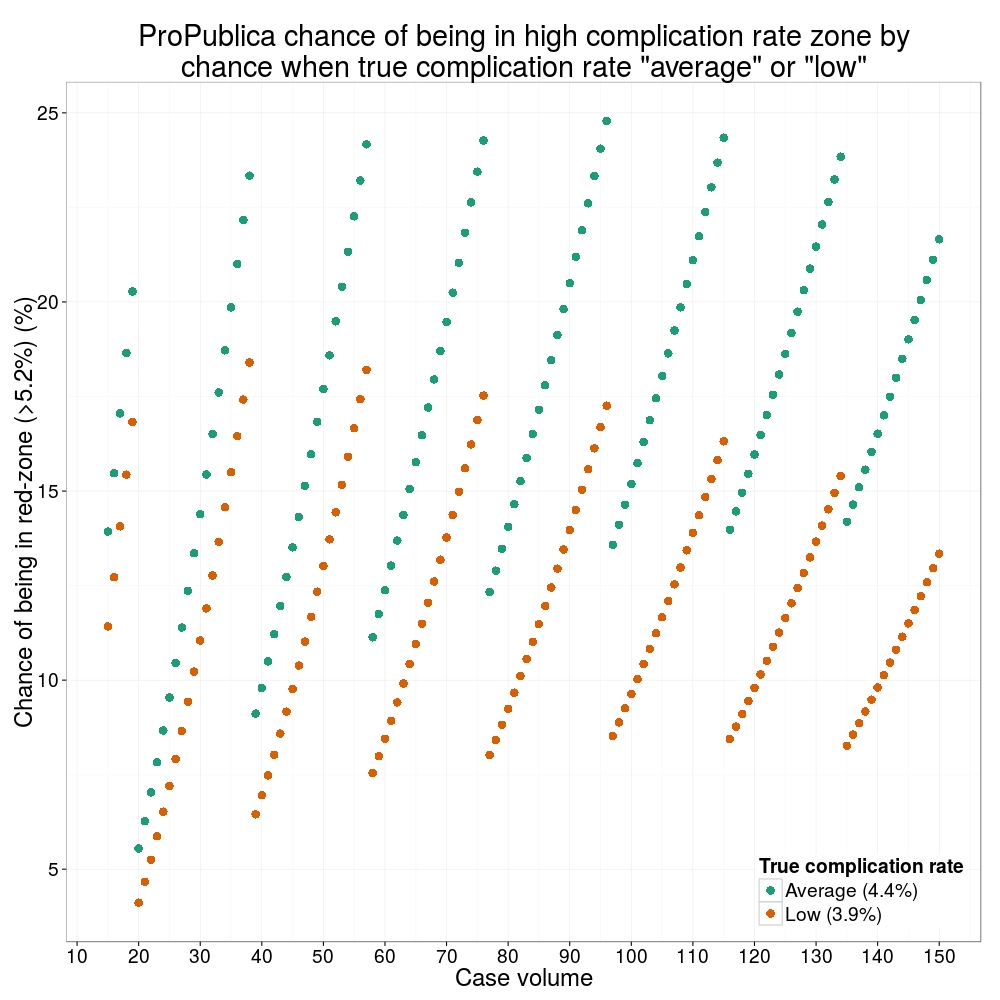
How likely is it that a surgeon with an average complication rate (4.4%) will appear in the red-zone just by chance (>5.2%)? The answer is, pretty likely given the small numbers of cases here: anything up to a 25% chance depending on the number of cases performed. Even at the top of the green-zone (low ACR, 3.9%), there is still around a 1 in 6 chance a surgeon will appear to have a high complication rate just by chance.

chance_of_being_in_redzoneProPublica have failed in their duty to explain these data in a way that can be understood. The surgeon score card should be revised. All “warning explanation points” should be removed for those other than the truly outlying cases.

Data

Download

Git

Link to repository.

Code

# ProPublica Surgeon Scorecard 
# https://projects.propublica.org/surgeons

# Laparoscopic cholecystectomy (gallbladder removal) data
# Surgeons with "high adjusted rate of complications"
# CA, NY, TX only

# Libraries needed ----
library(ggplot2)
library(binom)

# Upload dataframe ----
dat = read.csv("http://www.datasurg.net/wp-content/uploads/2015/07/ProPublica_CA_NY_TX.csv")

# Total number reported
dim(dat)[1] # 59

# Remove duplicate surgeons who operate in more than one hospital
duplicates = which(
    duplicated(dat$Surgeon)
)

dat_unique = dat[-duplicates,]
dim(dat_unique) # 27

# Funnel plot for gallbladder removal adjusted complication rate -------------------------
# Set up blank funnel plot ----
# Set control limits
pop.rate = 0.044 # Mean population ACR, 4.4%
binom_n = seq(5, 100, length.out=40)
ci.90 = binom.confint(pop.rate*binom_n, binom_n, conf.level = 0.90, methods = "wilson")
ci.95 = binom.confint(pop.rate*binom_n, binom_n, conf.level = 0.95, methods = "wilson")
ci.99 = binom.confint(pop.rate*binom_n, binom_n, conf.level = 0.99, methods = "wilson")

theme_set(theme_bw(24))
g1 = ggplot()+
    geom_line(data=ci.95, aes(ci.95$n, ci.95$lower*100), colour = "blue")+ 
    geom_line(data=ci.95, aes(ci.95$n, ci.95$upper*100), colour = "blue")+
    geom_line(data=ci.99, aes(ci.99$n, ci.99$lower*100), colour = "red")+ 
    geom_line(data=ci.99, aes(ci.99$n, ci.99$upper*100), colour = "red")+
    geom_line(aes(x=ci.90$n, y=pop.rate*100), colour="black", size=1)+
    xlab("Case volume")+
    ylab("Adjusted complication rate (%)")+
    scale_colour_brewer("", type = "qual", palette = 6)+
    theme(legend.justification=c(1,1), legend.position=c(1,1))
g1

g1 + 
    geom_point(data=dat_unique, aes(x=Volume, y=ACR), colour="black", alpha=0.6, size = 6, 
                         show_guide=TRUE)+
    geom_point(data=dat_unique, aes(x=Volume, y=ACR, colour=State), alpha=0.6, size=4) +
    ggtitle("Funnel plot of adjusted complication rate in CA, NY, TX")


# Probability of being shown as having high complication rate ----
# At 4.4%, what are the changes of being 5.2% by chance?
n <- seq(15, 150, 1)
average = 1-pbinom(ceiling(n*0.052), n, 0.044)
low = 1-pbinom(ceiling(n*0.052), n, 0.039)

dat_prob = data.frame(n, average, low)

ggplot(melt(dat_prob, id="n"))+
    geom_point(aes(x=n, y=value*100, colour=variable), size=4)+
    scale_x_continuous("Case volume", breaks=seq(10, 150, 10))+
    ylab("Adjusted complication rate (%)")+
    scale_colour_brewer("True complication rate", type="qual", palette = 2, labels=c("Average (4.4%)", "Low (3.9%)"))+
    ggtitle("ProPublica chance of being in high complication rate zone by\nchance when true complication rate \"average\" or \"low\"")+
    theme(legend.position=c(1,0), legend.justification=c(1,0))

The problem with ProPublica’s surgeon scorecards

ProPublica is an organisation performing independent, non-profit investigative journalism in the public interest. Yesterday it published an analysis of surgeon-level complications rates based on Medicare data.

Publication of individual surgeons results is well established in the UK. Transparent, easily accessible healthcare data is essential and initiatives like this are welcomed.

It is important that data are presented in a way that can be clearly understood. Communicating risk is notoriously difficult. This is particularly difficult when it is necessary to describe the precision with which a risk has been estimated.

Unfortunately that is where ProPublica have got it all wrong.

There is an inherent difficulty faced when we dealing with individual surgeon data. In order to be sure that a surgeon has a complication rate higher than average, that surgeon needs to have performed a certain number of that particular procedure. If data are only available on a small number of cases, we can’t be certain whether the surgeon’s complication rate is truly high, or just appears to be high by chance.

If you tossed a coin 10 times and it came up with 7 heads, could you say whether the coin was fair or biased? With only 10 tosses we don’t know.

Similarly, if a surgeon performs 10 operations and has 1 complication, can we sure that their true complication rate is 10%, rather than 5% or 20%? With only 10 operations we don’t know.

The presentation of the ProPublica data is really concerning. Here’s why.

For a given hospital, data are presented for individual surgeons. Bands are provided which define “low”, “medium” and “high” adjusted complication rates. If the adjusted complication rate for an individual surgeon falls within the red-zone, they are described as having a “high adjusted rate of complications”.

1How confident can we be that a surgeon in the red-zone truly has a high complication rate? To get a handle on this, we need to turn to an off-putting statistical concept called a “confidence interval”. As it’s name implies, a confidence interval tells us what degree of confidence we can treat the estimated complication rate.

2If the surgeon has done many procedures, the confidence interval will be narrow. If we only have data on a few procedures, the confidence interval will be wide.

To be confident that a surgeon has a high complication rate, the 95% confidence interval needs to entirely lie in the red-zone.

A surgeon should be highlighted as having a high complication rate if and only if the confidence interval lies entirely in the red-zone.

Here is an example. This surgeon performs the procedure to remove the gallbladder (cholecystectomy). There are data on 20 procedures for this individual surgeon. The estimated complication rate is 4.7%. But the 95% confidence interval goes from the green-zone all the way to the red-zone. Due to the small number of procedures, all we can conclude is that this surgeon has either a low, medium, or high adjusted complication rate. Not very useful.

8Here are some other examples.

Adjusted complication rate: 1.5% on 339 procedures. Surgeon has low or medium complication rate. They are unlikely to have a high complication rate.

5Adjusted complication rate: 4.0% on 30 procedures. Surgeon has low or medium or high complication rate. Note due to the low numbers of cases, the analysis correctly suggests an estimated complication rate, despite the fact this surgeon has not had any complications for the 30 procedures.
3Adjusted complication rate: 5.4% on 21 procedures. ProPublica conclusion: surgeon has high adjusted complication rate. Actual conclusion: surgeon has low, medium or high complication rate.
4Adjusted complication rate: 6.6% on 22 procedures. ProPublica conclusion: surgeon has high adjusted complication rate. Actual conclusion: surgeon has medium or high complication rate, but is unlikely to have a low complication rate.
6Adjusted complication rate: 7.6% on 86 procedures. ProPublica conclusion: surgeon has high adjusted complication rate. Actual conclusion: surgeon has high complication rate. This is one of the few examples in the dataset, where the analysis suggest this surgeon does have a high likelihood of having a high complication rate.

7In the UK, only this last example would to highlighted as concerning. That is because we have no idea whether surgeons who happen to fall into the red-zone are truly different to average.

The analysis above does not deal with issues others have highlighted: that this is Medicare data only, that important data may be missing , that the adjustment for patient case mix may be inadequate, and that the complications rates seem different to what would be expected.

ProPublica have not moderated the language used in reporting these data. My view is that the data are being misrepresented.

ProPublica should highlight cases like the last mentioned above. For all the others, all that can be concluded is that there are too few cases to be able to make a judgement on whether the surgeon’s complication rate is different to average.

Leeds paediatric heart surgery: how much variation is acceptable?

It’s all got very messy in Leeds.

A long-term strategy of the government, supported in general by the health profession, is the concentration of high-risk uncommon surgery in fewer centres. This of course means closing departments in some hospitals currently providing those services. Few are in doubt that child heart surgery is high-risk, relatively uncommon and there are probably too many UK centres performing this highly specialised surgery at the moment. Leeds was one of three UK hospitals identified in an NHS review where congenital heart surgery would stop.

On this background and a vigorous local campaign, a case was won in the High Court which ruled the consultation flawed. That was 7th March 2013 and the ruling was published 3 days ago.

The following day, children’s heart surgery was suspended at Leeds after NHS Medical Director, Sir Bruce Keogh, was shown data suggesting that the mortality rate in Leeds was higher than expected.

There have been rumblings in the cardiac surgical community for some time that all was not well in Leeds … As medical director I couldn’t do nothing. I was really disturbed about the timing of this. I couldn’t sit back just because the timing was inconvenient, awkward or would look suspicious, as it does.

– Sir Bruce Keogh, NHS Medical Director

An “agitated cardiologist” later identified as Professor Sir Roger Boyle, director of the National Institute of Clinical Outcomes Research, told Sir Bruce that mortality rates over the last two years were “about twice the national average or more” and rising.

These data are not in the public domain. Sir Bruce and the Trust faced a difficult decision given the implications of the data. This is complicated by the recent court ruling and strength of public feeling, the recent publication of the Francis report into Mid Staffordshire NHS Foundation Trust and the background of cardiac surgery deaths at Bristol Royal Infirmary between 1984 and 1995.

Is mortality in Leeds higher than expected? What is expected? How much variation can be put down to chance? Is this how a potential outlier should be managed?

Dr John Gibbs, chairman of the Central Cardiac Database and the man responsible for the collection and analysis of the data has said the data are “not fit to be looked at by anyone outside the committee”.

It was at a very preliminary stage, and we are at the start of a long process to make sure the data was right and the methodology was correct. We would be irresponsible if we didn’t put in every effort to get the data right. It will cause untold damage for the future of audit results in this country. I think nobody will trust us again. It’s dreadful.

– Dr John Gibbs, chairman of the Central Cardiac Database

Not surprisingly, a senior cardiologist from Leeds, Elspeth Brown, has come out and said the data are just plain wrong and did not include all the relevant operations.

Twice the national average sounds a lot. is it?

Possibly. It’s difficult to know not seeing the data. Natural variation between hospitals in the results of surgery can and does occur by chance. It is possible to see “twice the national average” as a results of natural variation, disturbing as that may sound. It depends on the number of procedures performed annually – small hospitals have more variation – and whether all cardiac procedures are compared together, as opposed to each individual surgical procedure in isolation.

The challenge is in confidently detecting hospitals performing worse than would be expected by chance, as has been alleged in Leeds. Care needs to be taken to ensure that data are accurate and complete. Account is usually made of differences in the patients being treated and the complexity of the surgery performed (often referred to as case-mix).

The graphs below are “funnel plots” that show differences in mortality after congenital heart surgery in US hospitals. These were published in 2012 by Jacobs and colleagues from the University of South Florida College of Medicine. The open source paper is here, but the graphs come from the final paper here which although behind a paywall, the graphs are freely available (note the final version differs from the open source version).

Each graph is for group of child heart operations of increasing complexity and therefore risk. Upper left are the more straightforward procedures, bottom right more complex. The horizontal axis is the annual number of cases and the vertical axis the mortality as a percentage. Each dot on the graph is a hospital performing that particular type of surgery. If a hospital lies outwith the dotted line (95% confidence interval) then there is a possibility that the mortality rate is different from the average. The further above the top line, the greater the chance. These particular funnel plots are not corrected for case-mix, but this has been done else where in the analysis.

It is easy to see that when a hospital does few cases per year, the natural variation in mortality can be high. On the first graph, there is variation from 0 – 3% between different hospitals and this range increases as the surgery gets riskier. There is less variation between hospitals that do more cases. However, in the second graph even the two hospitals doing around 800 procedures per year, there is a greater than two-fold difference in mortality. On the first plot, twice the national average is 1.2%. There are around 11 hospitals above that level in the US for these procedures, the differences for 9 apparently occuring by chance (within the dotted line). Similar conclusions can be drawn from the other graphs of increasingly risky surgery.

Funnel plots of US centres performing congenital cardiac surgery

Data for cardiac sugery is published and freely available to the public. At the moment, data for children’s heart surgery is not published separately. The data for Leeds General Surgery can be seen here.

To compare children’s heart surgery in Leeds with other centres, we need to the raw data presented in this form and the data corrected for differences in patients. Other issues may be at play, but with the data in the public domain we will be in a better position to make a judgement as to whether an excess in mortality does indeed exist.