A low blood count is common with cancer. There are now more studies showing that this can contribute to complications after surgery. Blood transfusion increases blood count but is best avoided in cancer unless the blood count is very low. This new study in the journal HPB shows the effect of anaemia after liver surgery. Here is the editorial highlight I wrote for the journal.
Preoperative anaemia is common and affects 30-60% of patients undergoing major elective surgery. In major non-cardiac surgery, anaemia is associated with increased morbidity and mortality, as well as higher blood transfusion rates.
The importance of preoperative anaemia in liver resection patients is becoming recognised. In this issue, Tohme and colleagues present an evaluation of the American College of Surgeons’ National Surgical Quality Improvement Program (ACS-NSQIP) database.
Of around 13000 patients who underwent elective liver resection from 2005 to 2012, one third were anaemic prior to surgery. After adjustment, anaemia was associated with major complications after surgery (OR 1.21, 1.09-1.33) but not death.
Patients who are anaemic have different characteristics to those who are not, characteristics that are likely to make them more susceptible to complications. While this analysis extensively adjusts for observed factors, residual confounding almost certainly exists.
The question remains, does anaemia itself contribute to the occurrence of complications, or is it just a symptom of greater troubles? The authors rightly highlight the importance of identifying anaemia prior to surgery, but it remains to be seen whether treatment is possible and whether it will result in better patient outcomes.
Perioperative transfusion is independently associated with major complications. Although there is no additive effect in anaemic patients, the benefits of treating anaemia may be offset by the detrimental effect of transfusion. For those with iron deficiency, treatment with intravenous iron may be of use and is currently being studied in an RCT of all major surgery (preventt.lshtm.ac.uk). Results of studies such as these will help determine causal relationships and whether intervention is possible and beneficial.
ProPublica, an independent investigative journalism organisation, have published surgeon-level complications rates based on Medicare data. I have already highlighted problems with the reporting of the data: surgeons are described as having a “high adjusted rate of complications” if they fall in the red-zone, despite there being too little data to say whether this has happened by chance.
This surgeon should not be identified as having a “high adjusted rate of complications” as there are too few cases to estimate the complication rate accurately.
I say again, I fully support transparency and public access to healthcare. But the ProPublica reporting has been quite shocking. I’m not aware of them publishing the number of surgeons out of the 17000 that are statistically different to the average. This is a small handful.
ProPublica could have chosen a different approach. This is a funnel plot and I’ve written about them before.
A funnel plot is a summary of an estimate (such as complication rate) against a measure of the precision of that estimate. In the context of healthcare, a centre or individual outcome is often plotted against patient volume. A horizontal line parallel to the x-axis represents the outcome for the entire population and outcomes for individual surgeons are displayed as points around this. This allows a comparison of individuals with that of the population average, while accounting for the increasing certainty surrounding that outcome as the sample size increases. Limits can be determined, beyond which the chances of getting an individual outcome are low if that individual were really part of the whole population.
In other words, a surgeon above the line has a complication rate different to the average.
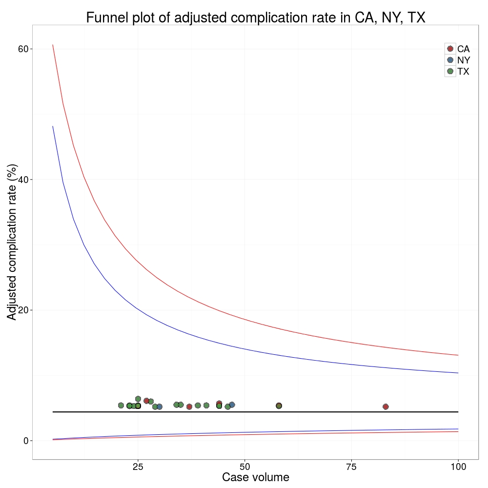
I’ve scraped the ProPublica data for gallbladder removal (laparoscopic cholecystectomy) from California, New York and Texas for surgeons highlighted in the red-zone. These are surgeons ProPublica says have high complication rates.
As can be seen from the funnel plot, these surgeons are no where near being outliers. There is insufficient information to say whether any of them are different to average. ProPublica decided to ignore the imprecision with which the complication rates are determined. For red-zone surgeons from these 3 states, none of them have complication rates different to average.
Black line, population average (4.4%), blue line 95% control limit, red line 99% control limit.
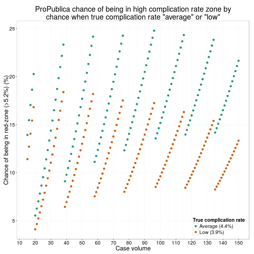
How likely is it that a surgeon with an average complication rate (4.4%) will appear in the red-zone just by chance (>5.2%)? The answer is, pretty likely given the small numbers of cases here: anything up to a 25% chance depending on the number of cases performed. Even at the top of the green-zone (low ACR, 3.9%), there is still around a 1 in 6 chance a surgeon will appear to have a high complication rate just by chance.
ProPublica have failed in their duty to explain these data in a way that can be understood. The surgeon score card should be revised. All “warning explanation points” should be removed for those other than the truly outlying cases.
ProPublica is an organisation performing independent, non-profit investigative journalism in the public interest. Yesterday it published an analysis of surgeon-level complications rates based on Medicare data.
Publication of individual surgeons results is well established in the UK. Transparent, easily accessible healthcare data is essential and initiatives like this are welcomed.
It is important that data are presented in a way that can be clearly understood. Communicating risk is notoriously difficult. This is particularly difficult when it is necessary to describe the precision with which a risk has been estimated.
Unfortunately that is where ProPublica have got it all wrong.
There is an inherent difficulty faced when we dealing with individual surgeon data. In order to be sure that a surgeon has a complication rate higher than average, that surgeon needs to have performed a certain number of that particular procedure. If data are only available on a small number of cases, we can’t be certain whether the surgeon’s complication rate is truly high, or just appears to be high by chance.
If you tossed a coin 10 times and it came up with 7 heads, could you say whether the coin was fair or biased? With only 10 tosses we don’t know.
Similarly, if a surgeon performs 10 operations and has 1 complication, can we sure that their true complication rate is 10%, rather than 5% or 20%? With only 10 operations we don’t know.
The presentation of the ProPublica data is really concerning. Here’s why.
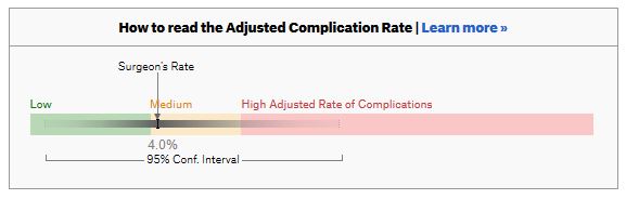
For a given hospital, data are presented for individual surgeons. Bands are provided which define “low”, “medium” and “high” adjusted complication rates. If the adjusted complication rate for an individual surgeon falls within the red-zone, they are described as having a “high adjusted rate of complications”.
How confident can we be that a surgeon in the red-zone truly has a high complication rate? To get a handle on this, we need to turn to an off-putting statistical concept called a “confidence interval”. As it’s name implies, a confidence interval tells us what degree of confidence we can treat the estimated complication rate.
If the surgeon has done many procedures, the confidence interval will be narrow. If we only have data on a few procedures, the confidence interval will be wide.
To be confident that a surgeon has a high complication rate, the 95% confidence interval needs to entirely lie in the red-zone.
A surgeon should be highlighted as having a high complication rate if and only if the confidence interval lies entirely in the red-zone.
Here is an example. This surgeon performs the procedure to remove the gallbladder (cholecystectomy). There are data on 20 procedures for this individual surgeon. The estimated complication rate is 4.7%. But the 95% confidence interval goes from the green-zone all the way to the red-zone. Due to the small number of procedures, all we can conclude is that this surgeon has either a low, medium, or high adjusted complication rate. Not very useful.
Here are some other examples.
Adjusted complication rate: 1.5% on 339 procedures. Surgeon has low or medium complication rate. They are unlikely to have a high complication rate.
Adjusted complication rate: 4.0% on 30 procedures. Surgeon has low or medium or high complication rate. Note due to the low numbers of cases, the analysis correctly suggests an estimated complication rate, despite the fact this surgeon has not had any complications for the 30 procedures. Adjusted complication rate: 5.4% on 21 procedures. ProPublica conclusion: surgeon has high adjusted complication rate. Actual conclusion: surgeon has low, medium or high complication rate. Adjusted complication rate: 6.6% on 22 procedures. ProPublica conclusion: surgeon has high adjusted complication rate. Actual conclusion: surgeon has medium or high complication rate, but is unlikely to have a low complication rate. Adjusted complication rate: 7.6% on 86 procedures. ProPublica conclusion: surgeon has high adjusted complication rate. Actual conclusion: surgeon has high complication rate. This is one of the few examples in the dataset, where the analysis suggest this surgeon does have a high likelihood of having a high complication rate.
In the UK, only this last example would to highlighted as concerning. That is because we have no idea whether surgeons who happen to fall into the red-zone are truly different to average.
The analysis above does not deal with issues others have highlighted: that this is Medicare data only, that important data may be missing , that the adjustment for patient case mix may be inadequate, and that the complications rates seem different to what would be expected.
ProPublica have not moderated the language used in reporting these data. My view is that the data are being misrepresented.
ProPublica should highlight cases like the last mentioned above. For all the others, all that can be concluded is that there are too few cases to be able to make a judgement on whether the surgeon’s complication rate is different to average.
The introduction of new surgical procedures is fraught with difficulty. Determining that a procedure is safe to perform while surgeons are still learning how to do it has obvious problems. Comparing a new procedure to existing treatments requires the surgery to be performed on a scale rarely available at early stages of development. The IDEAL framework helps greatly with this process.
When performing liver surgery, it is crucial that sufficient liver is left behind at the end of the operation to do the necessary job of the liver. This is particularly important in the first days and weeks following surgery. When disease demands that a large proportion of the liver is removed, manoeuvres can be performed before surgery to increase the size of the liver left behind. The disease is invariably cancer and the manoeuvres usually involves blocking the vein supplying the part of the liver to be removed, a procedure called portal vein embolisation. This causes the liver to think part of it has already been removed. The part which will stay behind after surgery increases in size, hopefully sufficient to do the job of the liver after surgery. This often works but does require a delay in definitive surgery and in some patients does not work sufficiently well.
An alternative procedure has come to the fore recently. The ALPPS procedure (Associating Liver Partition and Portal vein Ligation for Staged Liver resection) combines this embolisation procedure with an operation to cut the liver along the line required to remove the diseased portion. But after making the cut, the operation is stopped and the patient woken up. Over the course of the following week the liver being left behind increases in size – quicker and more effectively say proponents of the ALPPS procedure. After a week, the patient is taken back to the operating room and the disease liver portion removed.
So should we start using the procedure to treat cancer which is widely spread in the liver?
The difficulty is knowing whether the new procedure is safe and effective. Early results suggest quite a high mortality associated with the procedure. But of course for patients with untreated cancer in the liver who do not have surgery, the mortality rate is high.
However, it is still my feeling that the results of the procedure are not good and the traditional portal vein embolisation procedure seems to work well in our patients. Here is our letter with our concerns in response.
We read with interest the multicenter study by Schadde and colleagues in the April issue regarding the novel procedure of Associating Liver Partition and Portal vein Ligation for Staged Liver resection (ALPPS) [1]. Since the initial description 2 years ago [2] ALPPS has gained popularity as a surgical option for treating patients with advanced liver lesions not considered amenable to conventional two-stage or future liver remnant-enhancing procedures propagated by Rene Adam et al. [3] a decade ago. Indeed, the explosion of interest in ALPPS by surgeons and its adoption as a procedure of choice is concerning, given that the procedure appears to come with considerable cost to the patient, as shown in this study. The increased severe morbidity of 27 versus 15 % and the mortality of 15 versus 6 % may not achieve traditional measures of statistical significance in this study, but the effect size is concerning, and the direction of effect is consistent across outcome measures and studies. Is ALPPS in its current form safe enough for the widespread adoption that has occurred given increasingly effective nonsurgical approaches, including ablation, chemotherapy, selective internal radiation therapy [4], and growth factor/receptor inhibition?
As the authors rightly point out, the risk of selection bias is significant given the study design. It is unclear whether the logistic regression analysis adequately adjusts for the imbalance in baseline risk in favor of the ALPPS group: why, for instance, was operative risk (ASA grade) not controlled for in the multivariate analysis?
One of the potential benefits of a two-stage procedure is that it may disclose biologically unfavorable disease. By its very nature, ALPPS does not lend itself to such selection given the short time interval between the first and second stages. The authors appear to reject this argument, citing a similar overall recurrence rate seen in this study. We were puzzled with this position given that the study highlights an interesting observation: in the PVE/PVL group 11 % of patients had systemic progression prior to the second stage. Presumably this group of patients would not have benefitted from ALPPS.
In our practice, patients who may be deemed by others to be ideal candidates for ALPPS are seldom not amenable to either a two-stage liver resection or a single-stage resection with prior volume-enhancing maneuvers. Indeed, it is difficult to understand why an ALPPS approach was used at all in some of the cases presented at recent international conferences. We wonder what proportion and kind of patients with advanced liver lesions would really benefit from the ALPPS approach. The international ALPPS registry will perhaps provide clearer evidence for the role of this challenging approach to liver resection.
1. Schadde E, Ardiles V, Slankamenac K et al (2014) ALPPS offers a better chance of complete resection in patients with primarily unresectable liver tumors compared with conventional-staged hepatectomies: results of a multicenter analysis. World J Surg 38:1510–1519. doi:10.1007/s00268-014-2513-3
2. Schnitzbauer AA, Lang SA, Goessmann H et al (2012) Right portal vein ligation combined with in situ splitting induces rapid left lateral liver lobe hypertrophy enabling 2-staged extended right hepatic resection in small-for-size settings. Ann Surg 255:405–414
3. Adam R, Delvart V, Pascal G et al (2004) Rescue surgery for unresectable colorectal liver metastases downstaged by chemotherapy: a model to predict long-term survival. Ann Surg 240:644–657 discussion 657–658
4. Gulec SA, Pennington K, Wheeler J et al (2013) Yttrium-90 microsphere-selective internal radiation therapy with chemotherapy (chemo-SIRT) for colorectal cancer liver metastases: an in vivo double-arm-controlled phase II trial. Am J Clin Oncol 36:455–460
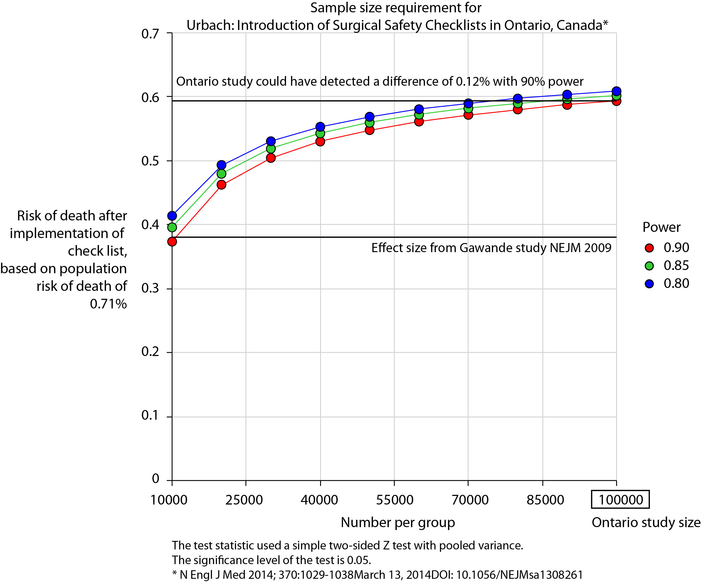
The recent publication of the Ontario experience in the introduction of Surgical Safety Checklists has caused a bit of a stooshie.
Checklists have consistently been shown to be associated with a reduction in death and complications following surgery. Since the publication of Atul Gawande’s seminal paper in 2009, checklists have been successfully introduced in a number of countries including Scotland. David Urbach and Nancy Baxter’s New England Journal of Medicine publication stands apart: the checklist made no difference.
Atul Gawande himself responded quickly asking two important questions. Firstly, were there sufficient patients included in the study to show a difference? Secondly, was the implementation robust and was the programme in place for long enough to expect a difference be seen.
He and others have reported the power of the study to be low – about 40% – meaning that were the study to be repeated multiple times and a true difference in mortality actually did exist, the chance of detecting it would be 40%. But power calculations performed after the event (post hoc) are completely meaningless – when no effect is seen in a study, the power is low by definition (mathsy explanation here).
There is no protocol provided with the Ontario study, so it is not clear if an estimate of the required sample size had been performed. Were it done, it may have gone something like this.
The risk of death in the Ontario population is 0.71%. This could have been determined from the same administrative dataset that the study used. Say we expect a similar reduction in death following checklist introduction as Gawande showed in 2009, 1.5% to 0.8%. For the Ontario population, this would be equivalent to an expected risk of death of 0.38%. This may or may not be reasonable. It is not clear that the “checklist effect” is the same across patients or procedures of different risks. Accepting this assumption for now, the study would have only required around 8000 patients per group to show a significant difference. The study actually included over 100000 patients per group. In fact, it was powered to show very small differences in the risk of death – a reduction of around 0.1% would probably have been detected.
Similar conclusions can be drawn for complication rate. Gawande showed a reduction from 11% to 7%, equivalent in Ontario to a reduction from 3.86% to 2.46%. The Ontario study was likely to show a reduction to 3.59% (at 90% power).
The explanation for the failure to show a difference does not lie in the numbers.
So assuming then that checklists do work, this negative result stems either from a failure of implementation – checklists were not being used or not being used properly – or a difference in the effect of checklists in this population. The former seems most likely. The authors report that …
… available data did not permit us to determine whether a checklist was used in a particular procedure, and we were unable to measure compliance with checklists at monthly intervals in our analysis. However, reported compliance with checklists is extraordinarily high …
Quality improvement interventions need sufficient time for introduction. In this study, only a minimum of 3 months was allowed which seems crazily short. Teams need to want to do it. In my own hospital there was a lot of grumbling (including from me) before acceptance. When I worked in the Netherlands, SURPASS was introduced. In this particular hospital it was delivered via the electronic patient record. A succession of electronic “baton passes” meant that a patient could not get to the operating theatre without a comprehensive series of checklists being completed. I like this use of technology to deliver safety. With robust implementation, training, and acceptance by staff, maybe the benefits of checklists will also be seen in Ontario.