Elegant regression results tables and plots in R: the finalfit package

The finafit package brings together the day-to-day functions we use to generate final results tables and plots when modelling. I spent many years repeatedly manually copying results from R analyses and built these functions to automate our standard healthcare data workflow. It is particularly useful when undertaking a large study involving multiple different regression analyses. When combined with RMarkdown, the reporting becomes entirely automated. Its design follows Hadley Wickham’s tidy tool manifesto.

Installation and Documentation

The full documentation is now here: finalfit.org

The code lives on GitHub.

You can install finalfit from CRAN with:

install.packages("finalfit")

It is recommended that this package is used together with dplyr, which is a dependent.

Some of the functions require rstan and boot. These have been left as Suggests rather than Depends to avoid unnecessary installation. If needed, they can be installed in the normal way:

install.packages("rstan")
install.packages("boot")

To install off-line (or in a Safe Haven), download the zip file and use devtools::install_local().

Main Features

1. Summarise variables/factors by a categorical variable

summary_factorlist() is a wrapper used to aggregate any number of explanatory variables by a single variable of interest. This is often “Table 1” of a published study. When categorical, the variable of interest can have a maximum of five levels. It uses Hmisc::summary.formula().

library(finalfit)
library(dplyr)

# Load example dataset, modified version of survival::colon
data(colon_s)

# Table 1 - Patient demographics by variable of interest ----
explanatory = c("age", "age.factor", 
  "sex.factor", "obstruct.factor")
dependent = "perfor.factor" # Bowel perforation
colon_s %>%
  summary_factorlist(dependent, explanatory,
  p=TRUE, add_dependent_label=TRUE)

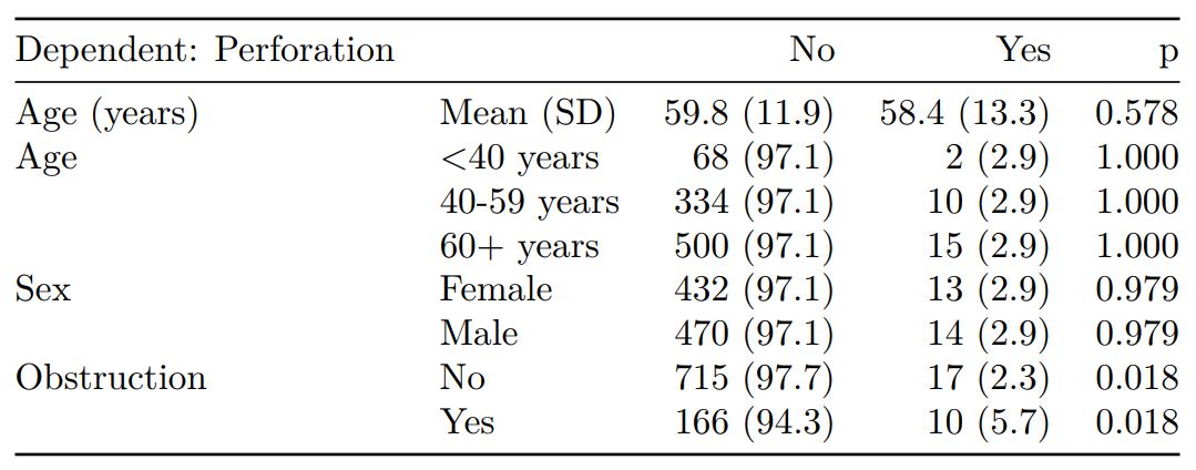
See other options relating to inclusion of missing data, mean vs. median for continuous variables, column vs. row proportions, include a total column etc.

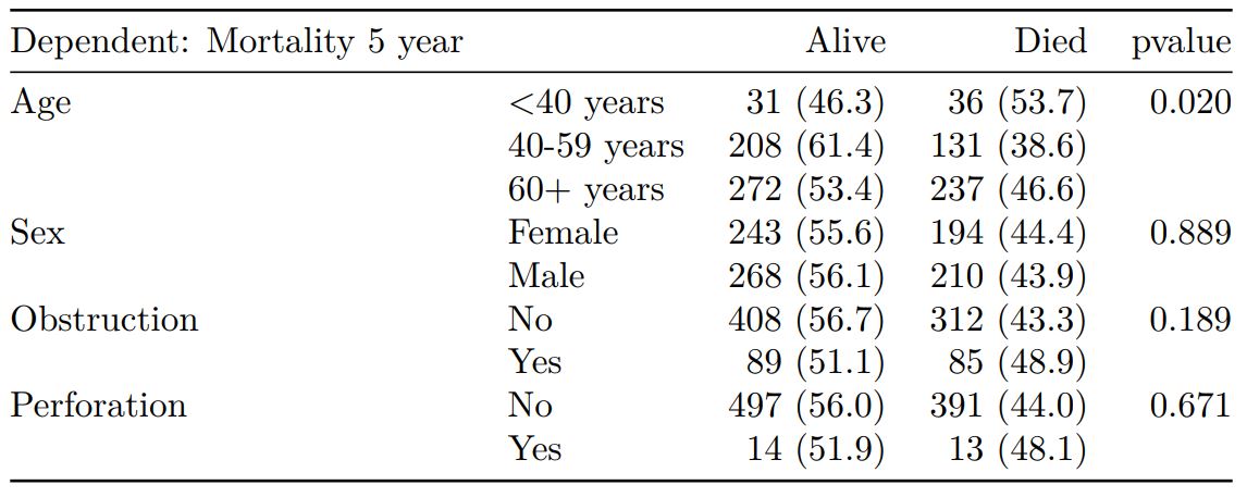
summary_factorlist() is also commonly used to summarise any number of variables by an outcome variable (say dead yes/no).

# Table 2 - 5 yr mortality ----
explanatory = c("age.factor", 
  "sex.factor",
  "obstruct.factor")
dependent = 'mort_5yr'
colon_s %>%
  summary_factorlist(dependent, explanatory, 
  p=TRUE, add_dependent_label=TRUE)

Tables can be knitted to PDF, Word or html documents. We do this in RStudio from a .Rmd document. Example chunk:

```{r, echo = FALSE, results='asis'}
knitr::kable(example_table, row.names=FALSE, 
    align=c("l", "l", "r", "r", "r", "r"))
```

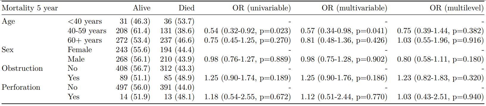
2. Summarise regression model results in final table format

The second main feature is the ability to create final tables for linear (lm()), logistic (glm()), hierarchical logistic (lme4::glmer()) and
Cox proportional hazards (survival::coxph()) regression models.

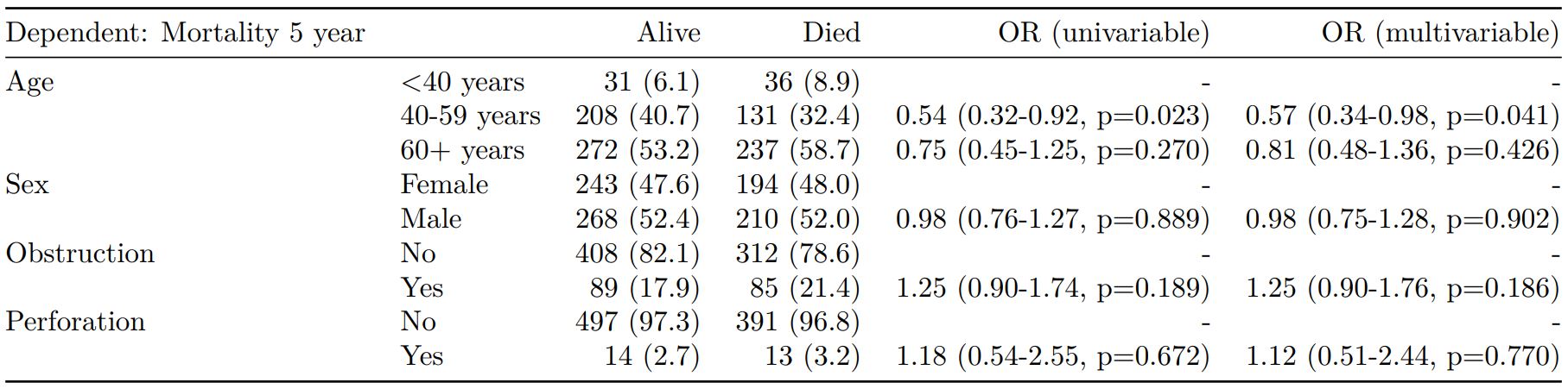
The finalfit() “all-in-one” function takes a single dependent variable with a vector of explanatory variable names (continuous or categorical variables) to produce a final table for publication including summary statistics, univariable and multivariable regression analyses. The first columns are those produced by summary_factorist(). The appropriate regression model is chosen on the basis of the dependent variable type and other arguments passed.

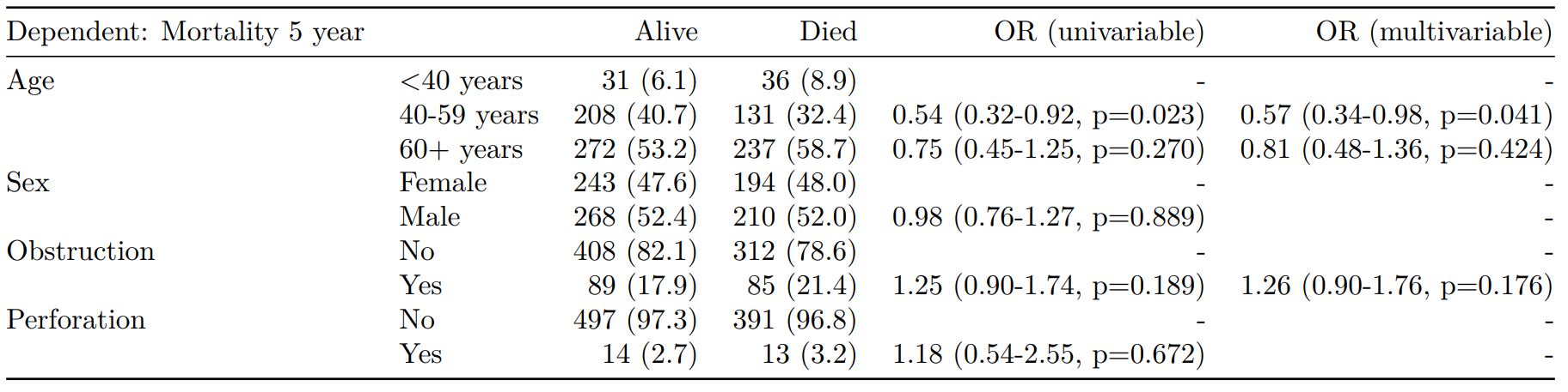
Logistic regression: glm()

Of the form: glm(depdendent ~ explanatory, family="binomial")

explanatory = c("age.factor", "sex.factor", 
  "obstruct.factor", "perfor.factor")
dependent = 'mort_5yr'
colon_s %>%
  finalfit(dependent, explanatory)

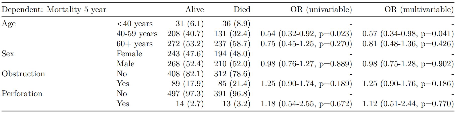
Logistic regression with reduced model: glm()

Where a multivariable model contains a subset of the variables included specified in the full univariable set, this can be specified.

explanatory = c("age.factor", "sex.factor", 
  "obstruct.factor", "perfor.factor")
explanatory_multi = c("age.factor", 
  "obstruct.factor")
dependent = 'mort_5yr'
colon_s %>%
  finalfit(dependent, explanatory, 
  explanatory_multi)

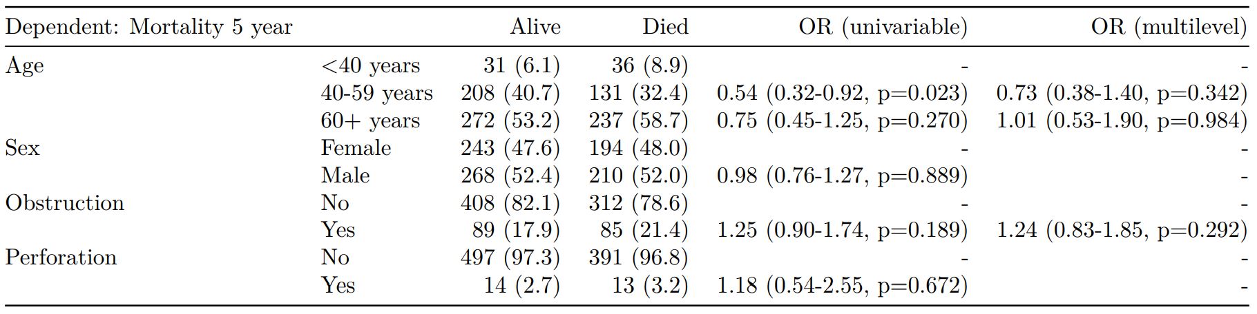
Mixed effects logistic regression: lme4::glmer()

Of the form: lme4::glmer(dependent ~ explanatory + (1 | random_effect), family="binomial")

Hierarchical/mixed effects/multilevel logistic regression models can be specified using the argument random_effect. At the moment it is just set up for random intercepts (i.e. (1 | random_effect), but in the future I’ll adjust this to accommodate random gradients if needed (i.e. (variable1 | variable2).

explanatory = c("age.factor", "sex.factor", 
  "obstruct.factor", "perfor.factor")
explanatory_multi = c("age.factor", "obstruct.factor")
random_effect = "hospital"
dependent = 'mort_5yr'
colon_s %>%
  finalfit(dependent, explanatory, 
  explanatory_multi, random_effect)

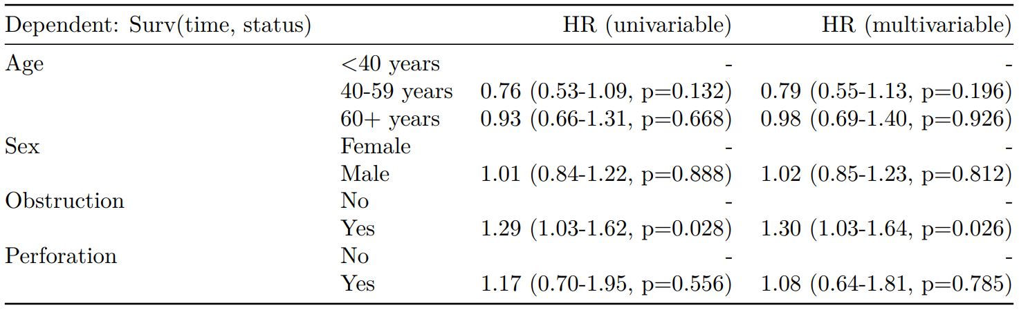
Cox proportional hazards: survival::coxph()

Of the form: survival::coxph(dependent ~ explanatory)

explanatory = c("age.factor", "sex.factor", 
"obstruct.factor", "perfor.factor")
dependent = "Surv(time, status)"
colon_s %>%
  finalfit(dependent, explanatory)

Add common model metrics to output

metrics=TRUE provides common model metrics. The output is a list of two dataframes. Note chunk specification for output below.

explanatory = c("age.factor", "sex.factor", 
  "obstruct.factor", "perfor.factor")
dependent = 'mort_5yr'
colon_s %>%
  finalfit(dependent, explanatory, 
  metrics=TRUE)
```{r, echo=FALSE, results="asis"}
knitr::kable(table7[[1]], row.names=FALSE, align=c("l", "l", "r", "r", "r"))
knitr::kable(table7[[2]], row.names=FALSE)
```

Rather than going all-in-one, any number of subset models can be manually added on to a summary_factorlist() table using finalfit_merge(). This is particularly useful when models take a long-time to run or are complicated.

Note the requirement for fit_id=TRUE in summary_factorlist(). fit2df extracts, condenses, and add metrics to supported models.

explanatory = c("age.factor", "sex.factor", 
  "obstruct.factor", "perfor.factor")
explanatory_multi = c("age.factor", "obstruct.factor")
random_effect = "hospital"
dependent = 'mort_5yr'

# Separate tables
colon_s %>%
  summary_factorlist(dependent, 
  explanatory, fit_id=TRUE) -> example.summary

colon_s %>%
  glmuni(dependent, explanatory) %>%
  fit2df(estimate_suffix=" (univariable)") -> example.univariable

colon_s %>%
  glmmulti(dependent, explanatory) %>%
  fit2df(estimate_suffix=" (multivariable)") -> example.multivariable

colon_s %>%
  glmmixed(dependent, explanatory, random_effect) %>%
  fit2df(estimate_suffix=" (multilevel)") -> example.multilevel

# Pipe together
example.summary %>%
  finalfit_merge(example.univariable) %>%
  finalfit_merge(example.multivariable) %>%
  finalfit_merge(example.multilevel) %>%
  select(-c(fit_id, index)) %>% # remove unnecessary columns
  dependent_label(colon_s, dependent, prefix="") # place dependent variable label

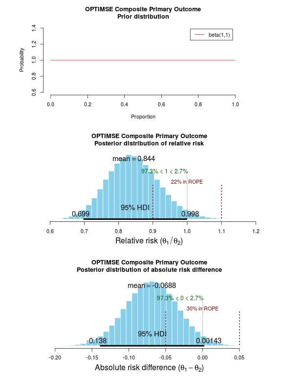
Bayesian logistic regression: with `stan`

Our own particular rstan models are supported and will be documented in the future. Broadly, if you are running (hierarchical) logistic regression models in Stan with coefficients specified as a vector labelled beta, then fit2df() will work directly on the stanfit object in a similar manner to if it was a glm or glmerMod object.

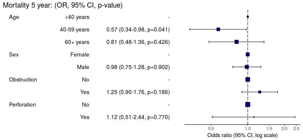
3. Summarise regression model results in plot

Models can be summarized with odds ratio/hazard ratio plots using or_plot, hr_plot and surv_plot.

OR plot

# OR plot
explanatory = c("age.factor", "sex.factor", 
  "obstruct.factor", "perfor.factor")
dependent = 'mort_5yr'
colon_s %>%
  or_plot(dependent, explanatory)
# Previously fitted models (`glmmulti()` or 
# `glmmixed()`) can be provided directly to `glmfit`
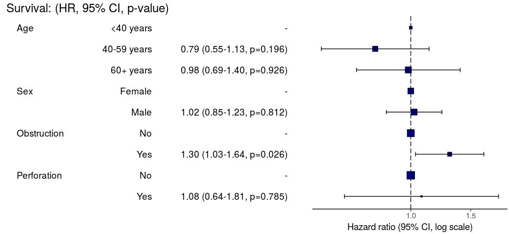
HR plot

# HR plot
explanatory = c("age.factor", "sex.factor", 
  "obstruct.factor", "perfor.factor")
dependent = "Surv(time, status)"
colon_s %>%
  hr_plot(dependent, explanatory, dependent_label = "Survival")
# Previously fitted models (`coxphmulti`) can be provided directly using `coxfit`

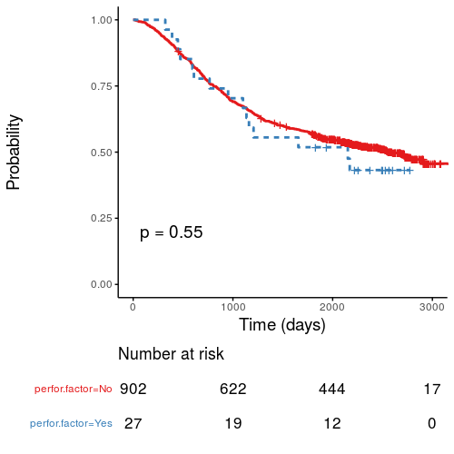
Kaplan-Meier survival plots

KM plots can be produced using the library(survminer)

# KM plot
explanatory = c("perfor.factor")
dependent = "Surv(time, status)"
colon_s %>%
  surv_plot(dependent, explanatory, 
  xlab="Time (days)", pval=TRUE, legend="none")

Notes

Use Hmisc::label() to assign labels to variables for tables and plots.

label(colon_s$age.factor) = "Age (years)"

Export dataframe tables directly or to R Markdown knitr::kable().

Note wrapper summary_missing() is also useful. Wraps mice::md.pattern.

colon_s %>%
  summary_missing(dependent, explanatory)

Development will be on-going, but any input appreciated.

Install github package on safe haven server

I’ve had few enquires about how to install the summarizer package on a server without internet access, such as the NHS Safe Havens.

  1. Uploadsummarizer-master.zip from here to server.
  2. Unzip.
  3. Run this:

“`
library(devtools)
source = devtools:::source_pkg(“summarizer-master”)
install(source)

“`

Edit

As per comments, devtools::install_local() has previously failed, but may now also work directly.

P-values from random effects linear regression models

lme4::lmer is a useful frequentist approach to hierarchical/multilevel linear regression modelling. For good reason, the model output only includes t-values and doesn’t include p-values (partly due to the difficulty in estimating the degrees of freedom, as discussed here).

Yes, p-values are evil and we should continue to try and expunge them from our analyses. But I keep getting asked about this. So here is a simple bootstrap method to generate two-sided parametric p-values on the fixed effects coefficients. Interpret with caution.

library(lme4)

# Run model with lme4 example data
fit = lmer(angle ~ recipe + temp + (1|recipe:replicate), cake)

# Model summary
summary(fit)

# lme4 profile method confidence intervals
confint(fit)

# Bootstrapped parametric p-values
boot.out = bootMer(fit, fixef, nsim=1000) #nsim determines p-value decimal places 
p = rbind(
  (1-apply(boot.out$t<0, 2, mean))*2,
  (1-apply(boot.out$t>0, 2, mean))*2)
apply(p, 2, min)

# Alternative "pipe" syntax
library(magrittr)

lmer(angle ~ recipe + temp + (1|recipe:replicate), cake) %>% 
  bootMer(fixef, nsim=100) %$% 
  rbind(
  (1-apply(t<0, 2, mean))*2,
  (1-apply(t>0, 2, mean))*2) %>% 
  apply(2, min)


An alternative presentation of the ProPublica Surgeon Scorecard

ProPublica, an independent investigative journalism organisation, have published surgeon-level complications rates based on Medicare data. I have already highlighted problems with the reporting of the data: surgeons are described as having a “high adjusted rate of complications” if they fall in the red-zone, despite there being too little data to say whether this has happened by chance.

4
This surgeon should not be identified as having a “high adjusted rate of complications” as there are too few cases to estimate the complication rate accurately.

I say again, I fully support transparency and public access to healthcare. But the ProPublica reporting has been quite shocking. I’m not aware of them publishing the number of surgeons out of the 17000 that are statistically different to the average. This is a small handful.

ProPublica could have chosen a different approach. This is a funnel plot and I’ve written about them before.

A funnel plot is a summary of an estimate (such as complication rate) against a measure of the precision of that estimate. In the context of healthcare, a centre or individual outcome is often plotted against patient volume. A horizontal line parallel to the x-axis represents the outcome for the entire population and outcomes for individual surgeons are displayed as points around this. This allows a comparison of individuals with that of the population average, while accounting for the increasing certainty surrounding that outcome as the sample size increases. Limits can be determined, beyond which the chances of getting an individual outcome are low if that individual were really part of the whole population.

In other words, a surgeon above the line has a complication rate different to the average.

I’ve scraped the ProPublica data for gallbladder removal (laparoscopic cholecystectomy) from California, New York and Texas for surgeons highlighted in the red-zone. These are surgeons ProPublica says have high complication rates.

As can be seen from the funnel plot, these surgeons are no where near being outliers. There is insufficient information to say whether any of them are different to average. ProPublica decided to ignore the imprecision with which the complication rates are determined. For red-zone surgeons from these 3 states, none of them have complication rates different to average.

ProPublica_lap_chole_funnel
Black line, population average (4.4%), blue line 95% control limit, red line 99% control limit.

How likely is it that a surgeon with an average complication rate (4.4%) will appear in the red-zone just by chance (>5.2%)? The answer is, pretty likely given the small numbers of cases here: anything up to a 25% chance depending on the number of cases performed. Even at the top of the green-zone (low ACR, 3.9%), there is still around a 1 in 6 chance a surgeon will appear to have a high complication rate just by chance.

chance_of_being_in_redzoneProPublica have failed in their duty to explain these data in a way that can be understood. The surgeon score card should be revised. All “warning explanation points” should be removed for those other than the truly outlying cases.

Data

Download

Git

Link to repository.

Code

# ProPublica Surgeon Scorecard 
# https://projects.propublica.org/surgeons

# Laparoscopic cholecystectomy (gallbladder removal) data
# Surgeons with "high adjusted rate of complications"
# CA, NY, TX only

# Libraries needed ----
library(ggplot2)
library(binom)

# Upload dataframe ----
dat = read.csv("http://www.datasurg.net/wp-content/uploads/2015/07/ProPublica_CA_NY_TX.csv")

# Total number reported
dim(dat)[1] # 59

# Remove duplicate surgeons who operate in more than one hospital
duplicates = which(
    duplicated(dat$Surgeon)
)

dat_unique = dat[-duplicates,]
dim(dat_unique) # 27

# Funnel plot for gallbladder removal adjusted complication rate -------------------------
# Set up blank funnel plot ----
# Set control limits
pop.rate = 0.044 # Mean population ACR, 4.4%
binom_n = seq(5, 100, length.out=40)
ci.90 = binom.confint(pop.rate*binom_n, binom_n, conf.level = 0.90, methods = "wilson")
ci.95 = binom.confint(pop.rate*binom_n, binom_n, conf.level = 0.95, methods = "wilson")
ci.99 = binom.confint(pop.rate*binom_n, binom_n, conf.level = 0.99, methods = "wilson")

theme_set(theme_bw(24))
g1 = ggplot()+
    geom_line(data=ci.95, aes(ci.95$n, ci.95$lower*100), colour = "blue")+ 
    geom_line(data=ci.95, aes(ci.95$n, ci.95$upper*100), colour = "blue")+
    geom_line(data=ci.99, aes(ci.99$n, ci.99$lower*100), colour = "red")+ 
    geom_line(data=ci.99, aes(ci.99$n, ci.99$upper*100), colour = "red")+
    geom_line(aes(x=ci.90$n, y=pop.rate*100), colour="black", size=1)+
    xlab("Case volume")+
    ylab("Adjusted complication rate (%)")+
    scale_colour_brewer("", type = "qual", palette = 6)+
    theme(legend.justification=c(1,1), legend.position=c(1,1))
g1

g1 + 
    geom_point(data=dat_unique, aes(x=Volume, y=ACR), colour="black", alpha=0.6, size = 6, 
                         show_guide=TRUE)+
    geom_point(data=dat_unique, aes(x=Volume, y=ACR, colour=State), alpha=0.6, size=4) +
    ggtitle("Funnel plot of adjusted complication rate in CA, NY, TX")


# Probability of being shown as having high complication rate ----
# At 4.4%, what are the changes of being 5.2% by chance?
n <- seq(15, 150, 1)
average = 1-pbinom(ceiling(n*0.052), n, 0.044)
low = 1-pbinom(ceiling(n*0.052), n, 0.039)

dat_prob = data.frame(n, average, low)

ggplot(melt(dat_prob, id="n"))+
    geom_point(aes(x=n, y=value*100, colour=variable), size=4)+
    scale_x_continuous("Case volume", breaks=seq(10, 150, 10))+
    ylab("Adjusted complication rate (%)")+
    scale_colour_brewer("True complication rate", type="qual", palette = 2, labels=c("Average (4.4%)", "Low (3.9%)"))+
    ggtitle("ProPublica chance of being in high complication rate zone by\nchance when true complication rate \"average\" or \"low\"")+
    theme(legend.position=c(1,0), legend.justification=c(1,0))

RStudio and GitHub

Version control has become essential for me keeping track of projects, as well as collaborating. It allows backup of scripts and easy collaboration on complex projects. RStudio works really well with Git, an open source open source distributed version control system, and GitHub, a web-based Git repository hosting service. I was always forget how to set up a repository, so here’s a reminder.

This example is done on RStudio Server, but the same procedure can be used for RStudio desktop. Git or similar needs to be installed first, which is straight forward to do.

Setup Git on RStudio and Associate with GitHub

In RStudio, Tools -> Version Control, select Git.

In RStudio, Tools -> Global Options, select Git//SVN tab. Ensure the path to the Git executable is correct. This is particularly important in Windows where it may not default correctly (e.g. C:/Program Files (x86)/Git/bin/git.exe).
1Now hit, Create RSA Key …

2_rsaClose this window.

Click, View public key, and copy the displayed public key.

4_rsaIf you haven’t already, create a GitHub account. Open your account settings and click the SSH keys tab. Click Add SSH key. Paste in the public key you have copied from RStudio.

6_add_keyTell Git who you are. Remember Git is a piece of software running on your own computer. This is distinct to GitHub, which is the repository website. In RStudio, click Tools -> Shell … . Enter:

git config --global user.email "[email protected]"
git config --global user.name "ewenharrison"

Use your GitHub username.

10_who_are_you

Create New project AND git

In RStudio, click New project as normal. Click New Directory.

7_new_project

Name the project and check Create a git repository.

8_new_project_with_git

Now in RStudio, create a new script which you will add to your repository.

9_test_scriptAfter saving your new script (test.R), it should appear in the Git tab on the Environment / history panel.

11_initial_commitClick the file you wish to add, and the status should turn to a green ‘A’. Now click Commit and enter an identifying message in Commit message.

12_inital_commit2You have now committed the current version of this file to your repository on your computer/server. In the future you may wish to create branches to organise your work and help when collaborating.

Now you want to push the contents of this commit to GitHub, so it is also backed-up off site and available to collaborators. In GitHub, create a New repository, called here test.

5_create_git In RStudio, again click Tools -> Shell … . Enter:

git remote add origin https://github.com/ewenharrison/test.git
git config remote.origin.url [email protected]:ewenharrison/test.git
git pull -u origin master
git push -u origin master

13_push_pullYou have now pushed your commit to GitHub, and should be able to see your files in your GitHub account. The Pull Push buttons in RStudio will now also work. Remember, after each Commit, you have to Push to GitHub, this doesn’t happen automatically.

Clone an existing GitHub project to new RStudio project

In RStudio, click New project as normal. Click Version Control.

7_new_projectIn Clone Git Repository, enter the GitHub repository URL as per below. Change the project directory name if necessary.

14_new_version_controlIn RStudio, again click Tools -> Shell … . Enter:

git config remote.origin.url [email protected]:ewenharrison/test.git

Interested in international trials? Take part in GlobalSurg.

Bayesian statistics and clinical trial conclusions: Why the OPTIMSE study should be considered positive

Statistical approaches to randomised controlled trial analysis

The statistical approach used in the design and analysis of the vast majority of clinical studies is often referred to as classical or frequentist. Conclusions are made on the results of hypothesis tests with generation of p-values and confidence intervals, and require that the correct conclusion be drawn with a high probability among a notional set of repetitions of the trial.

Bayesian inference is an alternative, which treats conclusions probabilistically and provides a different framework for thinking about trial design and conclusions. There are many differences between the two, but for this discussion there are two obvious distinctions with the Bayesian approach. The first is that prior knowledge can be accounted for to a greater or lesser extent, something life scientists sometimes have difficulty reconciling. Secondly, the conclusions of a Bayesian analysis often focus on the decision that requires to be made, e.g. should this new treatment be used or not.

There are pros and cons to both sides, nicely discussed here, but I would argue that the results of frequentist analyses are too often accepted with insufficient criticism. Here’s a good example.

OPTIMSE: Optimisation of Cardiovascular Management to Improve Surgical Outcome

Optimising the amount of blood being pumped out of the heart during surgery may improve patient outcomes. By specifically measuring cardiac output in the operating theatre and using it to guide intravenous fluid administration and the use of drugs acting on the circulation, the amount of oxygen that is delivered to tissues can be increased.

It sounds like common sense that this would be a good thing, but drugs can have negative effects, as can giving too much intravenous fluid. There are also costs involved, is the effort worth it? Small trials have suggested that cardiac output-guided therapy may have benefits, but the conclusion of a large Cochrane review was that the results remain uncertain.

A well designed and run multi-centre randomised controlled trial was performed to try and determine if this intervention was of benefit (OPTIMSE: Optimisation of Cardiovascular Management to Improve Surgical Outcome).

Patients were randomised to a cardiac output–guided hemodynamic therapy algorithm for intravenous fluid and a drug to increase heart muscle contraction (the inotrope, dopexamine) during and 6 hours following surgery (intervention group) or to usual care (control group).

The primary outcome measure was the relative risk (RR) of a composite of 30-day moderate or major complications and mortality.

OPTIMSE: reported results

Focusing on the primary outcome measure, there were 158/364 (43.3%) and 134/366 (36.6%) patients with complication/mortality in the control and intervention group respectively. Numerically at least, the results appear better in the intervention group compared with controls.

Using the standard statistical approach, the relative risk (95% confidence interval) = 0.84 (0.70-1.01), p=0.07 and absolute risk difference = 6.8% (−0.3% to 13.9%), p=0.07. This is interpreted as there being insufficient evidence that the relative risk for complication/death is different to 1.0 (all analyses replicated below). The authors reasonably concluded that:

In a randomized trial of high-risk patients undergoing major gastrointestinal surgery, use of a cardiac output–guided hemodynamic therapy algorithm compared with usual care did not reduce a composite outcome of complications and 30-day mortality.

A difference does exist between the groups, but is not judged to be a sufficient difference using this conventional approach.

OPTIMSE: Bayesian analysis

Repeating the same analysis using Bayesian inference provides an alternative way to think about this result. What are the chances the two groups actually do have different results? What are the chances that the two groups have clinically meaningful differences in results? What proportion of patients stand to benefit from the new intervention compared with usual care?

With regard to prior knowledge, this analysis will not presume any prior information. This makes the point that prior information is not always necessary to draw a robust conclusion. It may be very reasonable to use results from pre-existing meta-analyses to specify a weak prior, but this has not been done here. Very grateful to John Kruschke for the excellent scripts and book, Doing Bayesian Data Analysis.

The results of the analysis are presented in the graph below. The top panel is the prior distribution. All proportions for the composite outcome in both the control and intervention group are treated as equally likely.

The middle panel contains the main findings. This is the posterior distribution generated in the analysis for the relative risk of the composite primary outcome (technical details in script below).

The mean relative risk = 0.84 which as expected is the same as the frequentist analysis above. Rather than confidence intervals, in Bayesian statistics a credible interval or region is quoted (HDI = highest density interval is the same). This is philosphically different to a confidence interval and says:

Given the observed data, there is a 95% probability that the true RR falls within this credible interval.

This is a subtle distinction to the frequentist interpretation of a confidence interval:

Were I to repeat this trial multiple times and compute confidence intervals, there is a 95% probability that the true RR would fall within these confidence intervals.

This is an important distinction and can be extended to make useful probabilistic statements about the result.

The figures in green give us the proportion of the distribution above and below 1.0. We can therefore say:

The probability that the intervention group has a lower incidence of the composite endpoint is 97.3%.

It may be useful to be more specific about the size of difference between the control and treatment group that would be considered equivalent, e.g. 10% above and below a relative risk = 1.0. This is sometimes called the region of practical equivalence (ROPE; red text on plots). Experts would determine what was considered equivalent based on many factors. We could therefore say:

The probability of the composite end-point for the control and intervention group being equivalent is 22%.

Or, the probability of a clinically relevant difference existing in the composite endpoint between control and intervention groups is 78%

optimise_primary_bayesFinally, we can use the 200 000 estimates of the probability of complication/death in the control and intervention groups that were generated in the analysis (posterior prediction). In essence, we can act like these are 2 x 200 000 patients. For each “patient pair”, we can use their probability estimates and perform a random draw to simulate the occurrence of complication/death. It may be useful then to look at the proportion of “patients pairs” where the intervention patient didn’t have a complication but the control patient did:

Using posterior prediction on the generated Bayesian model, the probability that a patient in the intervention group did not have a complication/death when a patient in the control group did have a complication/death is 28%.

Conclusion

On the basis of a standard statistical analysis, the OPTIMISE trial authors reasonably concluded that the use of the intervention compared with usual care did not reduce a composite outcome of complications and 30-day mortality.

Using a Bayesian approach, it could be concluded with 97.3% certainty that use of the intervention compared with usual care reduces the composite outcome of complications and 30-day mortality; that with 78% certainty, this reduction is clinically significant; and that in 28% of patients where the intervention is used rather than usual care, complication or death may be avoided.

# OPTIMISE trial in a Bayesian framework
# JAMA. 2014;311(21):2181-2190. doi:10.1001/jama.2014.5305
# Ewen Harrison
# 15/02/2015

# Primary outcome: composite of 30-day moderate or major complications and mortality
N1 <- 366
y1 <- 134
N2 <- 364
y2 <- 158
# N1 is total number in the Cardiac Output–Guided Hemodynamic Therapy Algorithm (intervention) group
# y1 is number with the outcome in the Cardiac Output–Guided Hemodynamic Therapy Algorithm (intervention) group
# N2 is total number in usual care (control) group
# y2 is number with the outcome in usual care (control) group

# Risk ratio
(y1/N1)/(y2/N2)

library(epitools)
riskratio(c(N1-y1, y1, N2-y2, y2), rev="rows", method="boot", replicates=100000)

# Using standard frequentist approach
# Risk ratio (bootstrapped 95% confidence intervals) = 0.84 (0.70-1.01) 
# p=0.07 (Fisher exact p-value)

# Reasonably reported as no difference between groups.

# But there is a difference, it just not judged significant using conventional
# (and much criticised) wisdom.

# Bayesian analysis of same ratio
# Base script from John Krushcke, Doing Bayesian Analysis

#------------------------------------------------------------------------------
source("~/Doing_Bayesian_Analysis/openGraphSaveGraph.R")
source("~/Doing_Bayesian_Analysis/plotPost.R")
require(rjags) # Kruschke, J. K. (2011). Doing Bayesian Data Analysis, Academic Press / Elsevier.
#------------------------------------------------------------------------------
# Important
# The model will be specified with completely uninformative prior distributions (beta(1,1,).
# This presupposes that no pre-exisiting knowledge exists as to whehther a difference
# may of may not exist between these two intervention. 

# Plot Beta(1,1)
# 3x1 plots
par(mfrow=c(3,1))
# Adjust size of prior plot
par(mar=c(5.1,7,4.1,7))
plot(seq(0, 1, length.out=100), dbeta(seq(0, 1, length.out=100), 1, 1), 
         type="l", xlab="Proportion",
         ylab="Probability", 
         main="OPTIMSE Composite Primary Outcome\nPrior distribution", 
         frame=FALSE, col="red", oma=c(6,6,6,6))
legend("topright", legend="beta(1,1)", lty=1, col="red", inset=0.05)

# THE MODEL.
modelString = "
# JAGS model specification begins here...
model {
# Likelihood. Each complication/death is Bernoulli. 
for ( i in 1 : N1 ) { y1[i] ~ dbern( theta1 ) }
for ( i in 1 : N2 ) { y2[i] ~ dbern( theta2 ) }
# Prior. Independent beta distributions.
theta1 ~ dbeta( 1 , 1 )
theta2 ~ dbeta( 1 , 1 )
}
# ... end JAGS model specification
" # close quote for modelstring

# Write the modelString to a file, using R commands:
writeLines(modelString,con="model.txt")


#------------------------------------------------------------------------------
# THE DATA.

# Specify the data in a form that is compatible with JAGS model, as a list:
dataList =  list(
    N1 = N1 ,
    y1 = c(rep(1, y1), rep(0, N1-y1)),
    N2 = N2 ,
    y2 = c(rep(1, y2), rep(0, N2-y2))
)

#------------------------------------------------------------------------------
# INTIALIZE THE CHAIN.

# Can be done automatically in jags.model() by commenting out inits argument.
# Otherwise could be established as:
# initsList = list( theta1 = sum(dataList$y1)/length(dataList$y1) , 
#                   theta2 = sum(dataList$y2)/length(dataList$y2) )

#------------------------------------------------------------------------------
# RUN THE CHAINS.

parameters = c( "theta1" , "theta2" )     # The parameter(s) to be monitored.
adaptSteps = 500              # Number of steps to "tune" the samplers.
burnInSteps = 1000            # Number of steps to "burn-in" the samplers.
nChains = 3                   # Number of chains to run.
numSavedSteps=200000           # Total number of steps in chains to save.
thinSteps=1                   # Number of steps to "thin" (1=keep every step).
nIter = ceiling( ( numSavedSteps * thinSteps ) / nChains ) # Steps per chain.
# Create, initialize, and adapt the model:
jagsModel = jags.model( "model.txt" , data=dataList , # inits=initsList , 
        n.chains=nChains , n.adapt=adaptSteps )
# Burn-in:
cat( "Burning in the MCMC chain...\n" )
update( jagsModel , n.iter=burnInSteps )
# The saved MCMC chain:
cat( "Sampling final MCMC chain...\n" )
codaSamples = coda.samples( jagsModel , variable.names=parameters , 
        n.iter=nIter , thin=thinSteps )
# resulting codaSamples object has these indices: 
#   codaSamples[[ chainIdx ]][ stepIdx , paramIdx ]

#------------------------------------------------------------------------------
# EXAMINE THE RESULTS.

# Convert coda-object codaSamples to matrix object for easier handling.
# But note that this concatenates the different chains into one long chain.
# Result is mcmcChain[ stepIdx , paramIdx ]
mcmcChain = as.matrix( codaSamples )

theta1Sample = mcmcChain[,"theta1"] # Put sampled values in a vector.
theta2Sample = mcmcChain[,"theta2"] # Put sampled values in a vector.

# Plot the chains (trajectory of the last 500 sampled values).
par( pty="s" )
chainlength=NROW(mcmcChain)
plot( theta1Sample[(chainlength-500):chainlength] ,
            theta2Sample[(chainlength-500):chainlength] , type = "o" ,
            xlim = c(0,1) , xlab = bquote(theta[1]) , ylim = c(0,1) ,
            ylab = bquote(theta[2]) , main="JAGS Result" , col="skyblue" )

# Display means in plot.
theta1mean = mean(theta1Sample)
theta2mean = mean(theta2Sample)
if (theta1mean > .5) { xpos = 0.0 ; xadj = 0.0
} else { xpos = 1.0 ; xadj = 1.0 }
if (theta2mean > .5) { ypos = 0.0 ; yadj = 0.0
} else { ypos = 1.0 ; yadj = 1.0 }
text( xpos , ypos ,
            bquote(
                "M=" * .(signif(theta1mean,3)) * "," * .(signif(theta2mean,3))
            ) ,adj=c(xadj,yadj) ,cex=1.5  )

# Plot a histogram of the posterior differences of theta values.
thetaRR = theta1Sample / theta2Sample # Relative risk
thetaDiff = theta1Sample - theta2Sample # Absolute risk difference

par(mar=c(5.1, 4.1, 4.1, 2.1))
plotPost( thetaRR , xlab= expression(paste("Relative risk (", theta[1]/theta[2], ")")) , 
    compVal=1.0, ROPE=c(0.9, 1.1),
    main="OPTIMSE Composite Primary Outcome\nPosterior distribution of relative risk")
plotPost( thetaDiff , xlab=expression(paste("Absolute risk difference (", theta[1]-theta[2], ")")) ,
    compVal=0.0, ROPE=c(-0.05, 0.05),
    main="OPTIMSE Composite Primary Outcome\nPosterior distribution of absolute risk difference")

#-----------------------------------------------------------------------------
# Use posterior prediction to determine proportion of cases in which 
# using the intervention would result in no complication/death 
# while not using the intervention would result in complication death 

chainLength = length( theta1Sample )

# Create matrix to hold results of simulated patients:
yPred = matrix( NA , nrow=2 , ncol=chainLength ) 

# For each step in chain, use posterior prediction to determine outcome
for ( stepIdx in 1:chainLength ) { # step through the chain
    # Probability for complication/death for each "patient" in intervention group:
    pDeath1 = theta1Sample[stepIdx]
    # Simulated outcome for each intervention "patient"
    yPred[1,stepIdx] = sample( x=c(0,1), prob=c(1-pDeath1,pDeath1), size=1 )
    # Probability for complication/death for each "patient" in control group:
    pDeath2 = theta2Sample[stepIdx]
    # Simulated outcome for each control "patient"
    yPred[2,stepIdx] = sample( x=c(0,1), prob=c(1-pDeath2,pDeath2), size=1 )
}

# Now determine the proportion of times that the intervention group has no complication/death
# (y1 == 0) and the control group does have a complication or death (y2 == 1))
(pY1eq0andY2eq1 = sum( yPred[1,]==0 & yPred[2,]==1 ) / chainLength)
(pY1eq1andY2eq0 = sum( yPred[1,]==1 & yPred[2,]==0 ) / chainLength)
(pY1eq0andY2eq0 = sum( yPred[1,]==0 & yPred[2,]==0 ) / chainLength)
(pY10eq1andY2eq1 = sum( yPred[1,]==1 & yPred[2,]==1 ) / chainLength)

# Conclusion: in 27% of cases based on these probabilities,
# a patient in the intervention group would not have a complication,
# when a patient in control group did. 

A map of the world by tweets

With geo-tagging enabled, tweets include information on the location of the user when the tweet was sent. Miguel Rios (@miguelrios) has plotted locations of billions of tweets to create maps of the world. This is pretty amazing stuff – a world map rendered just from twitter posts!

Maps are created using every tweet from 2009 using R and the ggmap package.


Europe by tweets,  by Miguel Rios @miguelrios
Europe by tweets, by Miguel Rios @miguelrios


US by tweets,  by Miguel Rios @miguelrios
US by tweets, by Miguel Rios @miguelrios


Post is here with more here on flickr.

Mortality after paediatric heart surgery using public domain data

This post comes with some big health warnings.

The recent events in Leeds highlight the difficulties faced in judging the results of surgery by individual hospital. A clear requirement is timely access to data in a form easily digestible by the public.

Here I’ve scraped the publically available data from the central cardiac audit database (CCAD). All the data are available at the links provided and are as presented this afternoon (06/04/2013). Please read the caveats carefully.

Hospital-specific 30-day mortality data are available for certain paediatric heart surgery procedures for 2009-2012. These data are not complete for 2011-12 and there may be missing data for earlier years. There may be important data for procedures not included here that should be accounted for. There is no case-mix adjustment.

All data are included in spreadsheets below as well as the code to run the analysis yourself, to ensure no mistakes have been made. Hopefully these data will be quickly superseded with a quality-assured update.

Mortality by centre

The funnel plot below has been generated by taking all surgical procedures performed from pages such as this and expressing all deaths within 30 days as a proportion of the total procedures performed by hospital.

The red horizontal line is the mean mortality rate for these procedures – 2.3%. The green, blue and red curved lines are decreasingly stringent control limits within which unit results may vary by chance.

ccad_funnel_april_2013

Mortality by procedure

The mortality associated with different procedures can be explored with this google motion chart. Note when a procedure is uncommon (to the left of the chart) the great variation seen year to year. These bouncing balls trace out the limits of a funnel plot. They highlight why year to year differences in mortality rates for rare procedures must be interpreted with caution.

[cf]googleVis[/cf]


Data

ccad_public_data_april_2013.xls

ccad_public_data_april_2013_centre

ccad_public_data_april_2013_aggregate

ccad_public_data_april_2013_lookup


Script

####################################
# CCAD public domain data analysis #
# 6 April 2013                     #
# Ewen Harrison                    #
# www.datasurg.net                 #
#################################### 

# Read data
data<-read.table("ccad_public_data_april_2013_centre.csv", sep=",", header=TRUE)

# Correct variable-type
data$centre_code<-factor(data$centre_code)

# Read centre names table
centre<-read.table("ccad_public_data_april_2013_lookup.csv", sep=",", header=TRUE)

# Combine
data<-merge(data, centre, by="centre_code")

# Subset by only procedures termed "Surgery" and remove procedures with no data. 
surg<-subset(data, type=="Surgery" & !is.na(data$centre_code))

# Display data
surg
str(surg)

# install.packages("plyr") # remove "#" first time to install
library(plyr)

# Aggregate data by centre
agg.surg<-ddply(surg, .(centre_code), summarise, observed_mr=sum(death_30d)/sum(count), 
  sum_death=sum(death_30d), count=sum(count))

# Overall mortality rate for procedures lists in all centres
mean.mort<-sum(surg$death_30d)/sum(surg$count)
mean.mort #2.3%

# Generate binomial confidence limits

# install.packages("binom") # remove "#" first time to install
library(binom)
binom_n<-seq(90, 1100, length.out=40)
ci.90<-binom.confint(mean.mort*binom_n, binom_n, conf.level = 0.90, methods = "agresti-coull")
ci.95<-binom.confint(mean.mort*binom_n, binom_n, conf.level = 0.95, methods = "agresti-coull")
ci.99<-binom.confint(mean.mort*binom_n, binom_n, conf.level = 0.997, methods = "agresti-coull")

# Plot chart
# install.packages("ggplot2") # remove "#" first time to install
library(ggplot2)
ggplot()+
	geom_point(data=agg.surg, aes(count,observed_mr))+
	geom_line(aes(ci.90$n, ci.90$lower, colour = "90% CI"))+ #hack to get legend
	geom_line(aes(ci.90$n, ci.90$upper), colour = "green")+
	geom_line(aes(ci.95$n, ci.95$lower, colour = "95% CI"))+ 
	geom_line(aes(ci.95$n, ci.95$upper), colour = "blue")+
	geom_line(aes(ci.99$n, ci.99$lower, colour = "99.7% CI"))+ 
	geom_line(aes(ci.99$n, ci.99$upper), colour = "red")+
	geom_text(data=agg.surg, aes(count,observed_mr,label=centre_code), size=3,vjust=-1)+
	geom_line(aes(x=90:1100, y=mean.mort), colour="red")+
	ggtitle("Observed mortality rate following paediatric heart surgery\nby centre using CCAD public domain data 2009-2012 (incomplete)")+
	scale_x_continuous(name="Number cases performed per centre 2009-2012", limits=c(90,1100))+
	scale_y_continuous(name="Observed mortality rate")+
	scale_colour_manual("",
		breaks=c("90% CI", "95% CI", "99.7% CI"),
		values=c("green", "blue", "red"))+
	theme_bw()+
	theme(legend.position=c(.9, .9))

# Google motion chart
# Load national aggregate data by procedure
agg_data<-read.table("ccad_public_data_april_2013_aggregate.csv", sep=",", header=TRUE)

# check
str(agg_data)

# install.packages("googleVis") # remove "#" first time to install
library(googleVis)
Motion=gvisMotionChart(agg_data, idvar="procedure", timevar="year",
	options=list(height=500, width=600,
		state='{"showTrails":true,"yZoomedDataMax":1,"iconType":"BUBBLE","orderedByY":false,"playDuration":9705.555555555555,"xZoomedIn":false,"yLambda":1,"xAxisOption":"3","nonSelectedAlpha":0.4,"xZoomedDataMin":0,"iconKeySettings":[],"yAxisOption":"5","orderedByX":false,"yZoomedIn":false,"xLambda":1,"colorOption":"2","dimensions":{"iconDimensions":["dim0"]},"duration":{"timeUnit":"Y","multiplier":1},"xZoomedDataMax":833,"uniColorForNonSelected":false,"sizeOption":"3","time":"2000","yZoomedDataMin":0.33};'),
		chartid="Survival_by_procedure_following_congenital_cardiac_surgery_in_UK_2000_2010")
plot(Motion)


Organise your data

Use R to specify factors, recode variables and begin by-group analyses.

Video

Files

This file contains data on pain score after laparoscopic vs. open hernia repair. Age, gender and primary/recurrent hernia also included. The ultimate aim here is to work out which of these factors are associated with more pain after this operation.

lap_hernia

Script

##########################
# Organise your data     #
# Ewen Harrison          #
# April 2013             #
# www.datasurg.net       #
##########################

data<-read.table("lap_hernia.csv", sep=",", header=TRUE)

# This is how to check your data, recode variables and 
# begin to analyse group differences 

str(data)

# First look and ensure that all your grouped data - categorical - 
# are factors - they are not here.
# Check that the continuous data are integers or numeric. 

# The data is in a dataframe we have called data. 
# To access variables within that dataframe, use the "$" sign.

data$recurrent
summary(data$recurrent)

# Recurrent is a variable describing whether a hernia is 
# being repaired for the first time or is recurrent. 
# It is a factor, yes/no, and should be specified as such. 

# Change a variable to a factor
data$recurrent<-factor(data$recurrent)

# Check
summary(data$recurrent)

# Do the same for others.
data$laparoscopic<-factor(data$laparoscopic)
summary(data$laparoscopic)

# Check full dataset again and note what has changed
str(data)
summary(data)

data$gender

# This variable has a number of different representations of the same thing
# It needs recoded

# Do this by using "<-" 

data$gender[data$gender=="female"]<-"f"
data$gender[data$gender=="fem "]<-"f"
data$gender[data$gender=="m ale"]<-"m"
data$gender[data$gender=="male"]<-"m"

# This is important. R uses "NA" for missing data.
# All missing data should be specified NA.
# This often happens automatically, but hasn't happened in this case.

data$gender[data$gender==""]<-NA

summary(data$gender)

# Note that there all counts are now under the correct levels - 
# "m" and "f"
# Get rid of unused levels by re-defining as a factor:
data$gender<-factor(data$gender)

# This may all seem like a drag, but when you have had to import
# your data 7 times (as usually happens) because of errors
# that someone else made, just being able to ctrl-R this whole page
# to get back to where you were is amazing, rather than click-click
# which you have to do in SPSS etc. 
#---------------------------------------------------------------
# Summarise data by subgroup

# There are lots of ways of doing this, here's a couple. 

# By
help(by)

# Use "by" followed by the dependent variable you want to summarie
# then what you want to summarise by
# then what you want the summary to be.

by(data$pain.score, data$gender, mean)
by(data$pain.score, data$gender, sd)
by(data$pain.score, data$gender, median)
#etc.

# Make a group comparison by graph, boxplots are great
# They show the distribution very well. 

boxplot(data$pain.score~data$gender)

# Split
# This is often taught but I don't use it that much. 
# This splits the dataframe into one containing two dataframes
# defined by the group

data2<-split(data, data$gender)
str(data2)
summary(data2$f)

# Plyr
# This seems intimidating and is. 
# It will be very useful in the future, especially with large datasets
# Try this. 

# install.packages("plyr") #remove "#" first time to install
library(plyr)
help(package=plyr)

# Plyr takes data in any form and outputs in any form. 
# Here the "dd" means take a dataframe and give me one back. 

ddply(data, .(gender), summarise, mean=mean(pain.score), sd=sd(pain.score))

# Please post questions or anything that is not clear.


Install R

Video

Files

This file contains data on pain score after laparoscopic vs. open hernia repair. Age, gender and primary/recurrent hernia also included. The ultimate aim here is to work out which of these factors are associated with more pain after this operation.

lap_hernia

Script

##########################
# Getting started with R #
# Ewen Harrison          #
# April 2013             #
# www.datasurg.net       #
##########################

# Anything after a "#" is a comment and is not run
# Run a line or selection of lines with Ctrl-R

# Create a working directory
# Copy the address of the working directory
# Click on the R console window
# File > Change dir ...
# Paste address into Folder and hit OK. 
# Can also use command
# setwd("C:/Users/Administrator/R")
# but note \ need changed to /, which is a pain so above method easier.

# Import data from a csv file.
# You can export from Excel in .csv format. 
# This is often easier than importing an .xls file

# Read.table into an "object". It can be called anything.
# I've used "data" here, but can be anything
# Ensure file is in working directory.

data<-read.table("lap_hernia.csv", sep=",", header=TRUE)

# Check no errors in console.
# List objects in workspace
ls()

# Summarise data
summary(data)
str(data)
head(data)
tail(data)
data[1:5,] # first 5 lines
data[,1:5] # first 5 columns

# Get help
# If you know the exact command
?read.table
# or
help(read.table)

# If you don't know the exact command.
??read

# Help with a package.
help(package="ggplot2")


R function to retrieve pubmed citations from pmid number

R logo

This is useful number if you have hundreds of PMIDs and need specific fields from the pubmed/medline citation.

#################################
# Retrieve pubmed citation data #
# Ewen Harrison                 #
# March 2013                    #
# www.datasurg.net              #
#################################

# Sample data
pmid<-c(8339401,8485120,8427851,3418853,3195585,2643302,7947591,8274474,8243847)
#-----------------------------------------------------------------------------------------------------------------------------------
# Batch list of PMIDs into groups of 200
fn_batch<-function(pmid=pmid,n=200){
	require(plyr)	
	b<-list()
	max=ceiling(length(pmid)/n)
	for (i in 1:max){
		b[[i]]<-pmid[(1+((i-1)*n)):(n*i)]
	}
	b[[max]]<-b[[max]][!is.na(b[[max]])]	# drop missing values in the final block
	c<-llply(b, function(a){			# convert from list to comma separted list
		paste(a, collapse=",")
	})
	return(c)
}
#-----------------------------------------------------------------------------------------------------------------------------------
# Run
pmid_batch<-fn_batch(pmid)
#-----------------------------------------------------------------------------------------------------------------------------------
# Function to fetch, parse and extract medline citation data. Use wrapper below.
get_pubmed<-function(f){
	require(RCurl)
	require(XML)
	require(plyr)
		# Post PMID (UID) numbers
	url<-paste("http://eutils.ncbi.nlm.nih.gov/entrez/eutils/efetch.fcgi?db=pubmed&id=", f, "&retmode=XML", sep="")
		# Medline fetch
	g<-llply(url, .progress = progress_tk(label="Fetching and parse Pubmed records ..."), function(x){
		xmlTreeParse(x, useInternalNodes=TRUE)
		})
		# Using given format and xml tree structure, paste here the specific fields you wish to extract
	k<-ldply(g, .progress = progress_tk(label="Creating dataframe ..."), function(x){
		a<-getNodeSet(x, "/PubmedArticleSet/*/MedlineCitation")
		pmid_l<-sapply (a, function(a) xpathSApply(a, "./PMID", xmlValue))
		pmid<-lapply(pmid_l, function(x) ifelse(class(x)=="list" | class(x)=="NULL", NA, x))
		nct_id_l<-sapply (a, function(a) xpathSApply(a, "./Article/DataBankList/DataBank/AccessionNumberList/AccessionNumber", xmlValue))
		nct_id<-lapply(nct_id_l, function(x) ifelse(class(x)=="list" | class(x)=="NULL", NA, x))
		year_l<-sapply (a, function(a) xpathSApply(a, "./Article/Journal/JournalIssue/PubDate/Year", xmlValue))
		year<-lapply(year_l, function(x) ifelse(class(x)=="list" | class(x)=="NULL", NA, x))
		month_l<-sapply (a, function(a) xpathSApply(a, "./Article/Journal/JournalIssue/PubDate/Month", xmlValue))
		month<-lapply(month_l, function(x) ifelse(class(x)=="list" | class(x)=="NULL", NA, x))
		day_l<-sapply (a, function(a) xpathSApply(a, "./Article/Journal/JournalIssue/PubDate/Day", xmlValue))
		day<-lapply(day_l, function(x) ifelse(class(x)=="list" | class(x)=="NULL", NA, x))
		year1_l<-sapply (a, function(a) xpathSApply(a, "./Article/ArticleDate/Year", xmlValue))
		year1<-lapply(year1_l, function(x) ifelse(class(x)=="list" | class(x)=="NULL", NA, x))
		month1_l<-sapply (a, function(a) xpathSApply(a, "./Article/ArticleDate/Month", xmlValue))
		month1<-lapply(month1_l, function(x) ifelse(class(x)=="list" | class(x)=="NULL", NA, x))
		day1_l<-sapply (a, function(a) xpathSApply(a, "./Article/ArticleDate/Day", xmlValue))
		day1<-lapply(day1_l, function(x) ifelse(class(x)=="list" | class(x)=="NULL", NA, x))
		medlinedate_l<-sapply (a, function(a) xpathSApply(a, "./Article/Journal/JournalIssue/PubDate/MedlineDate", xmlValue))
		medlinedate<-lapply(medlinedate_l, function(x) ifelse(class(x)=="list" | class(x)=="NULL", NA, x))
		journal_l<-sapply (a, function(a) xpathSApply(a, "./Article/Journal/Title", xmlValue))
		journal<-lapply(journal_l, function(x) ifelse(class(x)=="list" | class(x)=="NULL", NA, x))
		title_l<-sapply (a, function(a) xpathSApply(a, "./Article/ArticleTitle", xmlValue))
		title<-lapply(title_l, function(x) ifelse(class(x)=="list" | class(x)=="NULL", NA, x))
		author_l<-sapply (a, function(a) xpathSApply(a, "./Article/AuthorList/Author[1]/LastName", xmlValue))
		author<-lapply(author_l, function(x) ifelse(class(x)=="list" | class(x)=="NULL", NA, x))
		return(data.frame(nct_pm=unlist(nct_id), pmid=unlist(pmid), year=unlist(year), month=unlist(month), day=unlist(day),
			year1=unlist(year1), month1=unlist(month1), day1=unlist(day1), medlinedate=unlist(medlinedate), journal=unlist(journal), 
			title=unlist(title), author=unlist(author) ))
	})
}

#-----------------------------------------------------------------------------------------------------------------------------------
# Wrapper function uses batched PMID list and get_pubmed to run pubmed search
# Path takes desired name for folder to save data frames referred to as data files.

fn_pubmed<-function(pmid = pmid_batch, path="pmid_data", from=1, to=max){
	require(plyr)
	max<-length(pmid)
	if (file.exists(path)==FALSE){
		dir.create(path)
	}
	for (i in from:to){
		df<-data.frame()
		df<-get_pubmed(pmid[[i]])
		file<-paste(path, "/data", i,".txt", sep="")
		write.table(df, file=file, sep=";")
	}
}
#-----------------------------------------------------------------------------------------------------------------------------------
fn_pubmed(pmid_batch)
#-----------------------------------------------------------------------------------------------------------------------------------
# Merge back saved tables
fn_merge<-function(path="pmid_data"){
	require(plyr)
	data_files<-list.files(path, full.names=T)
	df<-ldply(data_files, function(x){
		df1<-read.csv(x, header=TRUE, sep=";")
		df2<-data.frame(data_files=gsub(pattern=paste(path, "/", sep=""), replacement="",x), df1)
		return(df2)
	})
	return(df)
}
#-----------------------------------------------------------------------------------------------------------------------------------
# Run
data<-fn_merge()